This was the second smallest space I’ve ever done.
Overall, it wasn’t bad but there were a few things that simply weren’t working. The paint colour, while bright and light, made the space feel stark and cold. The area rug was way too busy and the futon was, well, broken. It was a bit cluttered, not as bad as I’ve seen, but the space just didn’t have that warm, cozy, welcoming feel that my client wanted.


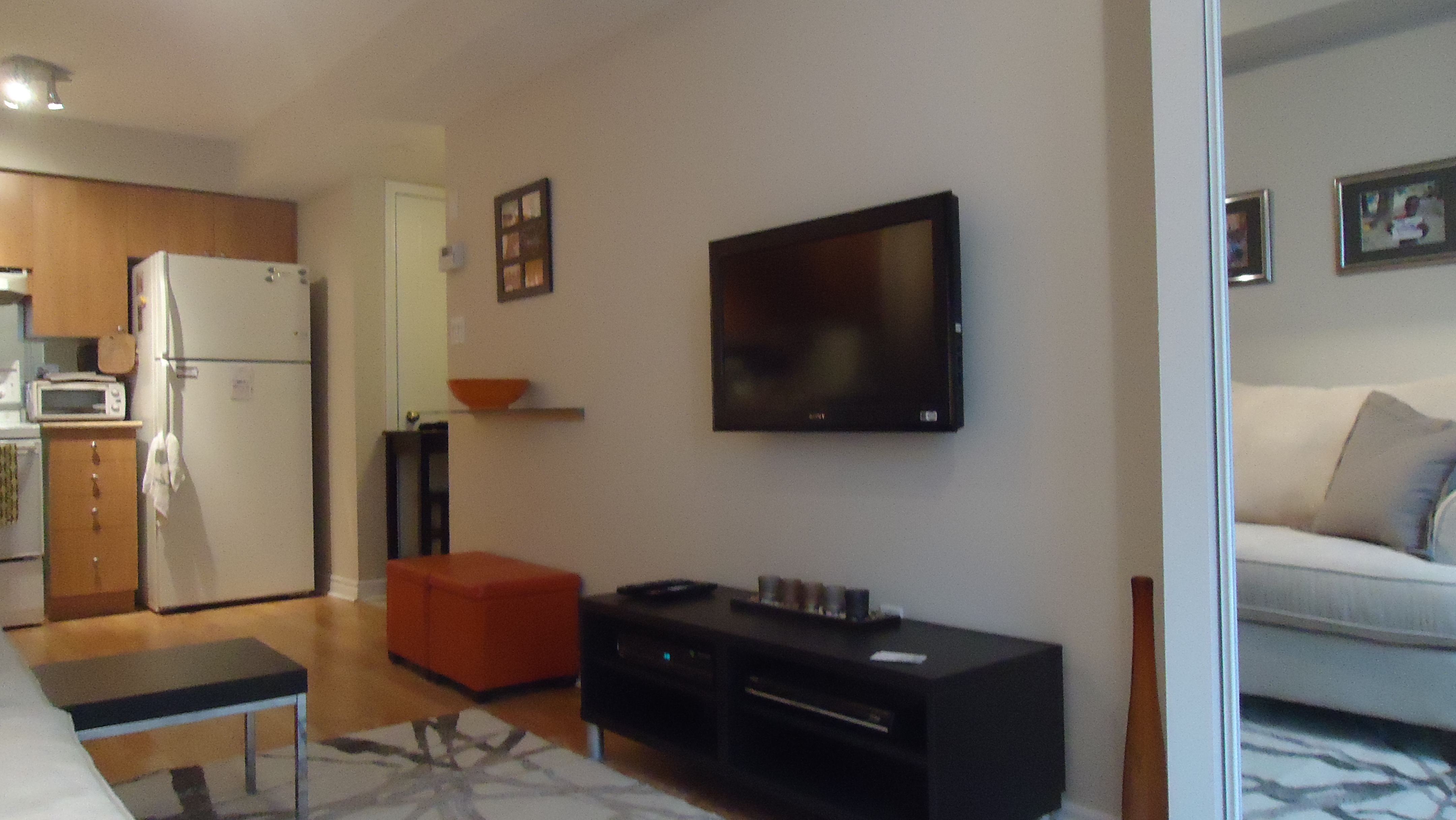
We began by decluttering a bit, as always. The large chunky bookcase had to go as did the rug and futon. The shelf under the TV served no purpose so we decided to keep it and simply relocate it.
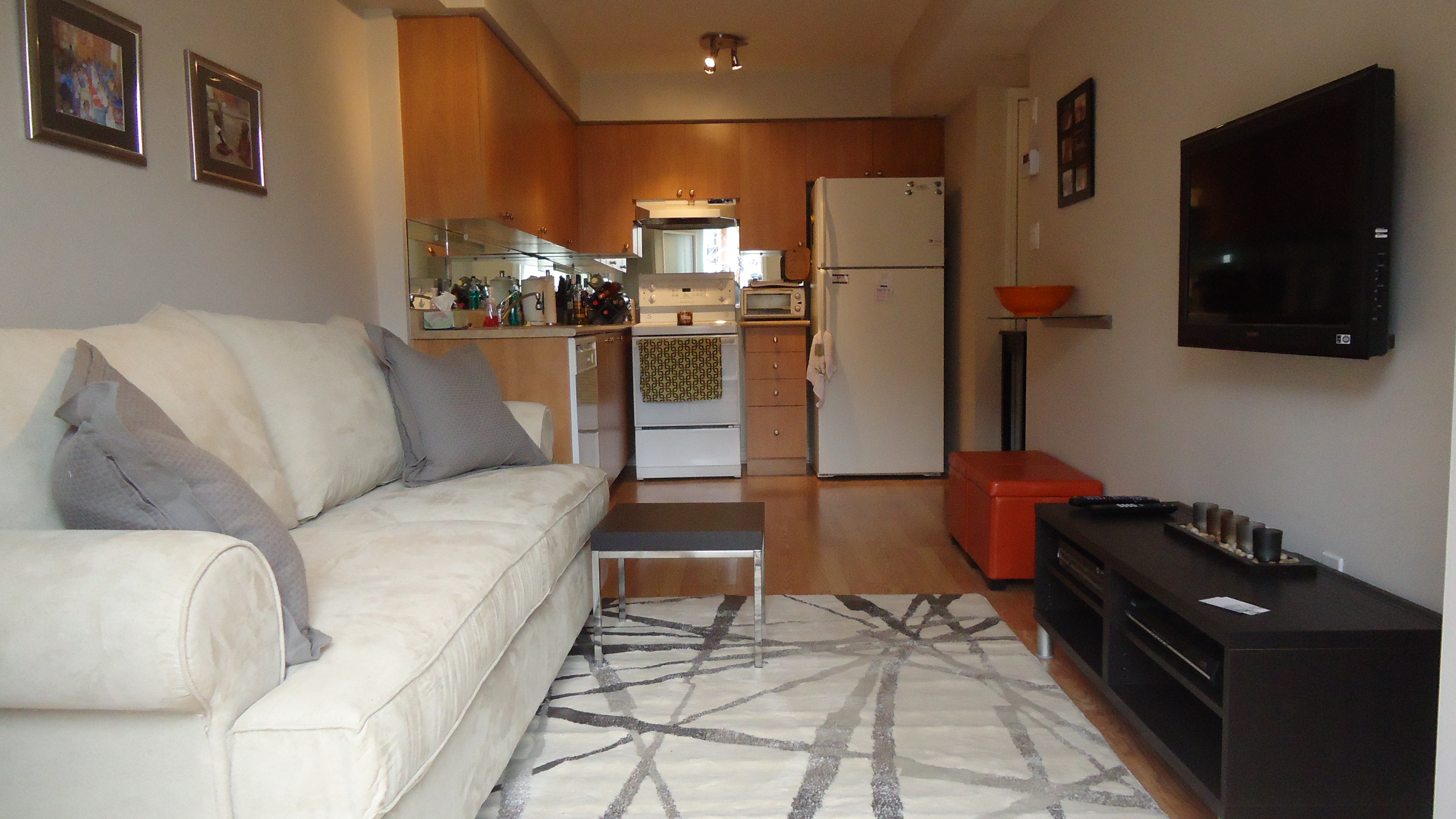
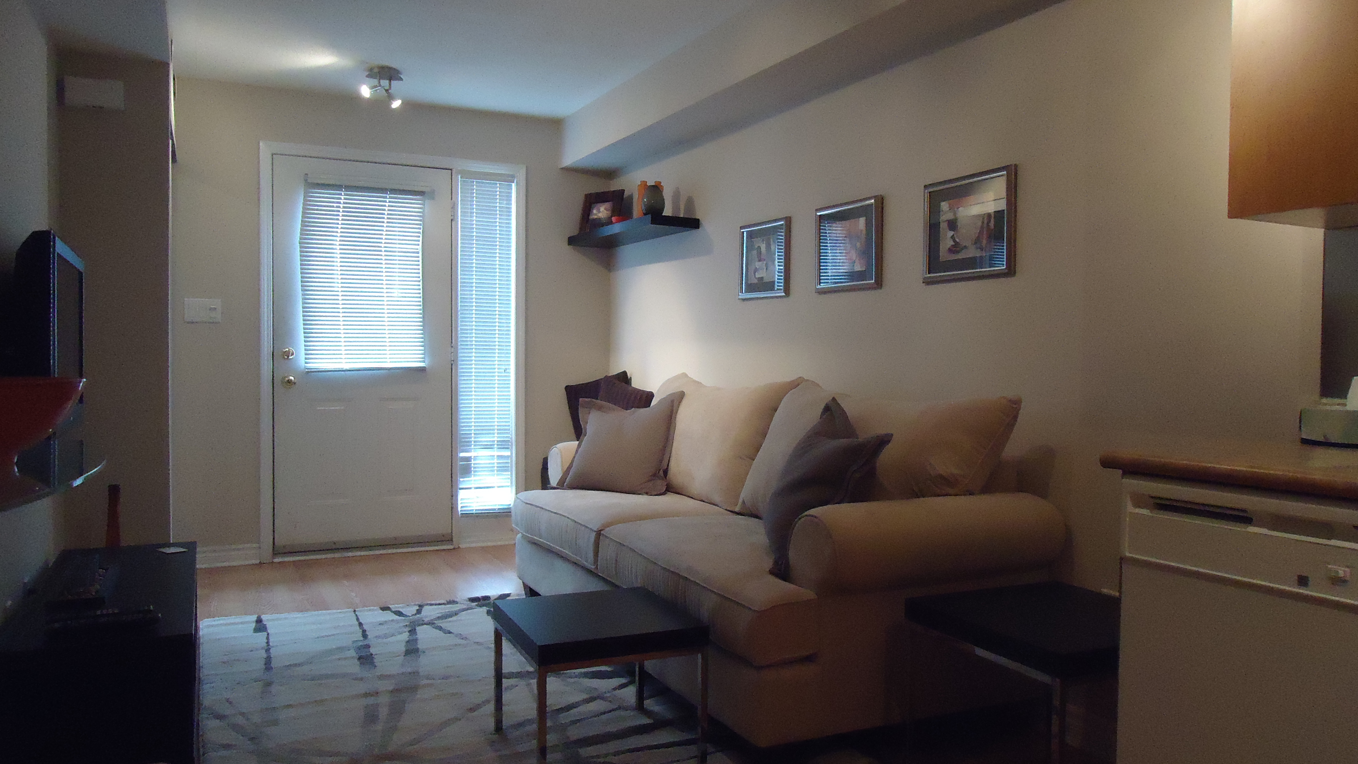
We chose a colour scheme of light cream (Benjamin Moore Baby Fawn OC-15) as our base colour and then chose orange and gray as accent colours.
To minimize contrast, which is critical in a small space, our walls, sofa and new area rug were all the same base colour. Contrast, as I’ve mentioned before, is one of the single greatest factors contributing to a space feeling small, so it’s important that all the large pieces be the same colour.
We brought in our accent colours in the cubes, vases, cushions and artwork. Everything ties in and relates to one another. There is gray in the rug, cushions and artwork mattes and orange in the photos themselves (which the client took on one of her trips – always try to personalize your artwork whenever possible), cubes, bowl and vases.
The result is absolutely beautiful. The space is warm, cozy and inviting. Everything ties in and relates. There’s lots of extra seating for guests and the home is clean, organized and simple.
Have a look:


Looks absolutely amazing…congrats on yet another job well done! Love your work!