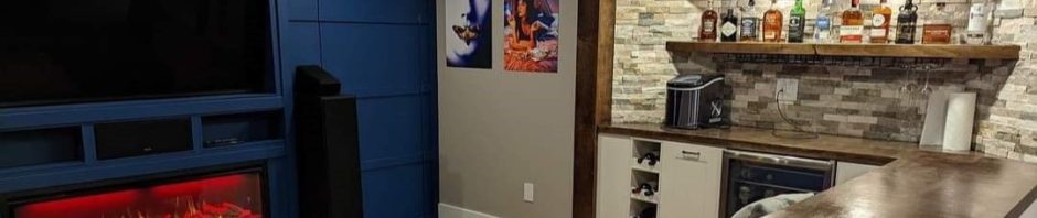
This property was at one time a small cottage on a lake north of Oshawa. It was added on to several times over the years and after some fairly extensive renovations it became a beautiful, rather large home.


This property was at one time a small cottage on a lake north of Oshawa. It was added on to several times over the years and after some fairly extensive renovations it became a beautiful, rather large home.
An open concept home can be nice but sometimes you can go a little overboard.
This was the case when a client bought an 85 year old west Toronto home and then tore down almost every interior wall on the main floor creating a home that felt like, well, a barn.
Her home office which is right off the living room had no privacy and was open for everyone to see whenever she entertained.
The challenge was how to keep the open concept while still affording the option of being closed in.

The solution was to add “barn doors”. We began by extending the wall between the office and the living room to allow the doors to “stack” behind it.

Next we added the track and some moulding to hide it and built the doors, trimmed out to mimic the moulding around the fireplace.

With the doors closed, it gives the living room a cozier feel and keeps the home office private.

From behind you can see how the doors “stack” behind the wall.


The doors were a great compromise, allowing my client to maintain her open concept home while still giving the option of privacy.
The Robert Watson Lofts located in Roncesvalles Village is a redeveloped 6 story 19th century warehouse once owned by confectioners RT Watson and Co.
The building is stunning and the charming loft units boast concrete walls, exposed duct work and 12 to 16 foot ceilings.
This loft project that I completed last year for a young single client is one of my favorites.


This loft, which I completed two years ago, is still to this day one of my favourite makeovers.I love everything about it from the 12 foot ceilings to the concrete pillars. Simply a great space in a great area, Toronto’s King West neighbourhood.
When I first met with the owner, he had recently purchased the loft and owned a TV and stand and a mattress, as well as a leather sofa which he gave to his brother. Everything else was up to me.
I love starting with a blank canvas. It’s amazing what a difference some colour and the right furnishings can make.


When it comes to window coverings (treatments) there are so many factors to consider and so many choices and decisions to make, it can seem a bit overwhelming.
So let’s see if I can help a bit.
Think about the overall look you’re trying to achieve. Do you want simple, uncluttered, clean lines? Do you want a softer, warmer look? Do you want or need to add some colour? Do want a contemporary look or something more traditional, or something in between?
Think about what you’re trying to achieve as far as functionality. Do you want to block out the light or simply diffuse it a bit? Is privacy an issue?
The choices are many but basically break down into four categories.
There are blinds (vertical, horizontal, wood, faux wood, metal and PVC), shades (cellular, pleated, roman, rollar and sun screens), shutters and draperies (including sheers).
I’ll walk you through a few that I’ve done and give you a bit of my thinking around each.
The first and one of my favourites is the sheer horizontal blind. This is basically a horizontal blind with a sheer fabric attached to both sides. This allows you to let the light in and still have some privavcy during the day but then at night you can fully close them like a regular blind. You can tilt the vanes to control the light and you can pull the blinds all the up. It’s a very clean look but also very soft and warm.


Another favourite of mine that I use often in condos where privacy isn’t an issue, is the sun screen. This is basically a roller blind but the but itself has thousands of tiny perforations to allow some light and visibility. They come in different levels of opacity so you can decide how much light you want to allow in. Even when fully closed, you can still see out so they don’t close the space in. Perfect for small spaces.


If you like the look of shutters but they’re a bit out of reach for your budget, you can opt for a wood or faux wood blind. They have a look similar to shutters but come at a fraction of the price.

Don’t overlook drapery panels and sheers as a great way to give privacy and a warm, cozy feel. They also allow you to add some colour to your windows and tie in your colour scheme.


If your budget allows and you’re looking for a clean, contemporary look, opt for shutters. They allow light control and privacy.


There are many on line resources you can turn to for help and inspiration. Hunter Douglas, Blinds To Go and Covers all have great websites and there is always google images.
If I can be of any help, feel free to call or email me or post a comment here.
I’ve spent a fair amount of time on this blog writing about paint colours for walls and trimwork, but I’ve never touched on sheen levels, which can have a huge impact on the results of your painting project. So, here we go…..
Paints come in a variety of sheen levels from matte to gloss and a few in between. Here’s some insight into the differences and the reasons behind my preferences.
Matte (or flat) is the sheen level I use 99% of the time on interior walls. Matte paint will give your walls a velvety look, especially under soft lighting. I find matte paint gives the room a warmer, cozier, more inviting feel than any other sheen level.
Matte paint also hides wall imperfections very well, since it tends to absorb light as opposed to reflect it, so it’s ideal if you live in an older home where the walls are typically plaster or if you’re not great at repairing damaged walls.
A myth about matte paint is that it’s not washable, which is why most people opt for asatin or eggshell finish. In my experience, I have found that a high quality paint such as Regal or Aura from Benjamin Moore, is very washable once it’s had time to fully cure.
A high qulaity paint will also tend to not fade over time and when you do wash it, you won’t see the streaks that are left behind on an inexpensive paint.
As a side note, don’t “cheap out” on the paint. Trust me. If you buy an inexpensive paint, you will find you have to recoat several times to get the coverage you need and the paint is simply not durable enough to withstand fading and washing. You’ll be repainting within a year.
When it comes to trim, I tend to use an Ultra White satin finish. For me, white is not an option, it’s the only option. White trim will unify your home and tie all the room colours together.
Alot of people will use a high gloss sheen on their trim, which I would tend to agree with if your walla are eggshell. I find that the contrast between matte walls and high gloss trim is a bit too much and a satin or pearl finish on the trim blends well with the matte walls.
I’ve found that satin trim washes well and stands up over time.
If you’re looking for jmore ideas and information, Benjamin Moore has a fanmtastic website full of tons of useful information and on line tools to help you. Their staff is incredibly knowledgeable and helpful and I have often “bounced” ideas off of them and been given ideas I hadn’t thought of.
I’ll spend some time in a future post on some of the different paint brands I recommend and use on a regular basis.
For now, I hope this has been of some help.
If you’re looking for an easy, inexpensive way to add character and visual interest to your kitchen, think about your backsplash. A fabulous tile backsplash can be the defining element in your kitchen.
There are so many options and choices available from ceramic, stainless steel, glass, stone and mosaics that include different elements, it can be a bit daunting.
Try to pick up a colour from your countertop, cabinets, wall colour, artwork, anything to tie it in. Look on line at photos of other kitchens or head to your local bookstore and peruse through the magazines.
Here’s a couple I did where I pulled the backsplash colour from both the countertop and the wall colour:


Here are a few done in the classic and timeless white subway tile:


You can find a huge selection of tiles at the big box stores (Lowes, Home Depot) and at tile suppliers (Olympia Tile). Buy a few that you like, take them home and see how they look. Don’t rush the selection process. Once the backsplash is up and finished, it’s not an easy thing to replace.
Remember how contrast can affect the visual size of the room. A white backsplash against white cabinetry will make the kitchen feel larger than a dark backsplash against light cabinetry. The colour contrast is what makes the difference.
Check out styleathome.ca or houseandhome.com to see some fabulous kitchens or simply search google images.
Take your time and have fun with it! Your backsplash can define your kitchen and your style.
One of the complaints I hear most often from new clients is that their home feels disjointed and there is no flow.
There are a few reasons why this happens but one of the most common is that when people decorate, they tend to decorate room by room without an overall plan for the home. Each room is a different colour and may look great on it’s own, but the rooms and their colours don’t relate to each other and it feels like they could all be from a different home.
People will go crazy trying to figure out what colour to paint the next room, when really they should be thinking about repeating one of the existing colours. Repetition, whether in pattern, shapes or colours, gives unity and flow.
When I am developing a colour scheme, I try to limit myself to THREE colours and I use those colours throughout the home.
I will have one colour, which is fairly neutral, that, in a house, I will use throughout the foyer, the main hallway, up the stairs and throughout the upstairs hallway. In a condo, which is usually an open concept design, I will use one neutral colour throughout the main living area which would include the foyer, any hallway, and the living, dining and kitchen area.
The next two colours I will use for bedrooms and bathrooms and to relate the rooms together. For example, I may use a second colour in the bathroom and a third colour in the bedrooms, then repeat the bedroom or bathroom colour as an accent wall in the living or dining area.
Accent walls are a great way to add some visual interest and to bring colours together. Then you can use accent furniture, cushions, draperies or artwork in the accent wall colour.


As I’ve mentioned previously, I always use white trim as it helps to “link” all the rooms together.
If you struggle with paint colours, let the experts help you. Designer Brian Gluckstein has teamed up with Benjamin Moore and developed a colour palette where each uses three colours. It is fantastic! Why stress over colour choices when someone else has done all the work for you?
http://www.benjaminmoore.com/en-ca/for-your-home/benjamin-moore-teams-with-designer-brian-gluckstein
Hopefully I’ve helped you a little bit when it comes to developing a colour scheme. Make sure you read my other post in this category.
Here’s a great way to add some privacy to a glass shower stall, windows or doors.
It’s inexpensive and relatively easy to install, if, and I can’t stress this enough, you follow the instructions.
I’ve done a few of these and it gets easier each time you do it. Take your time and be patient and the results will be fantastic.
Window films available from http://www.gilafilms.com are a great way to add privacy and light control.
Recently, I added window films to a glass wall shower stall in a downtown condo to give the owners some privacy in their master bath.

I’ve installed these films on bathroom windows, sliding patio doors and a couple of years ago, on glass doors separating a solarium from the rest of the condo. Here are the before and afters. The window film provides some privacy for the solarium which is sometimes used as a guest room and also some light control for the rest of the living area.


Have a look through their website. There are many different types and styles to choose from so it’s easy to find something you’ll like.
You know, you’d think when you pay a million bucks for a condo, you’d get a decent walk in closet but, noooooo, you get the same junk that builders install in every condo I’ve ever seen. You get a shelf and a closet rod and a ton of useless space.


My client needed a much better use of space. They needed space to hang clothes, store shoes, sweaters, luggage….in a condo you need to make use of every inch and the master bedroom walk in closet often becomes a catch-all for a lot of other items.
In this project, I designed a walk in closet using the SuiteSymphony system from Closetmaid and then customized it to fit.
We started by removing the old shelving and some of the baseboards (I wanted the system to mount flush against the walls). Then we filled the holes and painted the closet to match the master bedroom, giving flow and unity to the space.

I designed a system that combined a corner tower for sweaters and seasonal clothing items, two wall towers housing drawers, shoes storage and shelves for folded items and seven closet rods to hang everything else. A top shelf links them all together and provides storage for items used once in a while such as luggage.


The Closetmaid system is one that I highly recommend. It’s easy to custom fit by cutting the closet rods with a simple hack saw and the top shelves with a table saw. It can also be customized as your needs change by adding more drawers and doors.
You can view all the options by visiting http://www.closetmaid.com clicking on Shop and following the links.

