Developing a Lighting Plan

One of the things I see in almost every home I go into is how poorly lit they are. This is especially true in new condos where often times there aren’t even electrical boxes in the ceilings or if there are any, they are in an area of the ceiling that makes them virtually useless.

Lighting is very often the one thing that is overlooked and yet it is one of the most important design elements. It can make or break the mood and look of a room.

A great lighting plan is absolutely critical.

So, where do you start? Let’s look at the different types of lighting that you need to consider and I’ll show you some examples of how and where I’ve used them.

There are four basic types of lighting:

1. Ambient Lighting

Ambient lighting is general overall illumination. It fills the room with light and can be a chandelier, a ceiling fixture or a floor or table lamp.

2. Task Lighting

Task lighting provides focused, directional lighting for a specific area and task. Lighting for reading or lighting focused on different areas in the kitchen (sink, counter or stove) are examples of task lighting.

3. Accent Lighting

Accent lighting lights a particular part of the room or an object in the room. For example, lighting focused on a painting or sculpture.

4. Decorative Lighting

Decorative lighting is simply a decorative element. An example would be a wrought iron candle stand or small decorative lamp. It is not there to provide much light, but simply to add a decorative touch.

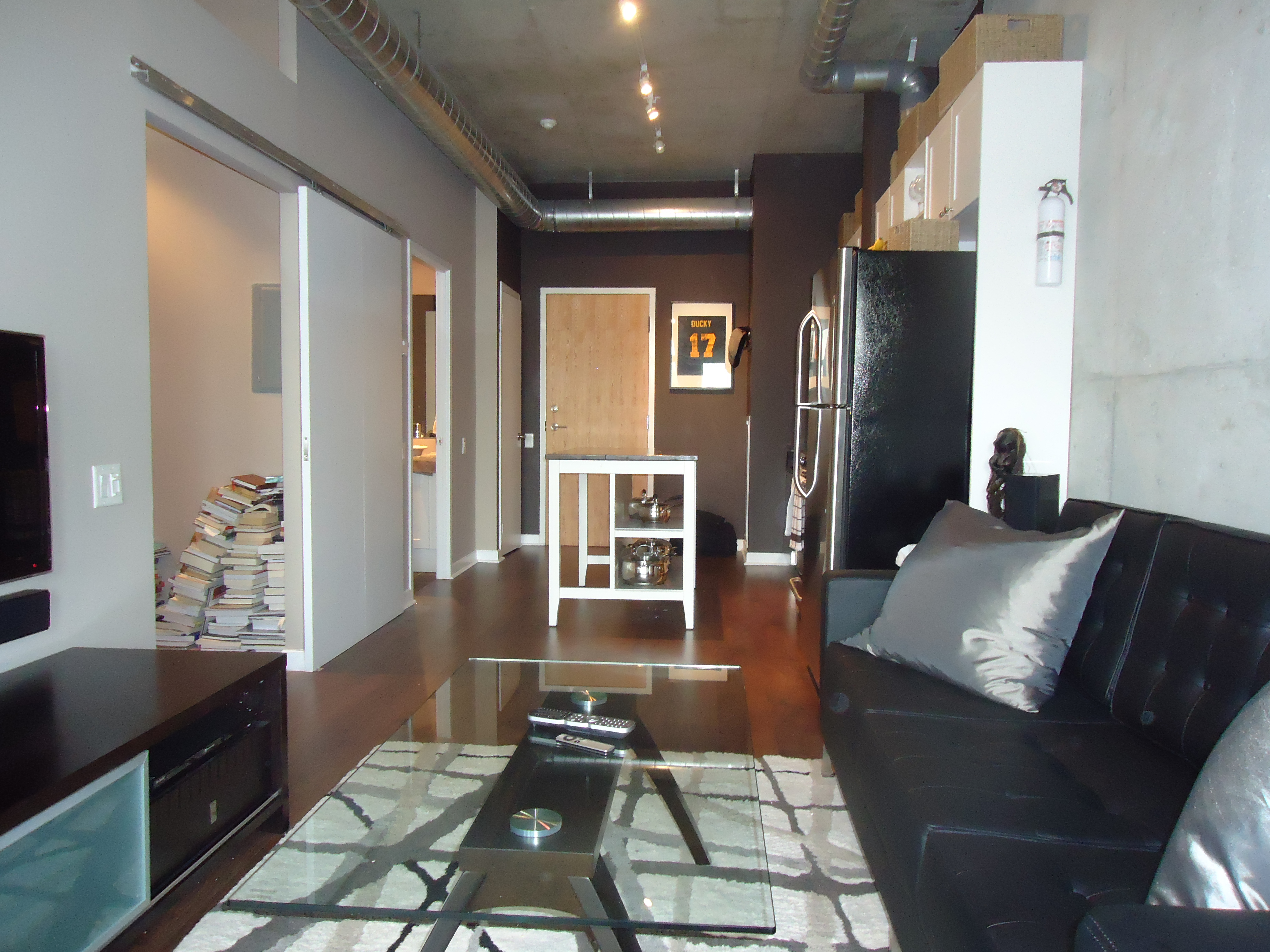
Here’s a loft in the fashion district where I replaced the track lighting that was in the ceiling with a simple fixture that fills the room with light. The track lighting was so directional that it didn’t really light the room and everytime you looked up, you were momentarilly blinded.


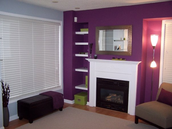
In this North York townhome, there were no electrical boxes in the ceiling, so I chose a floor lamp that combined a torchiere for overall illumination and an adjustable reading lamp. It has the option of using one, the other or both.


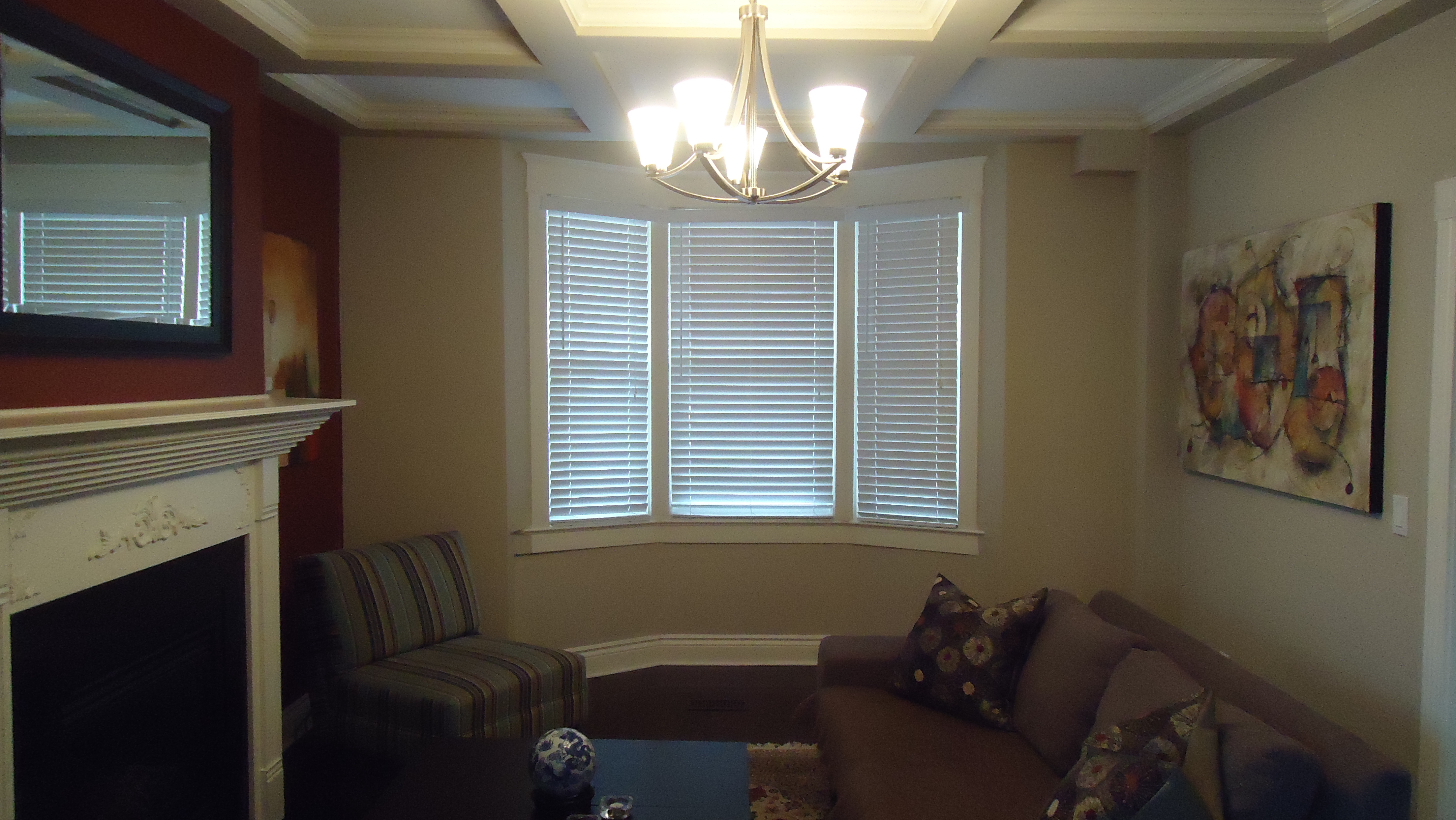
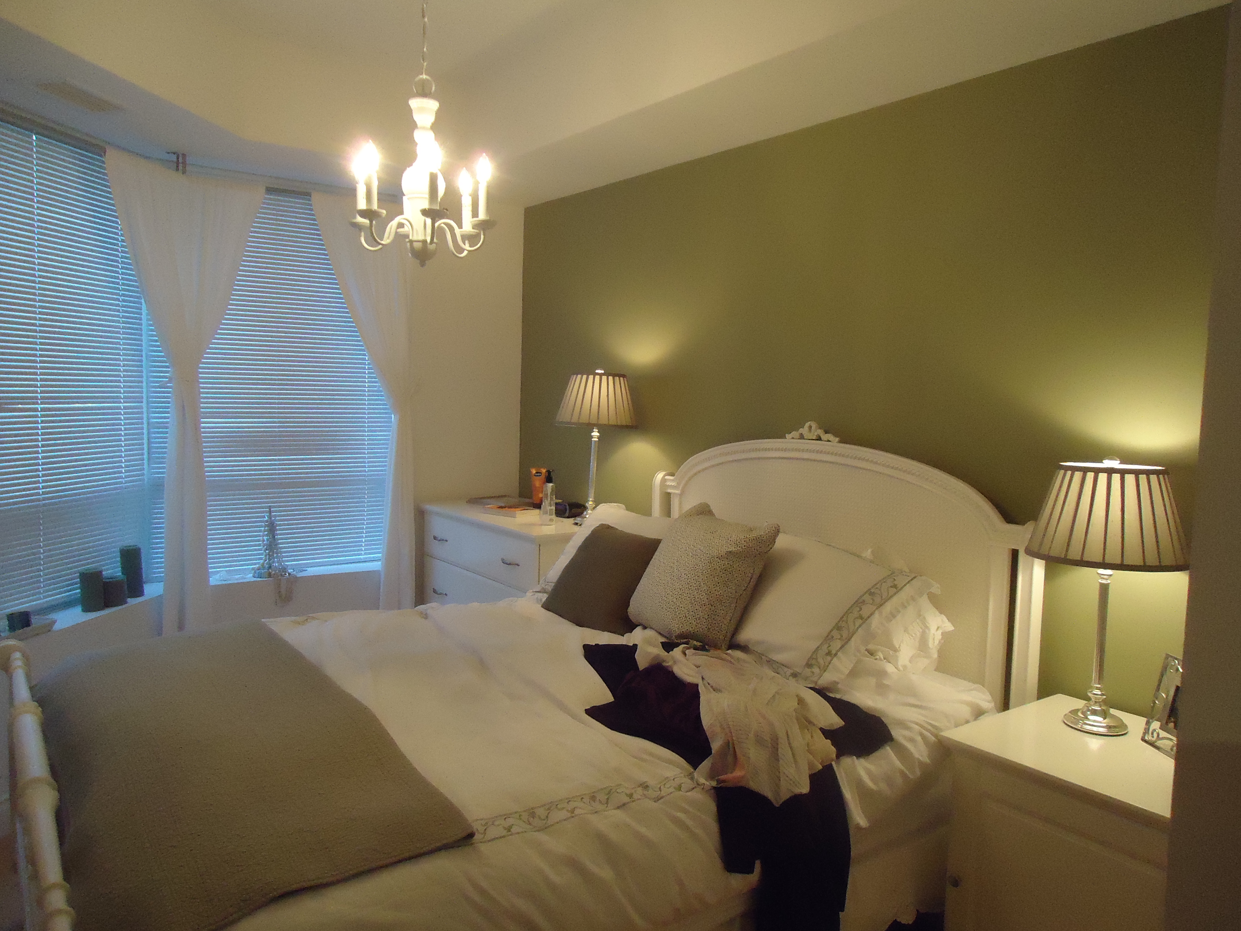
Don’t overlook a chandelier as a great way to light a living room or bedroom. They are not just for dining rooms.


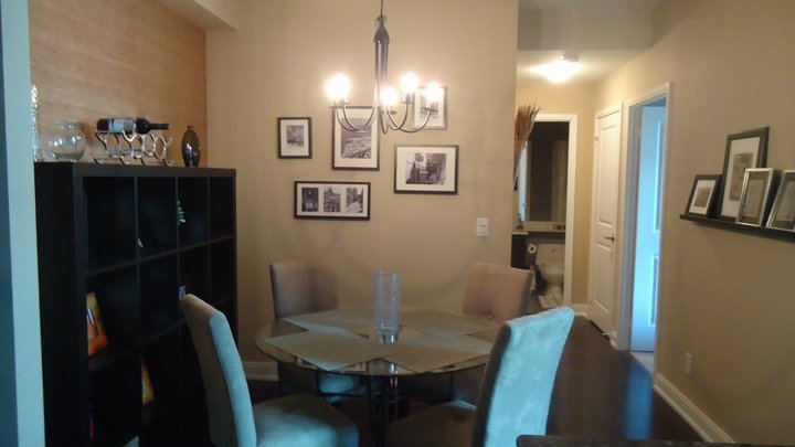
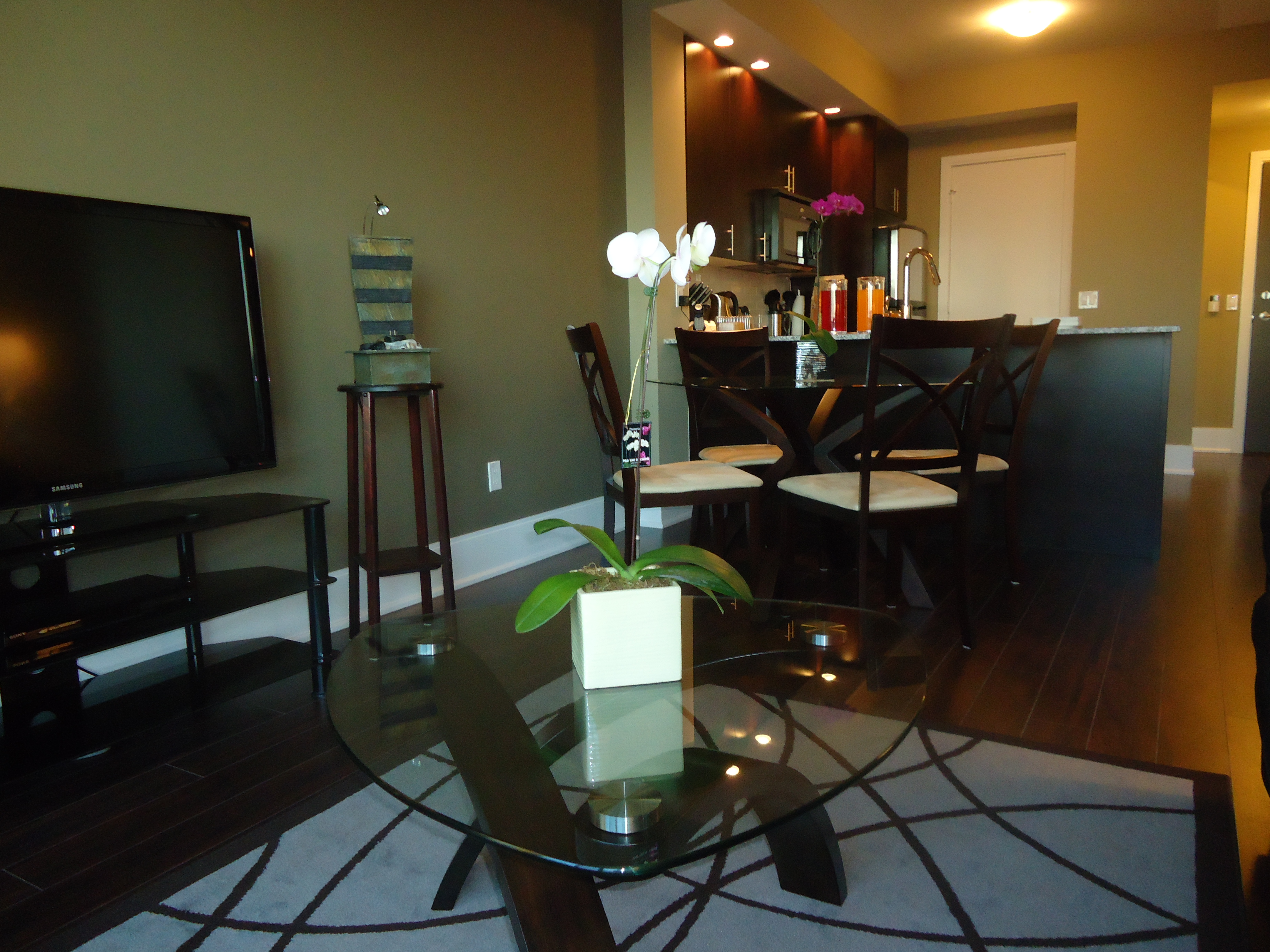
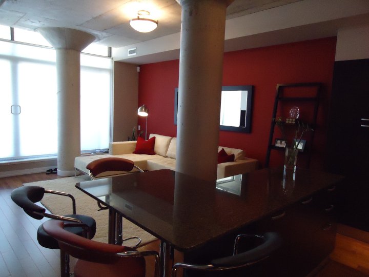
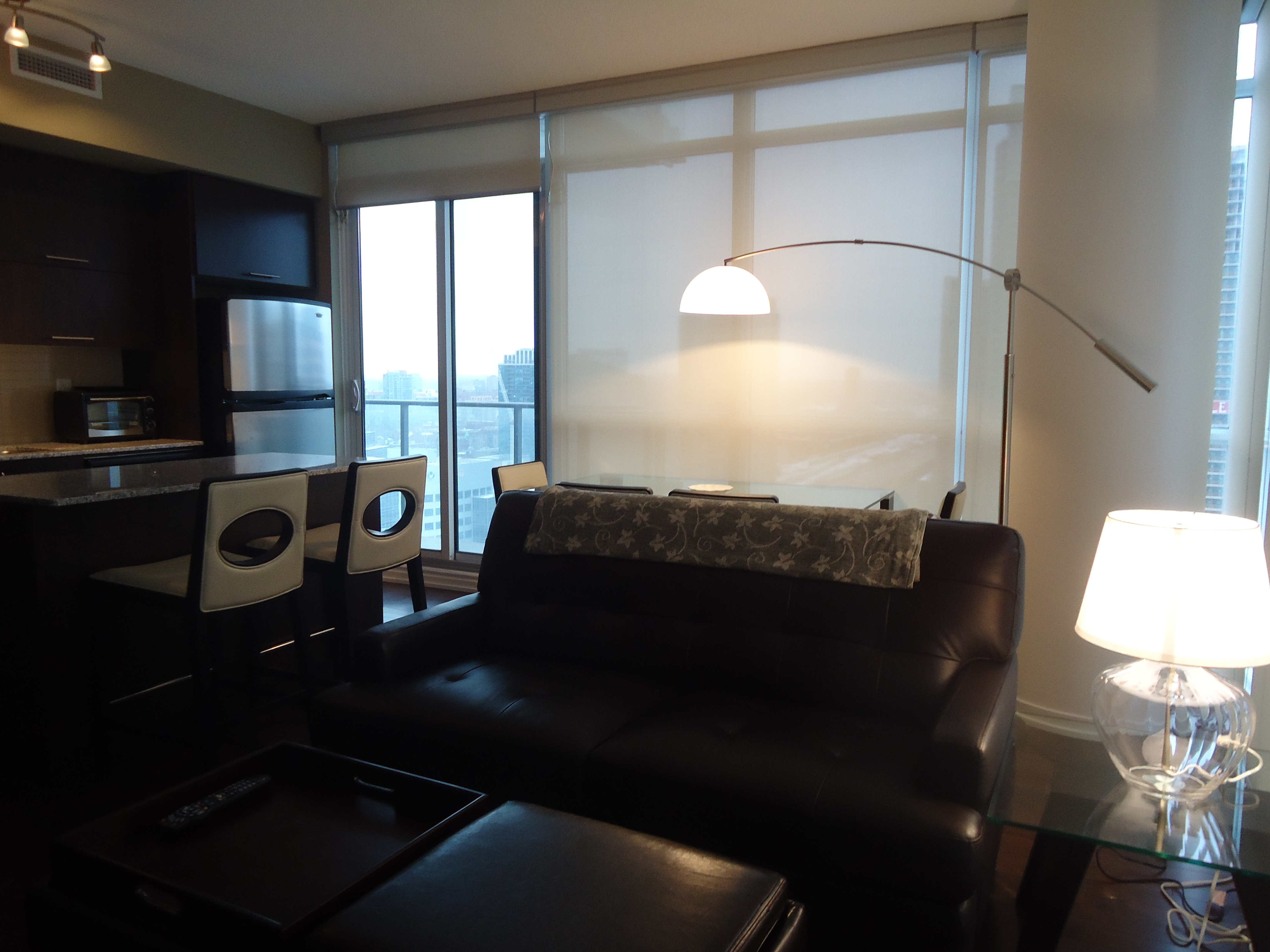
This downtown condo had an electrical box in a part of the ceiling that made it unuseable so I opted to use a floor lamp to light the dining room table. In fact, in this photo you can also see the track lighting (task) in the kitchen area and the table lamp (ambient) in the living area.


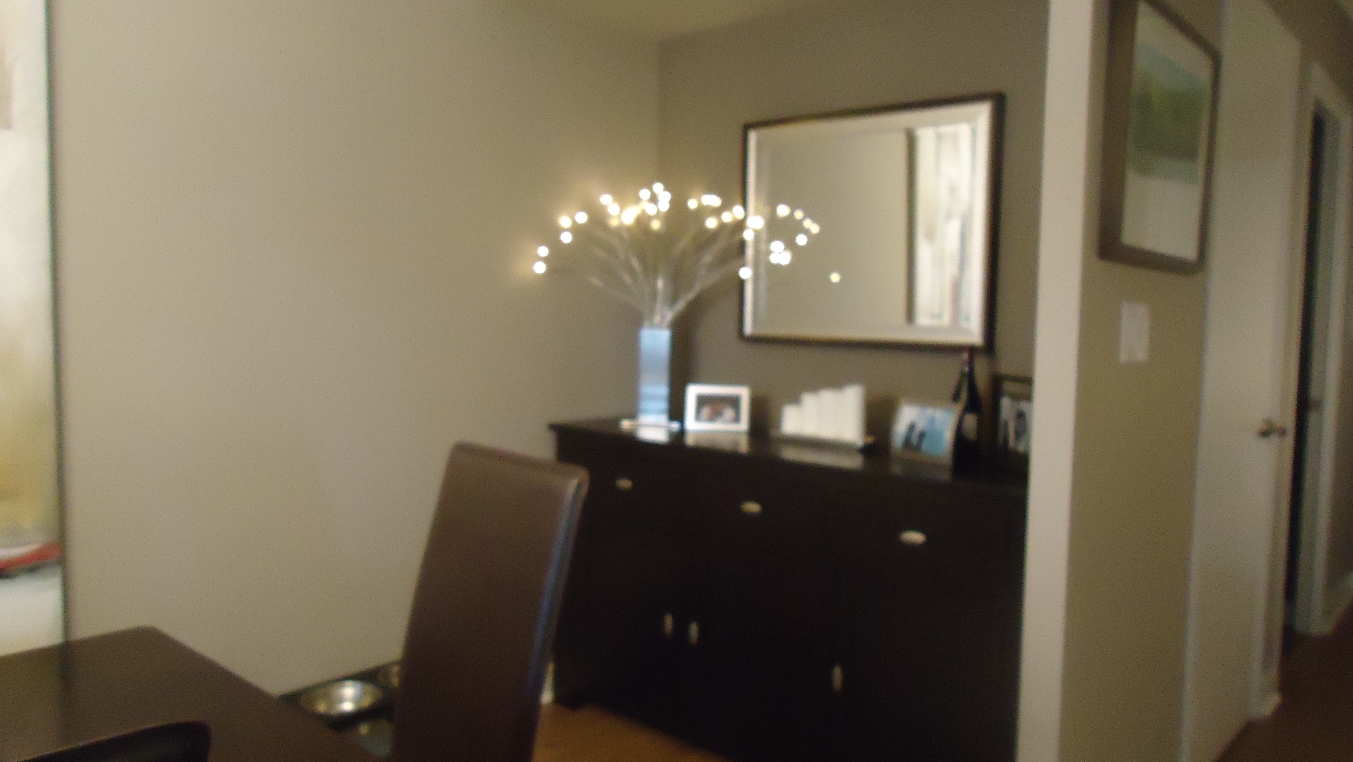
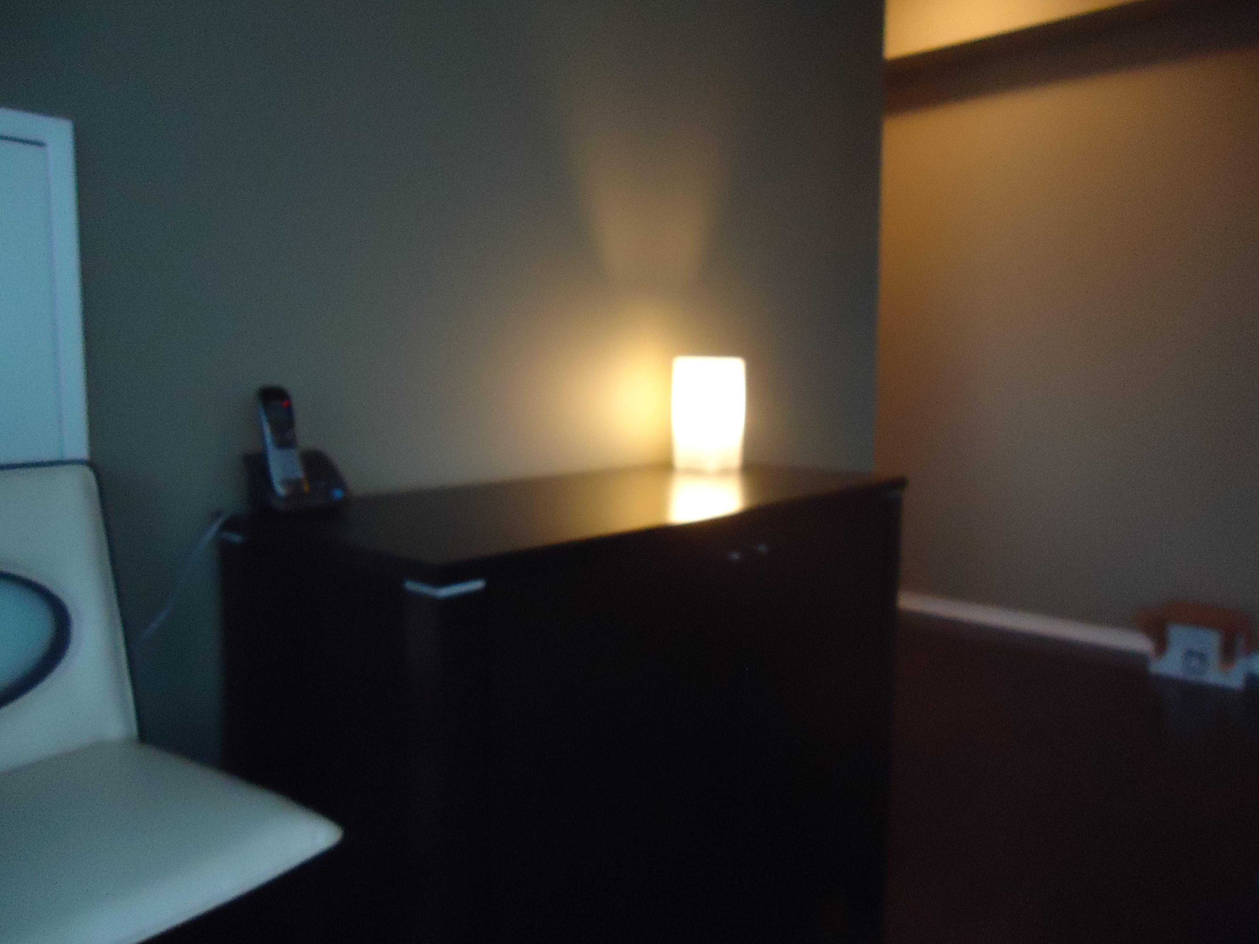
Here’s a couple of decorative lamps that don’t do much of anything except look nice.


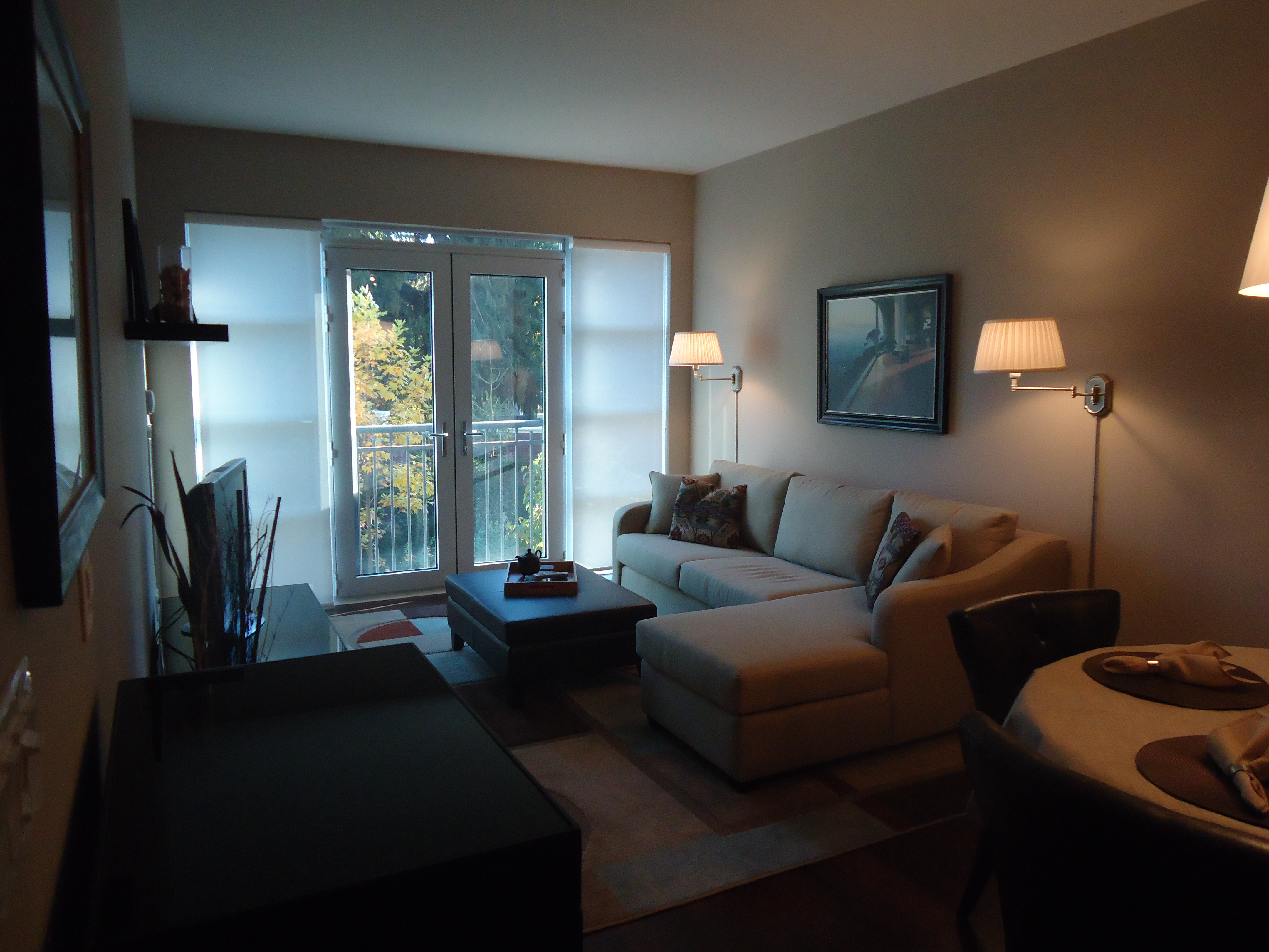
There was no room for side tables in this Bloor West Village condo so I opted for wall lamps flanking the sofa.


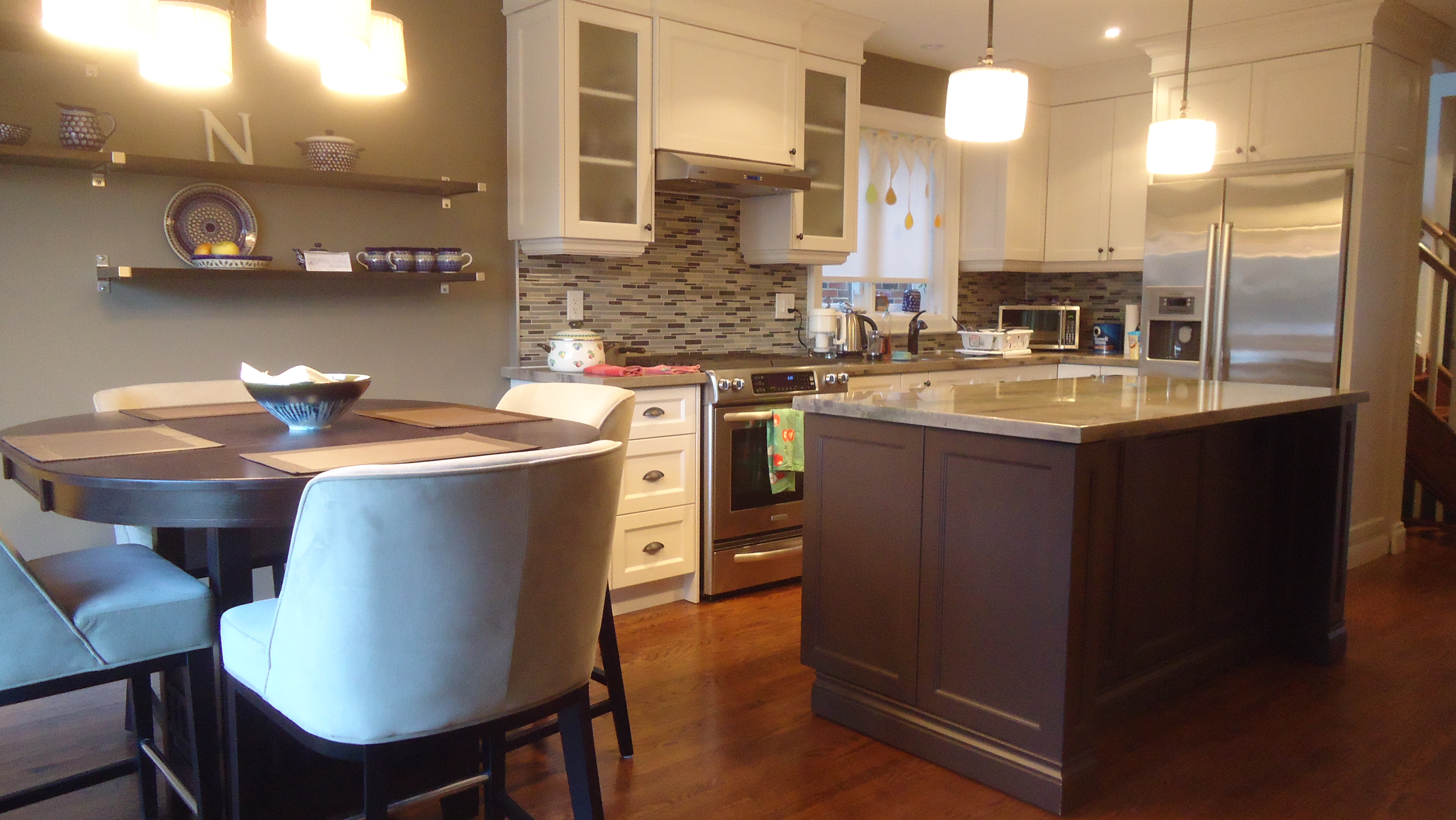
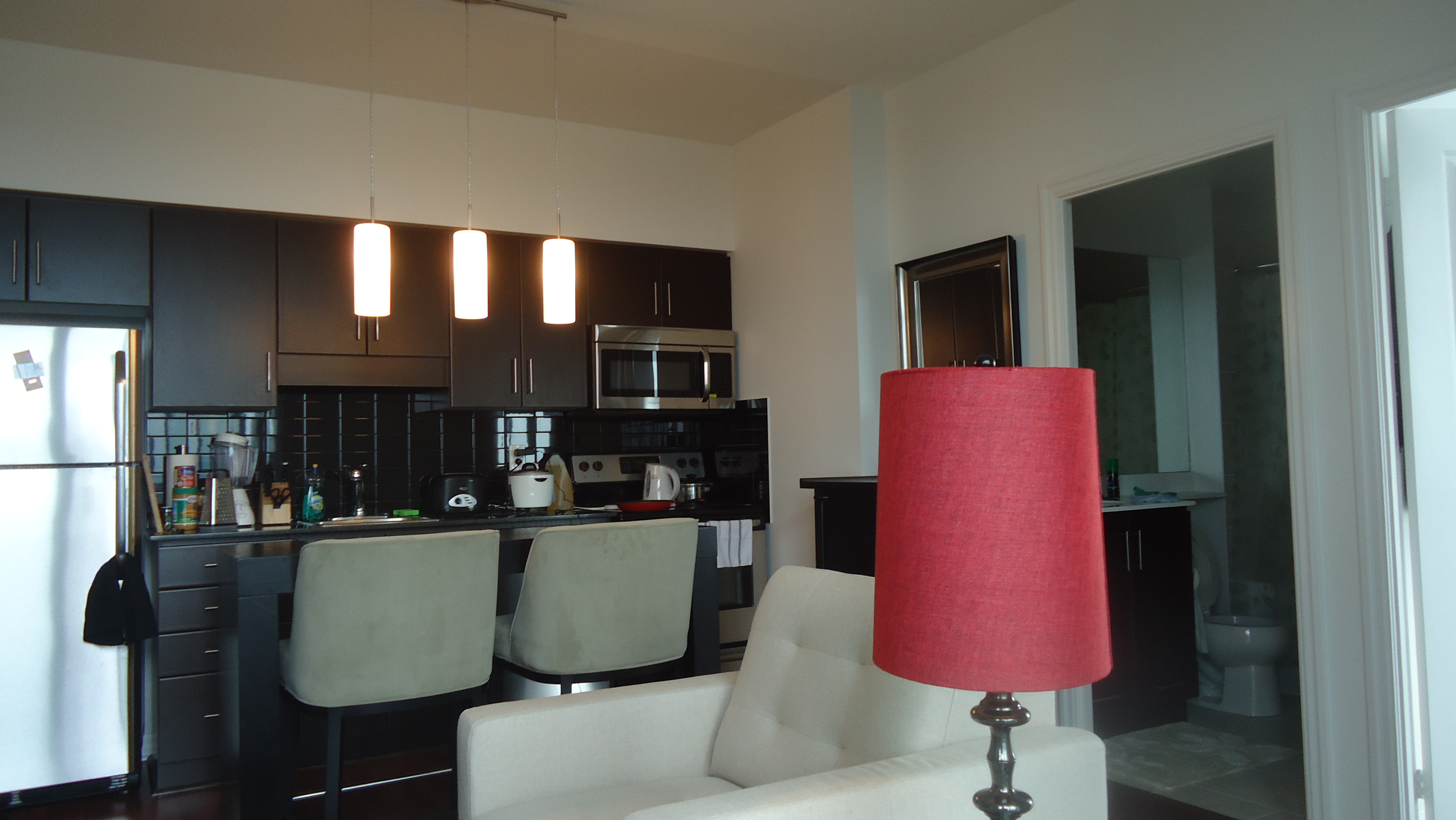
Pendants over an island provide great task lighting.


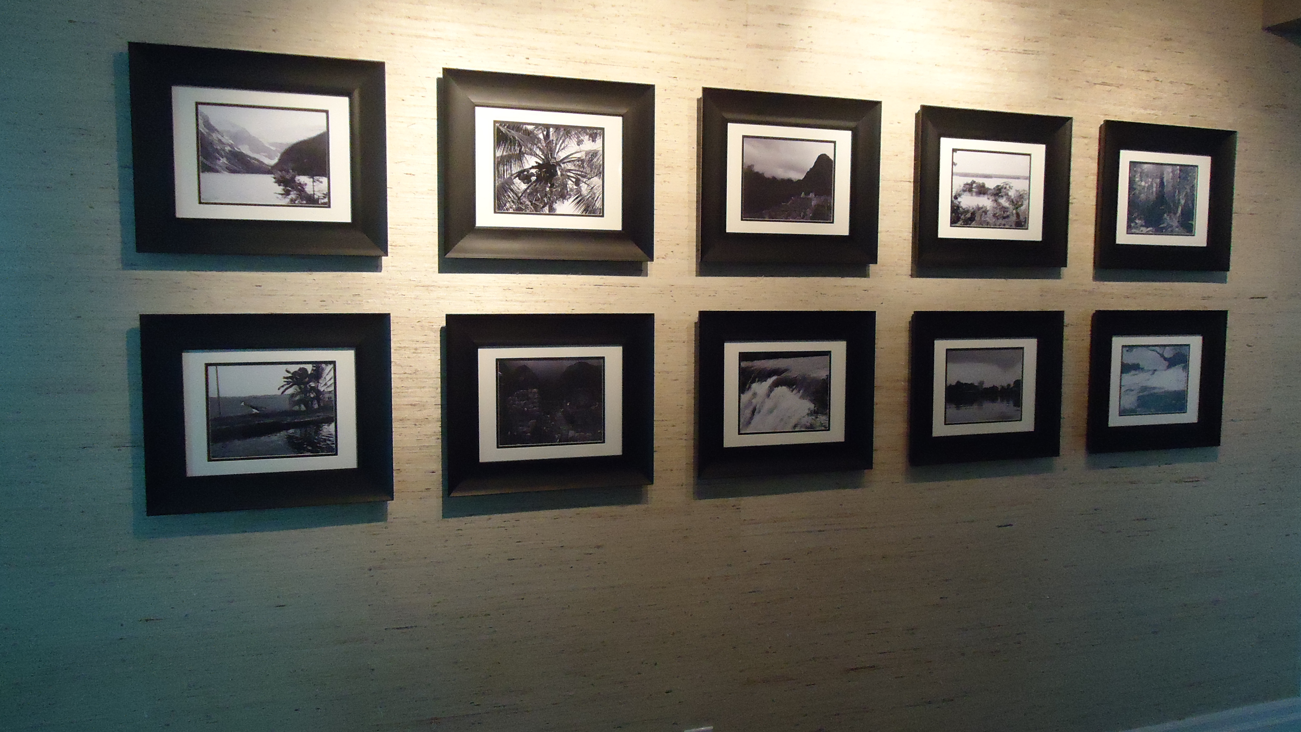
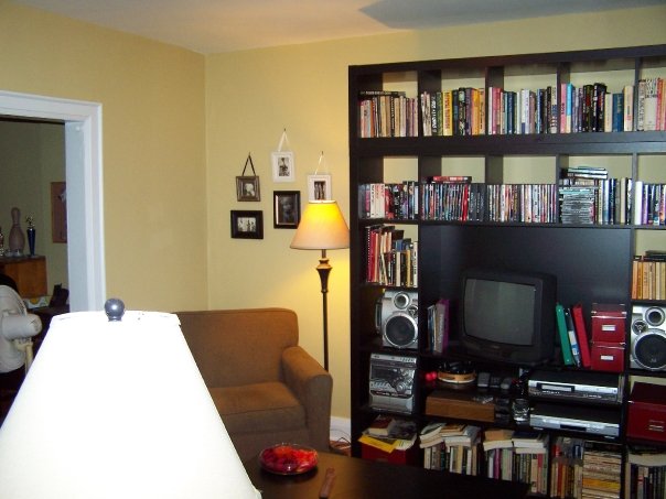
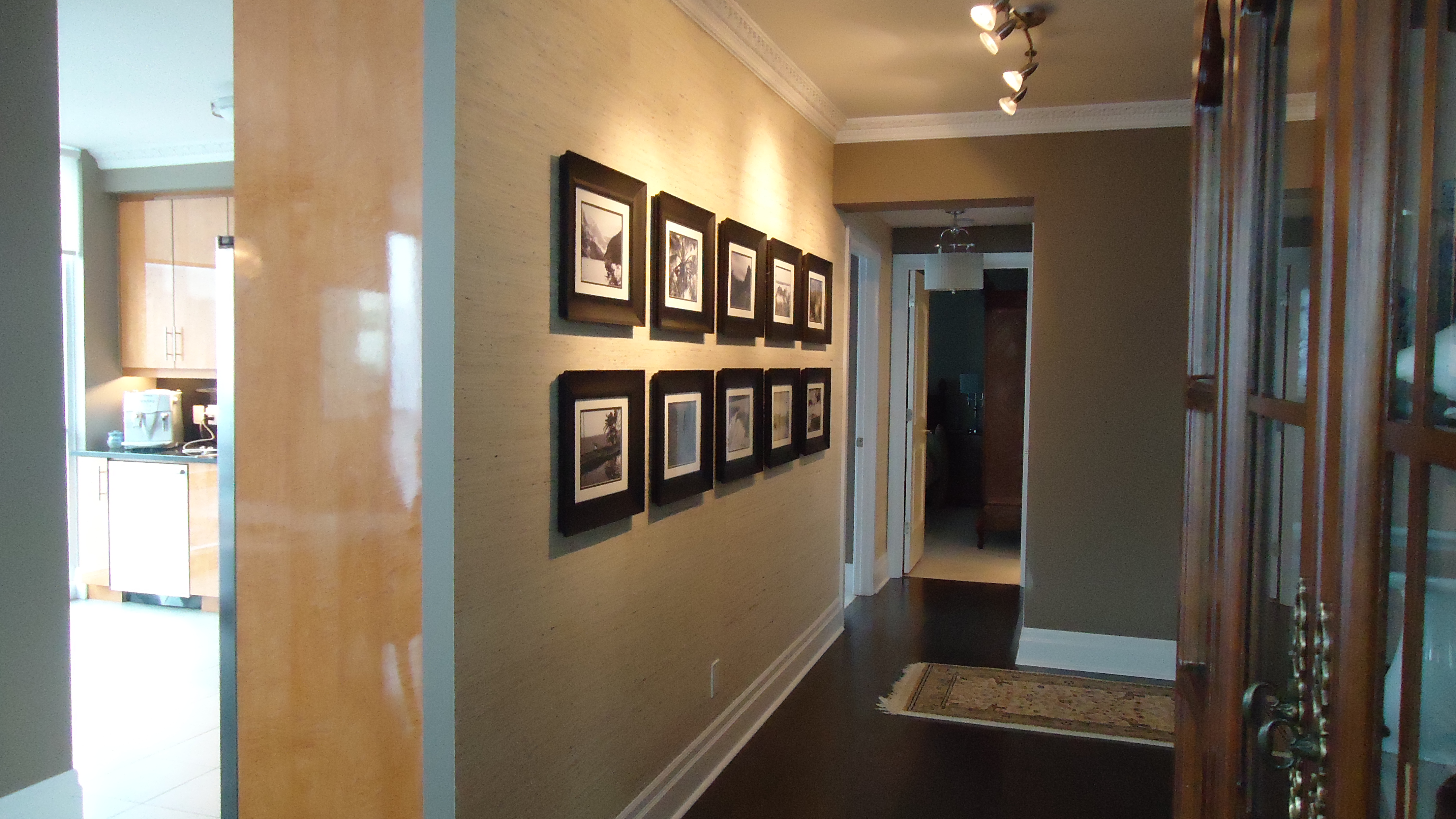
Here’s the perfect use for track lighting…to highlight a wall of photos or art.
When my clients purchased this lakefront property, the home had a mix of every style of light you can imagine; brass, wrought iron, brushed nickel. There was no flow and the home felt very chopped up.

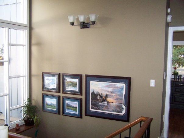
We replaced all the lights in the home with light fixtures from one “family” of lights. In these photos, you can see the chandelier, semi flush flixture and wall sconces.
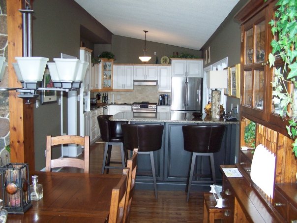
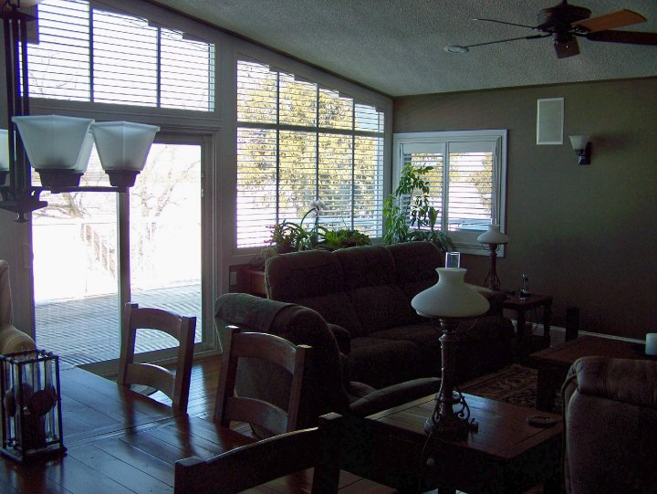


Very often, you can find a family of lights that includes chandeliers, flush, semi-flush and  wall sconces. I highly recommend that when you have a lot of ceiling fixtures, especially in an open conept home, that you choose light fixtures from one family. It will bring unity and flow to your home.

Keep in mind as well that the bottom of your chandelier should hang 30″ above the table top or 36″ if your ceilings are 9′ or higher.

Hopefully I have given you some food for thought and some inspiration when planning lighting for your home. Remember to include all four types (ambient, accent, task and decorative) and don’t be afraid to get creative.

Great lighting provides not only light, but visual interest as well.

Posted in Uncategorized | 1 Comment

My favourite fireplace makeover

I’m pretty proud of all my work, but, every now and then I complete a project that just comes together beautifully and brings a smile to my face when I step back and have a look.

This is the case when I completed one of my earliest fireplace makeovers a couple of years ago.

The builder, as most builders seem to do, gave them just an awful looking fireplace. Nothing more than a firebox in the wall with some tile around it.


My client wanted something that was more asthetically pleasing, had lots of storage and they wanted to mount their flat screen TV above it. They also wanted to install in wall speakers and be able to hide all the wiring.

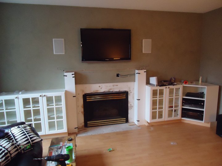
The first thing I did was remove all the old tile and install the mount for the TV. You’ll notice the two holes in the wall which were cut to enable the wiring from the TV to pass down through the wall and into the hollow fireplace mantle. You can also see the sketch of the new mantle, surround and cabinetry on the wall. This was done so that I could see exactly where holes needed to be and to help position the in-wall speakers.


Next began the work of building the cabinets and fireplace surround. A base was built of 1 X 6 pine then stock Ikea upper kitchen cabinets were mounted. I used a large corner unit to house all the AV components. The fireplace surround was constructed piece by piece from MDF. You can see the in-wall speakers are in place, the TV is mounted and all the wiring runs down through the wall and into the back of the cabinetry.


More MDF was added to begin the mantle and decorative trim was installed.


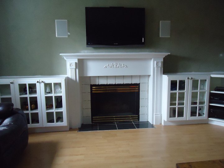
The mantle was finished off with crown moulding, tops were added to the side cabinets and new tile was laid on the surround and the hearth.


A new coat of paint in the room (Sun-Dried Tomato) was chosen to really make the new fireplace stand out and become the focal point it should have been all along.


Lastly, the brass trim on the fireplace screen was spray painted black as we felt the brass was a bit dated. Crown moulding, an area rug and a few new furniture items completed the room.


What a dramatic difference! This family room is now warm and inviting, with a much better use of space and tons of additional storage.

Posted in Fireplace Makeovers | 2 Comments

Developing a colour scheme

Usually when I am trying to come up with a colour scheme for a client, there is something from which to draw inspiration. It could be a fantastic piece of artwork, a dramatic shower curtain or a unique throw cushion.

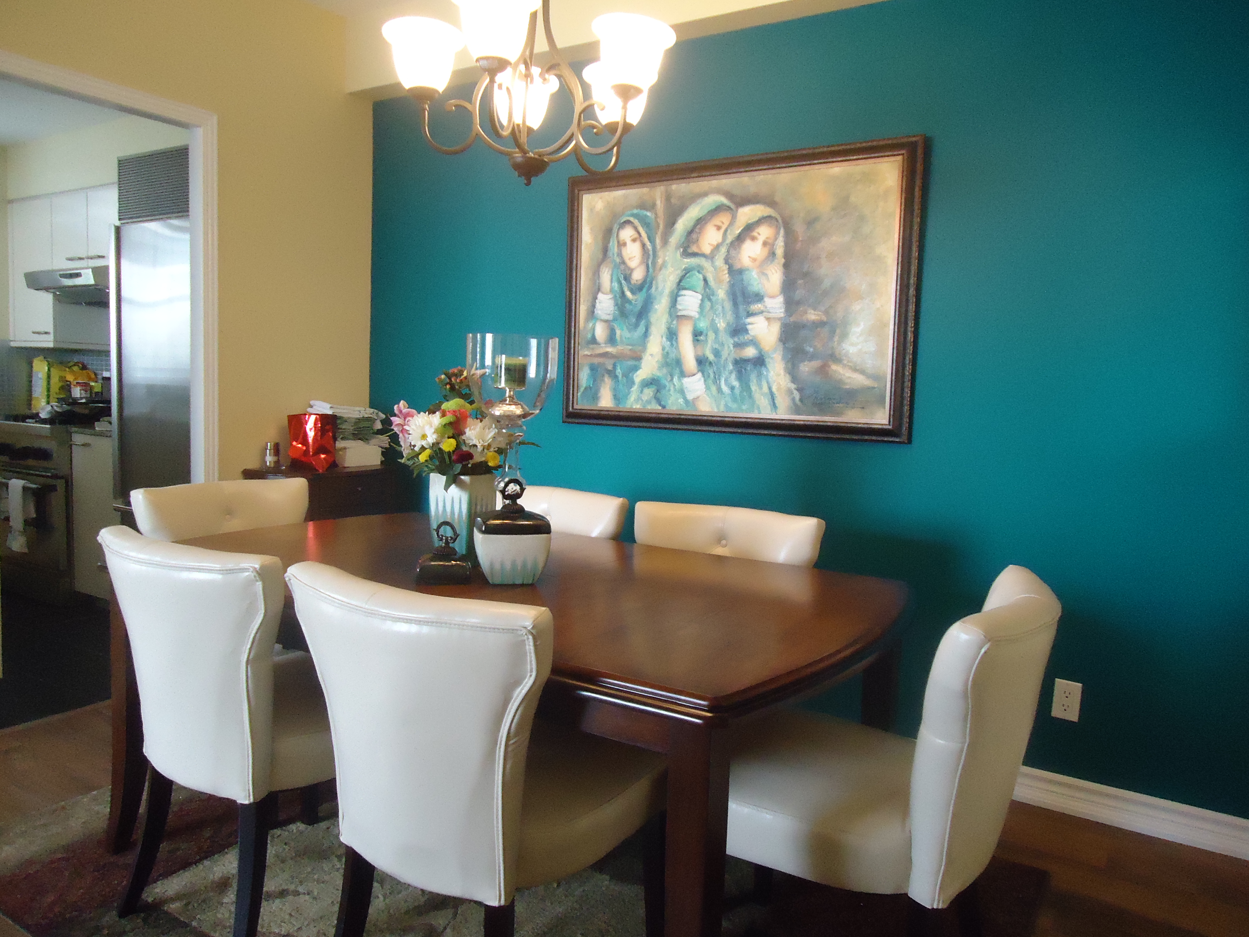
In this lakefront townhome, the pale yellow and bright teal came from the artwork they had brought with them from India.


In this upscale west end Toronto home, the colour scheme came from the beautiful granite counter tops.


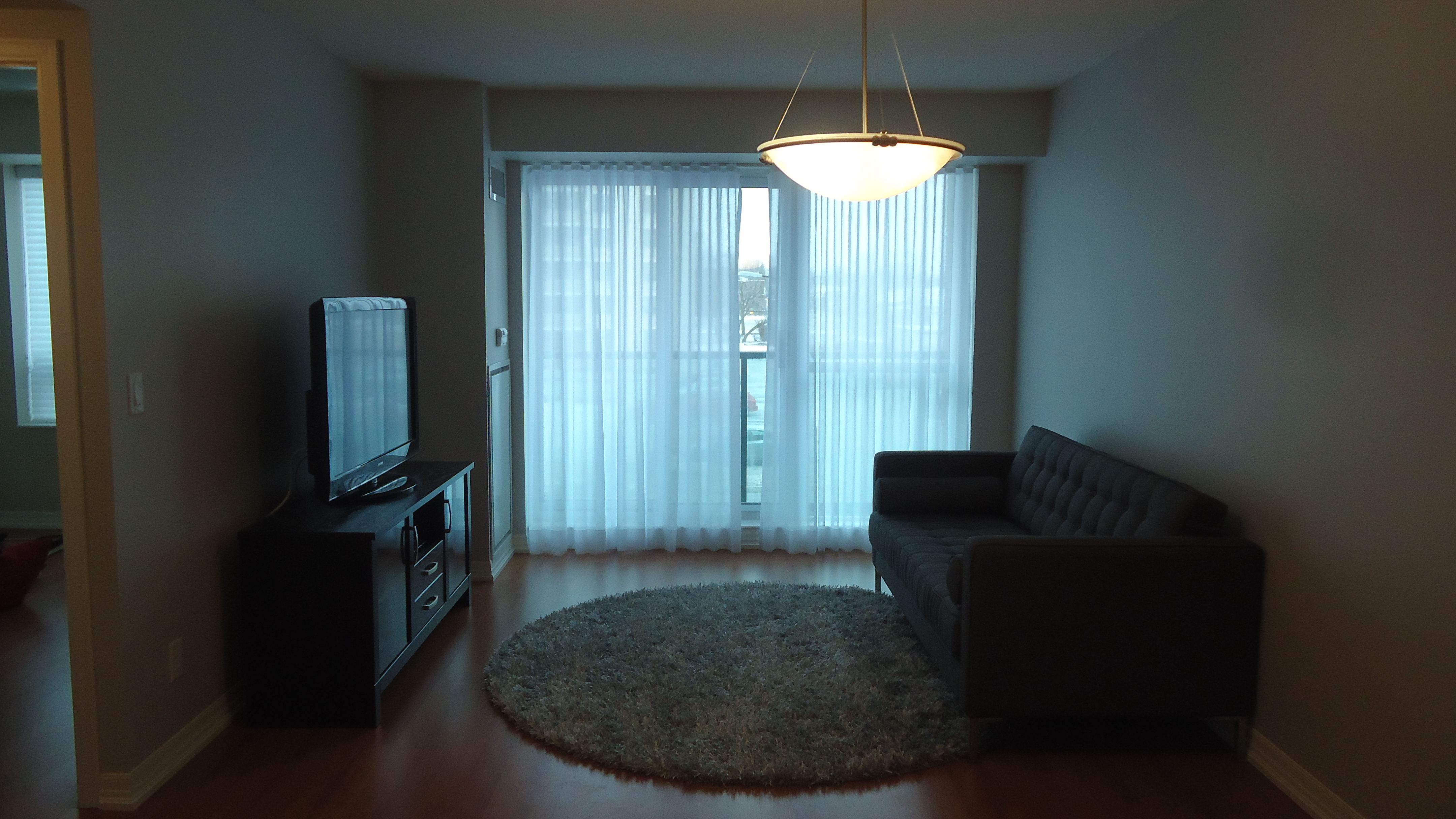
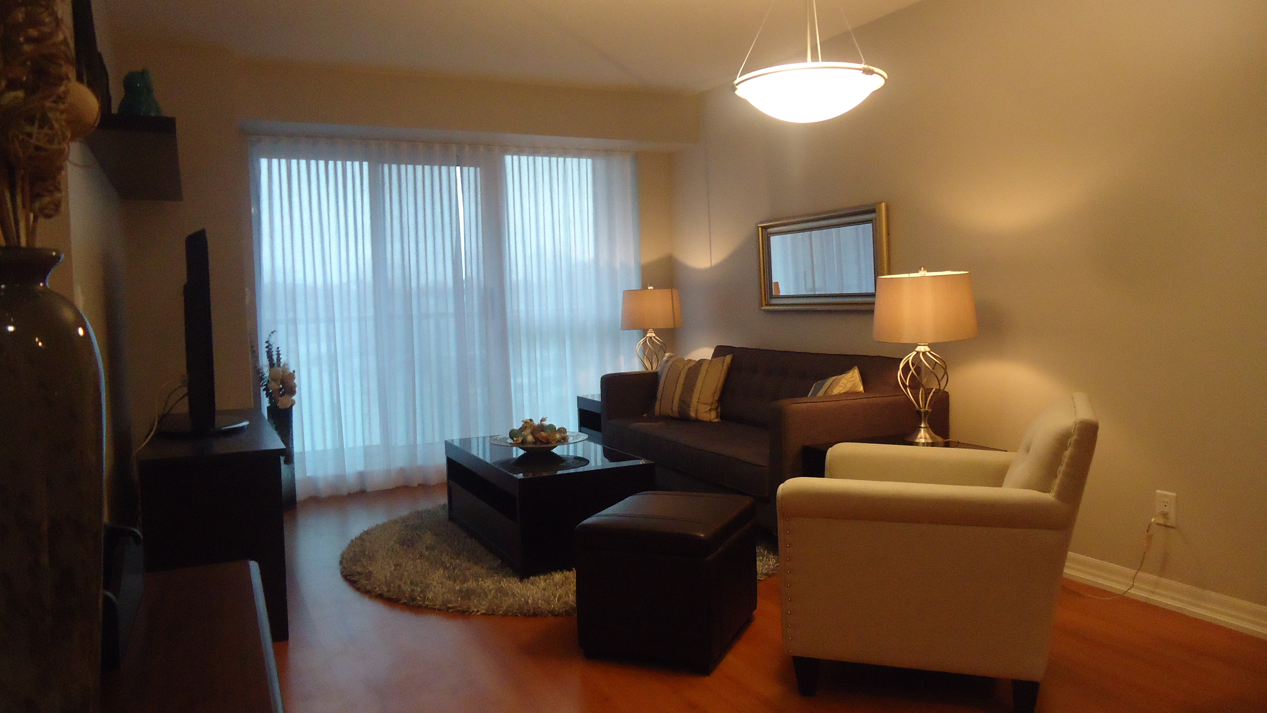
Recently I took on a new project where the client had a few furnishings but no real artwork or decor accesories that I could draw inspiration from. The only thing I had to develop a colour scheme from was her walls, which she had painted in various shades of gray and beige.


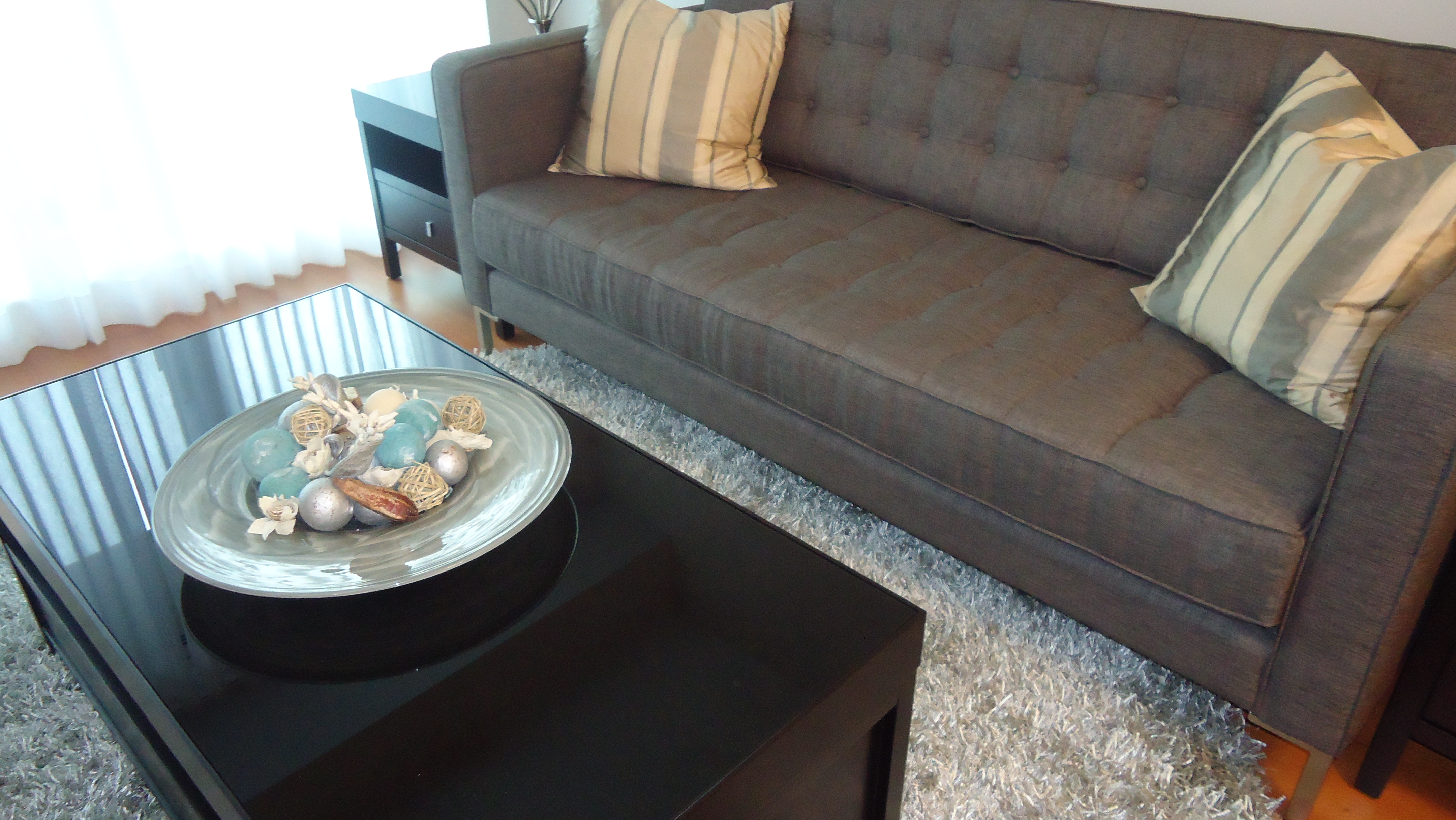
What I decided to do was use a colour scheme of golds and silvers to play on the gray and beige wall colours. I chose cushions, lamps and a mirror that brought the colours together and on the advice of my design intern, chose some decor accessories that brought in a third colour to mimic the shag rug, a soft pale blue.


We also decided to combine shapes and textures by blending silky cushions and polished china with organic flowers and pot pouri.

Here you can see how the bowl and pot pouri brings in the colour and shape of the area rug.


The flowers in the two vases add another organic element and help to relate all the colours.


The result is a home that is warm and inviting, where all the colours, shapes and textures come together to form a cohesive and relaxing look.

Posted in Colour and Paint | Leave a comment

Yet another fireplace makeover

You know, when I started this business, it never occured to me that I would end up doing so many fireplace makeovers. It was never my intention to become a “fireplace guy”, it’s just that, well, I see so many horrible, awful fireplaces….so many….

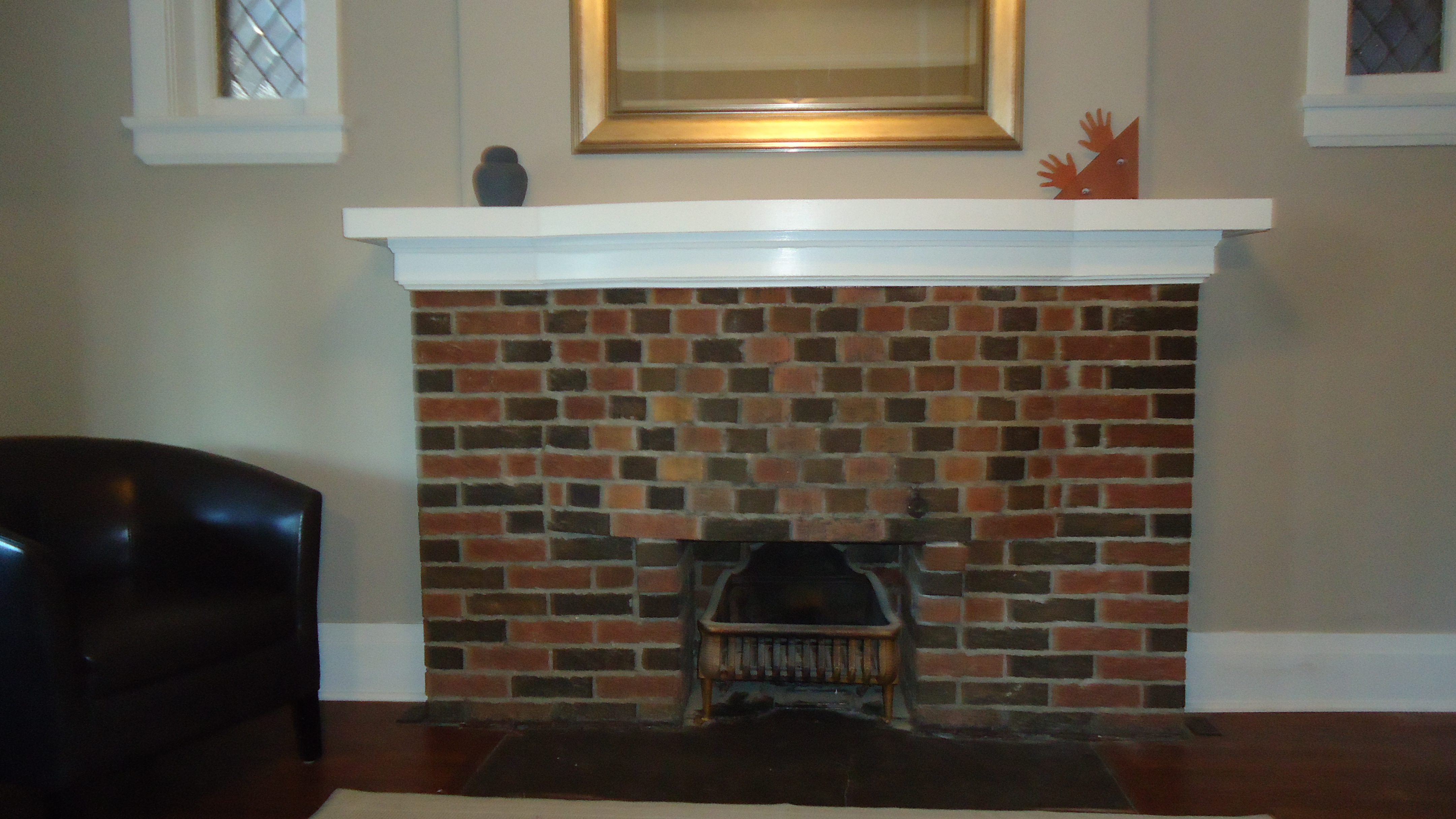
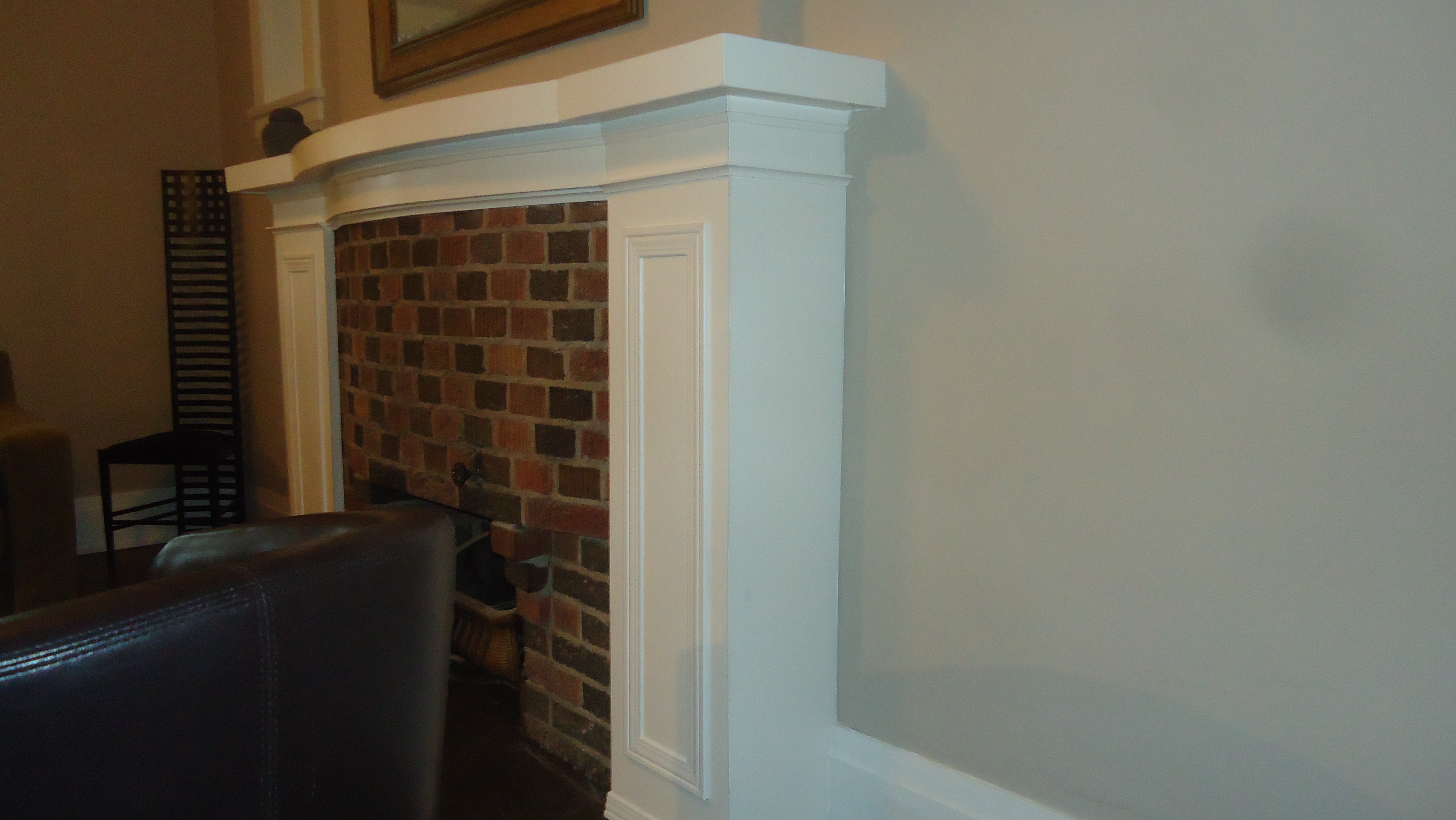
Here’s one that I suppose looked great 95 years ago when the house was built, but today, not so much. To be fair, I’m sure function was more important in those days than form. At any rate, there’s just way too much brick going on for a 2012 urban home in an upscale Toronto neighbourhood.


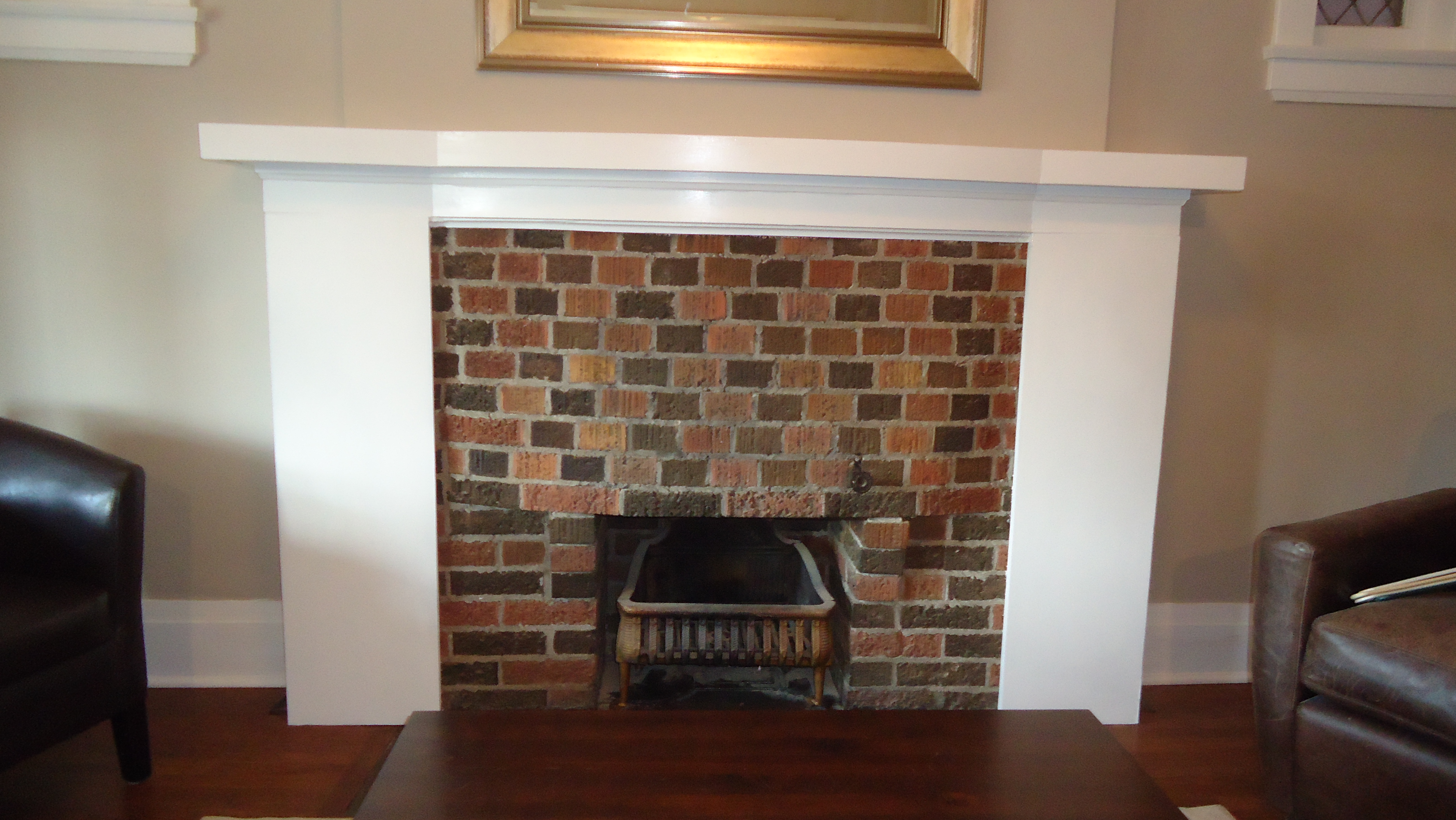
A simple solution was just to add some wood cladding to the two sides by installing some strapping onto the brick and then adding some MDF to the strapping.


Then all that was left was to add some decorative mouldings and give it a final coat of paint.


Fairly simple, relatively inexpensive, but the results are fantastic.

Updates the old brick fireplace while still retaining it’s classic charm.

Posted in Fireplace Makeovers | 1 Comment

Creating a “custom” desk unit

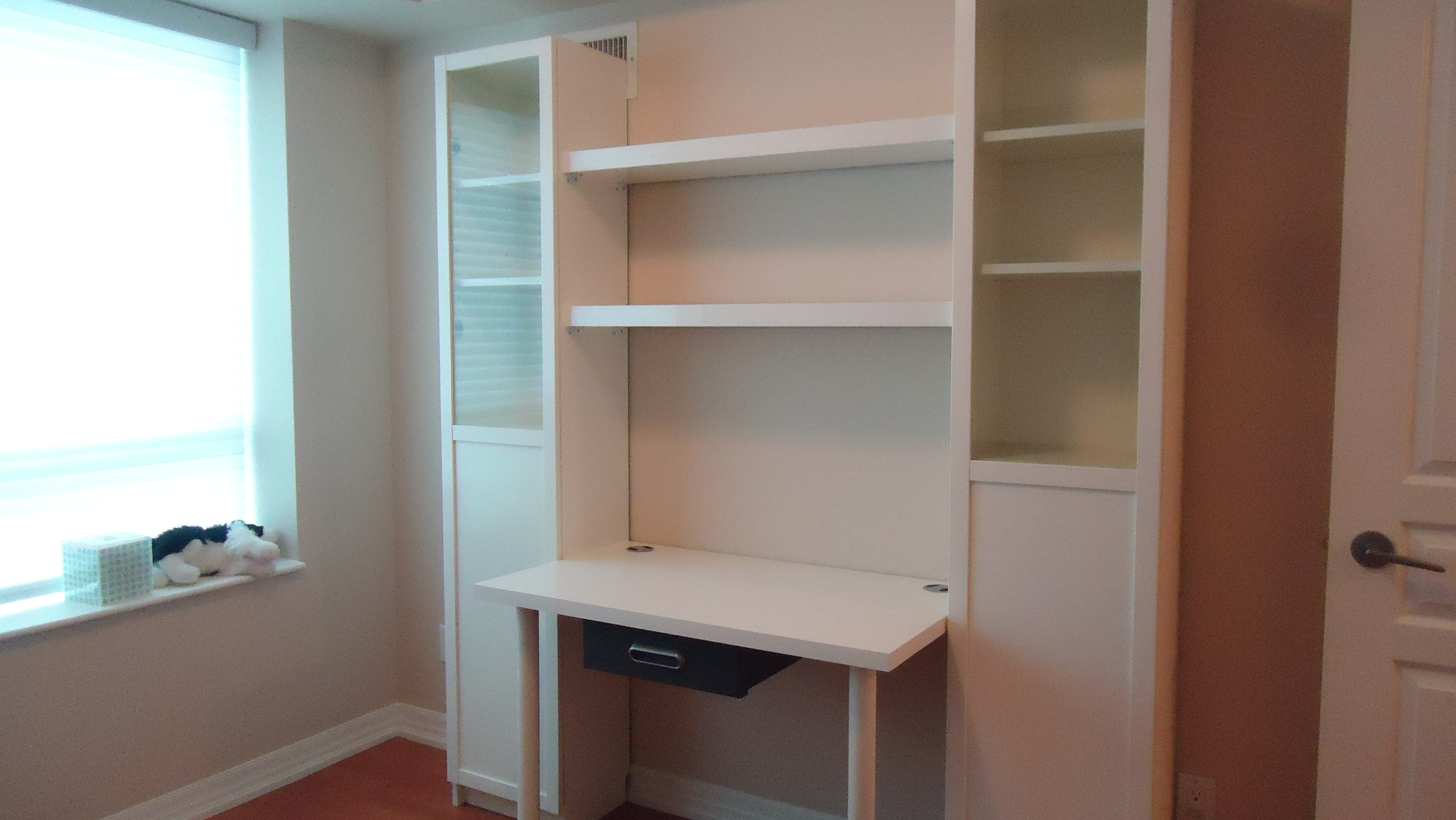
Here’s a cool way to build a “custom” Ikea desk unit.

Take 2 Billy bookcases with doors, add a Vika table top with a drawer in between , mount 2 Lack shelves between the bookcases using L-brackets (you’ll have to cut them to fit) and voila, you end up with this:


Posted in Custom Desks and Wall Units | Leave a comment

Space saving laptop desk

Space challenged? No room for a desk?

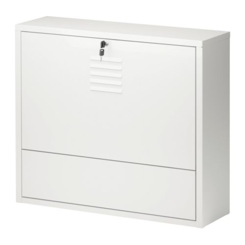
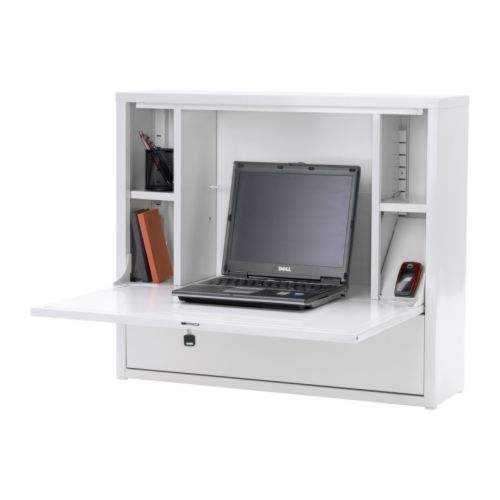
Here’s a great little wall mounted folding desk that’s perfect for a small bedroom or home office.


It’s made from powder coated steel and is available from Ikea for only $60.

If you haven’t seen this blog, you have to check out:

It’s a fantastic blog full of ideas on how you can modify and customize pieces from Ikea to make them into something they are not. It’s simply amazing what some people have done.

Posted in Space Saving Furniture | 1 Comment

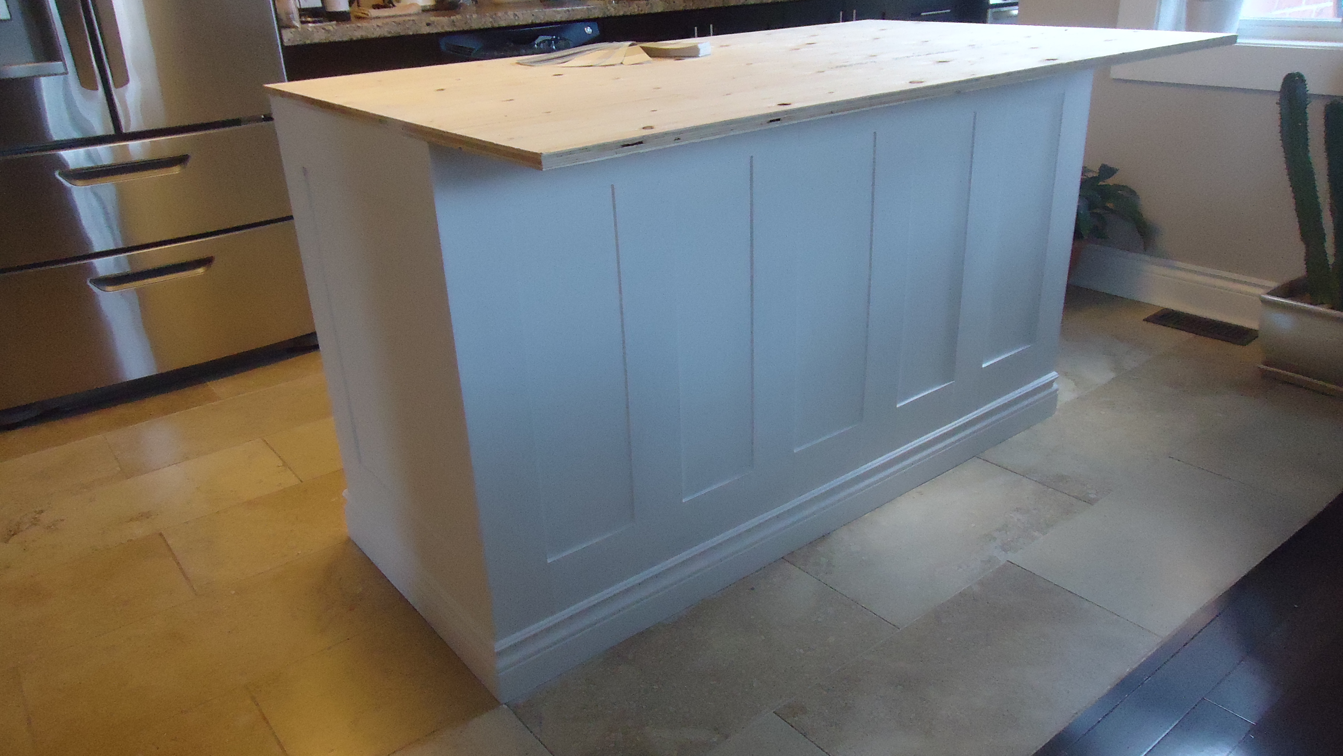
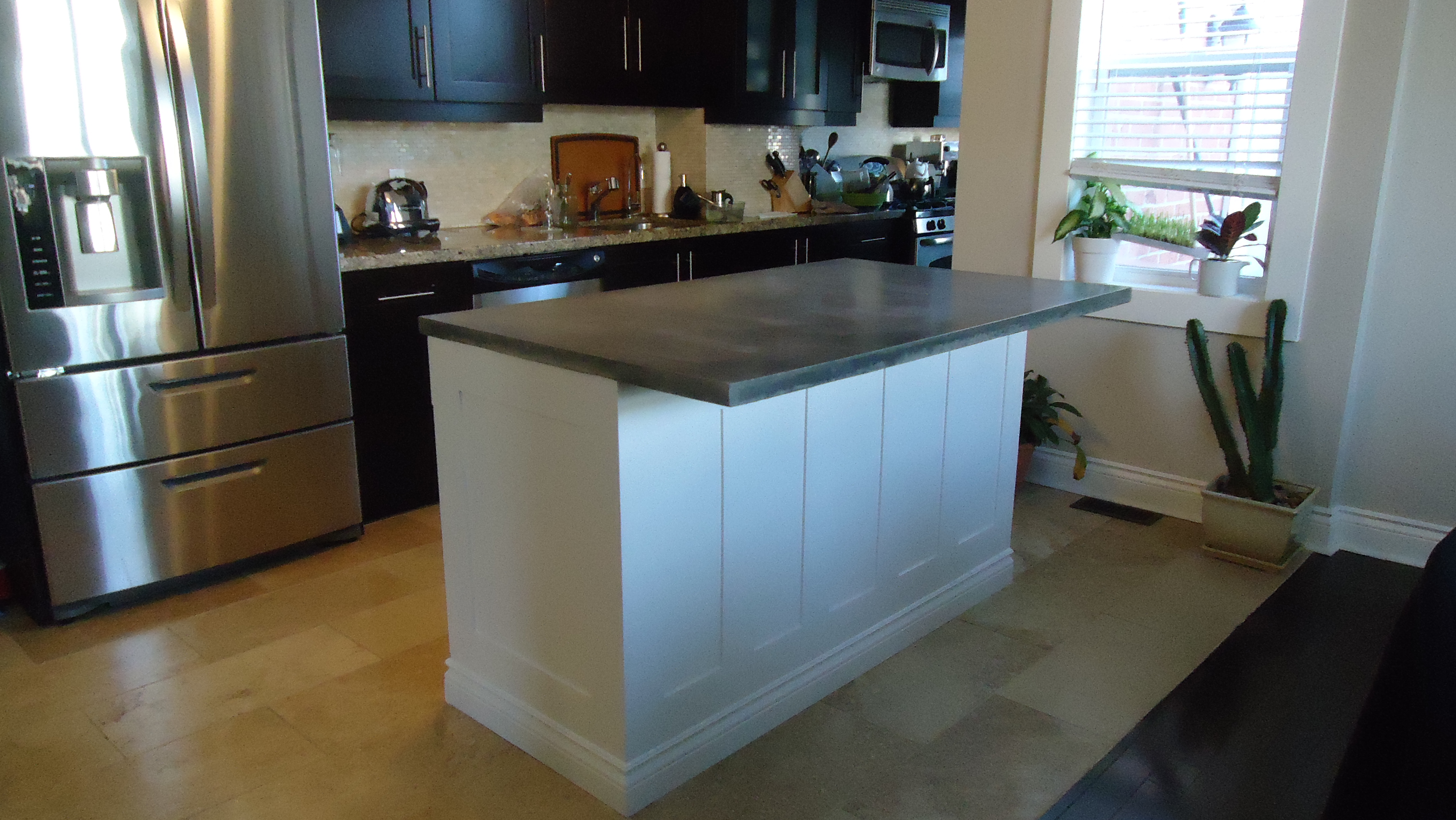
Building a kitchen island

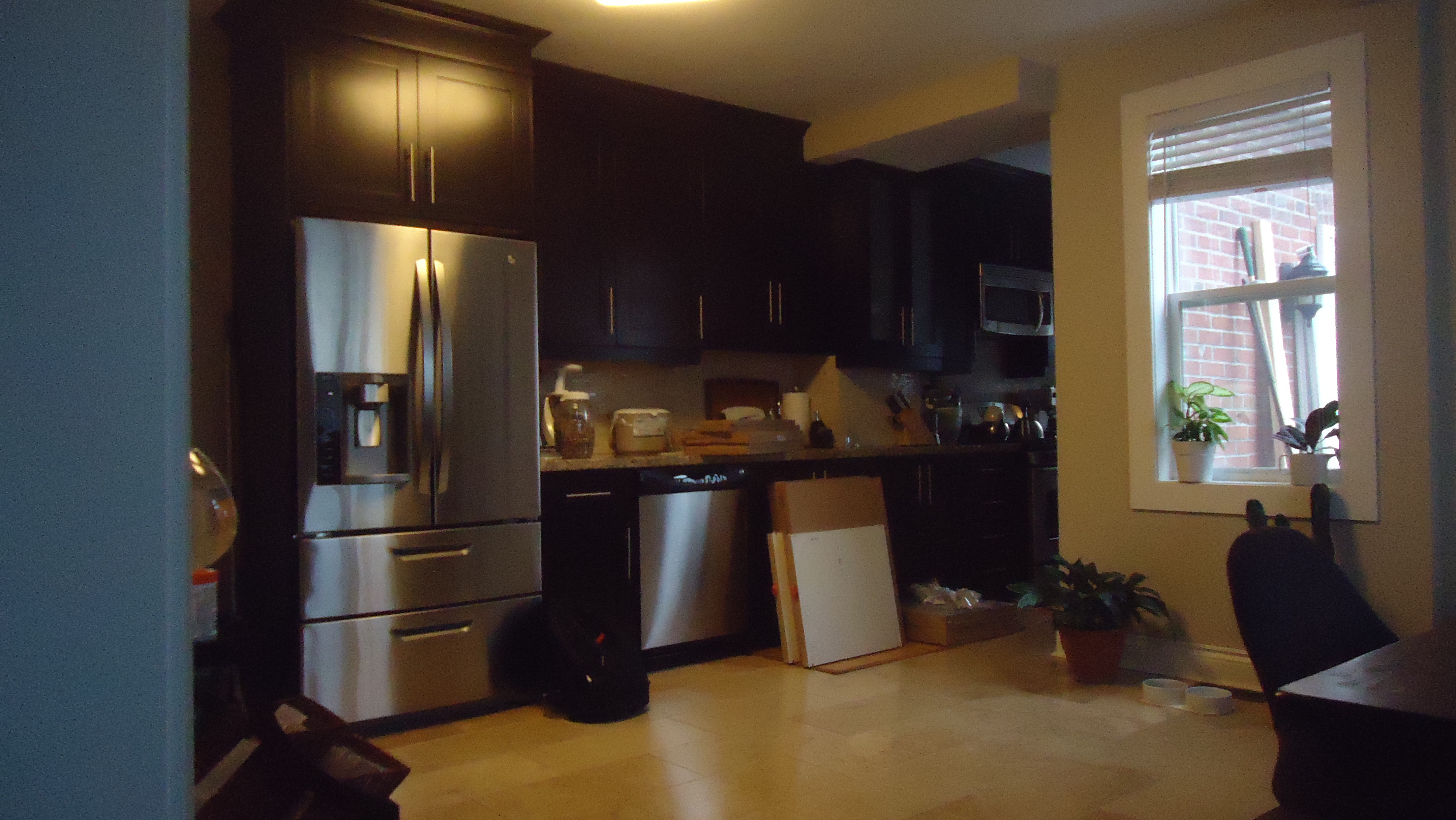
Recently I took on a project in a home that had been renovated prior to my clients moving in. The kitchen had been completely redone but had a large empty space that screamed “I need an island”.


Building an island can be as simple or as complicated as you want it to be. I opted to go the simple route.

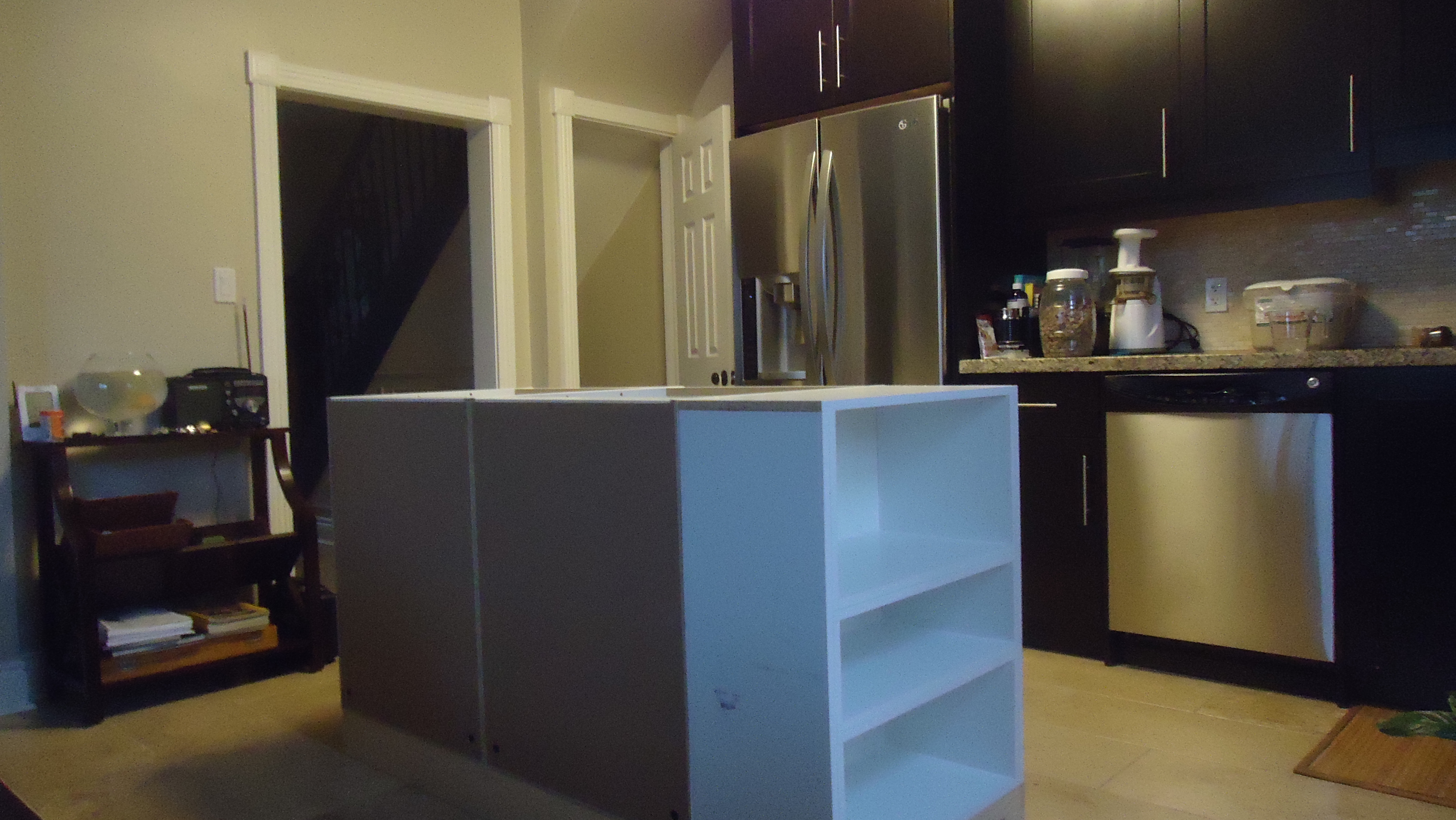
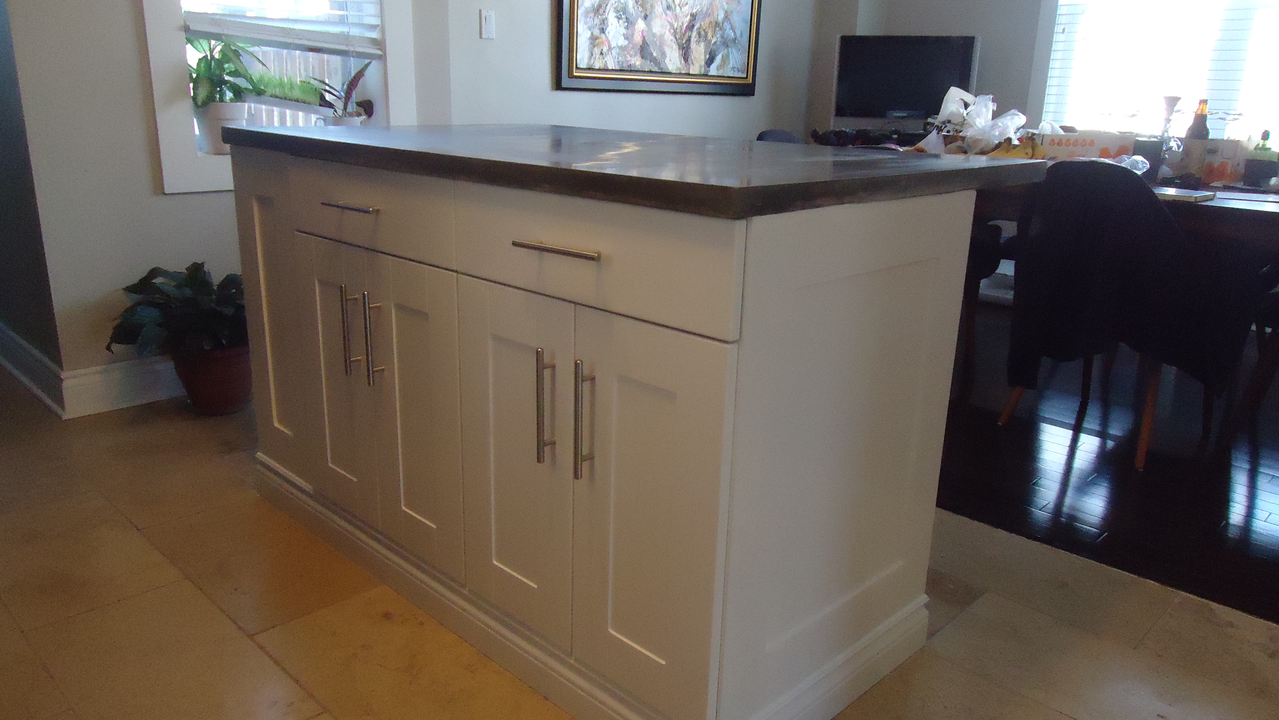
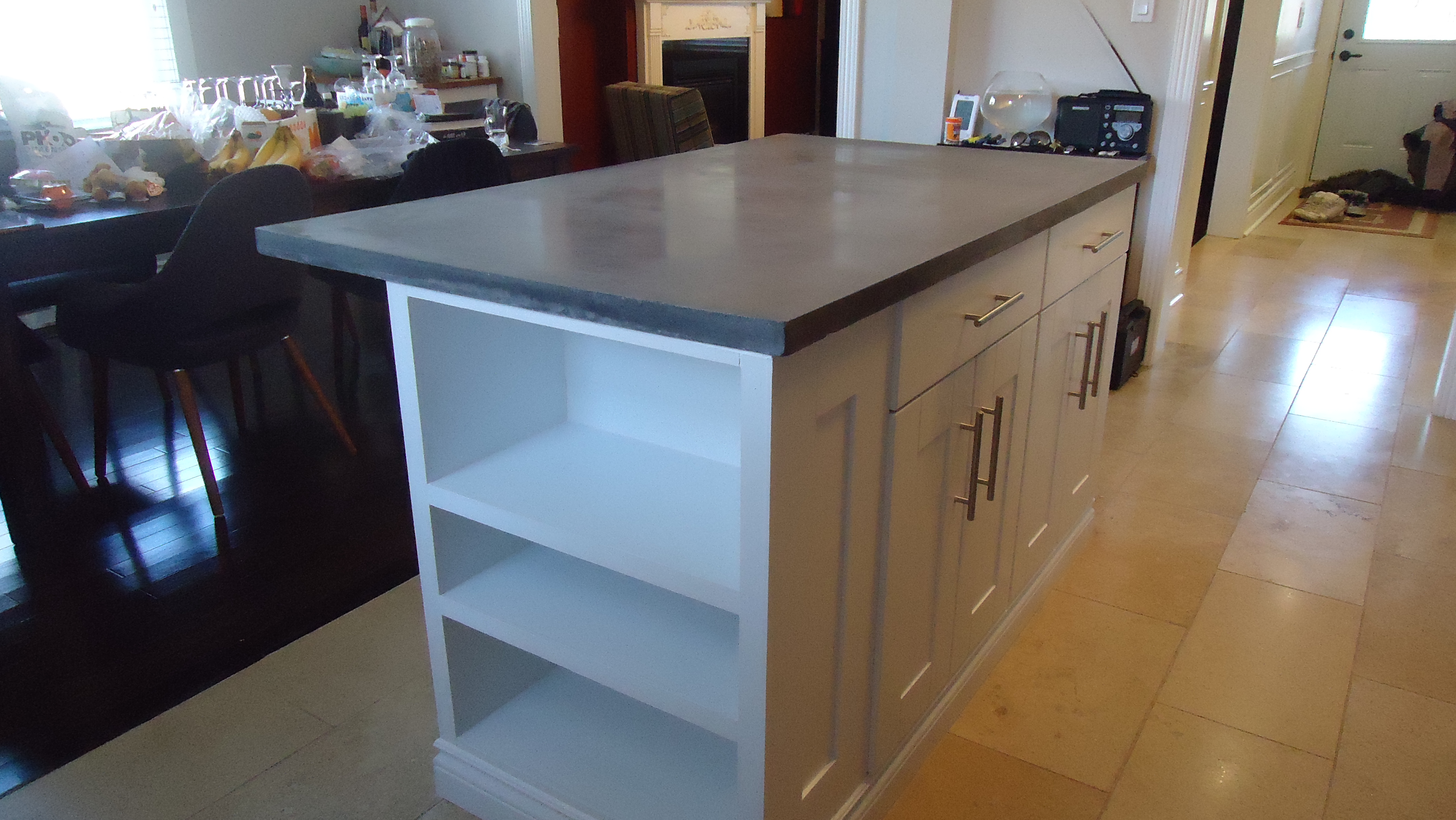
The client had specified 2 cabinets with one drawer in each and some book shelves along one end. She wanted an overhang to accomodate some stools and a look that was very simple and clean, nothing too ornate.

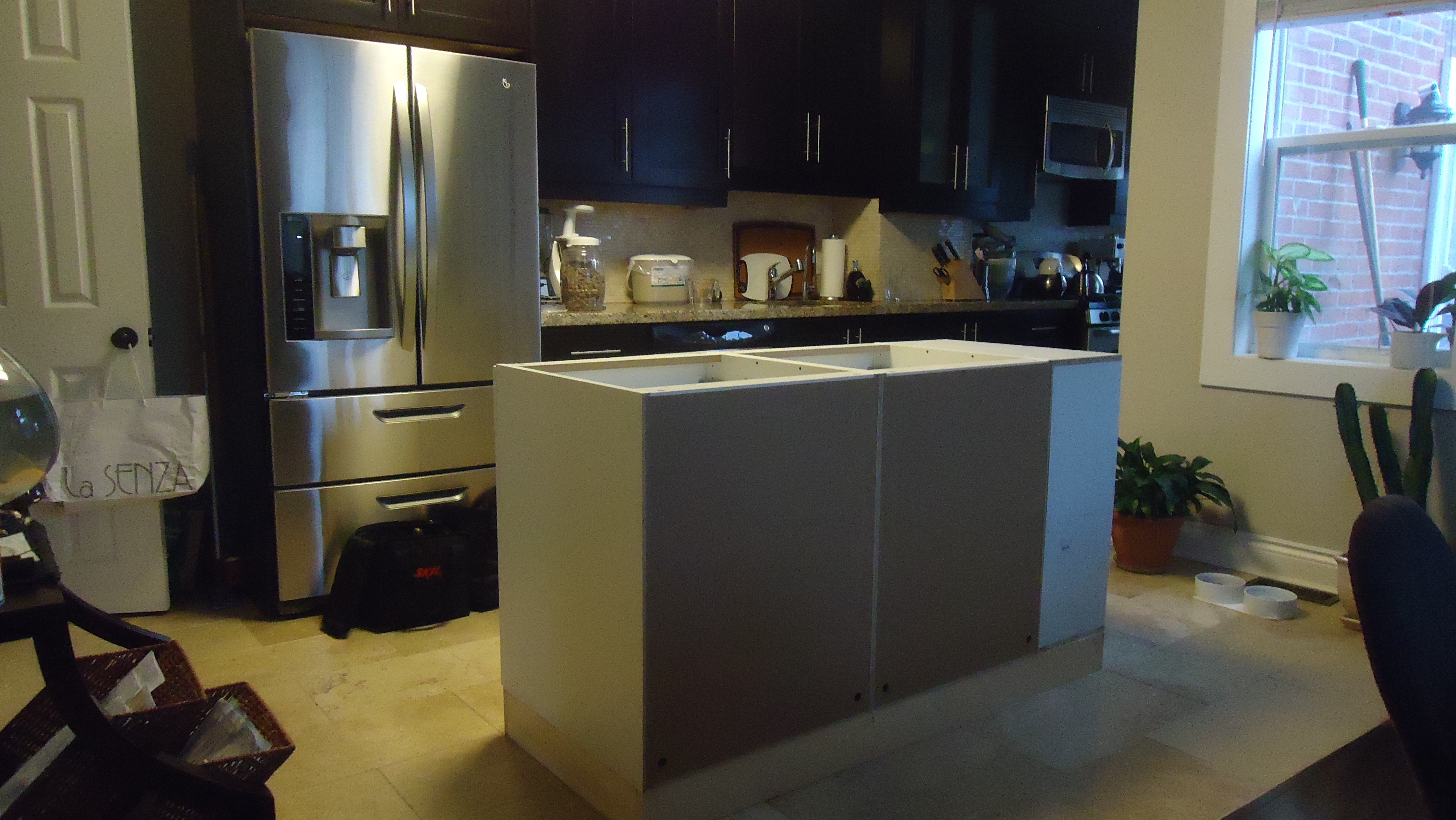
I started by building a base from 1 X 6 pine and added two stock Ikea base cabinets anchored together.  I then built the book shelves from stock Home Depot shelving.


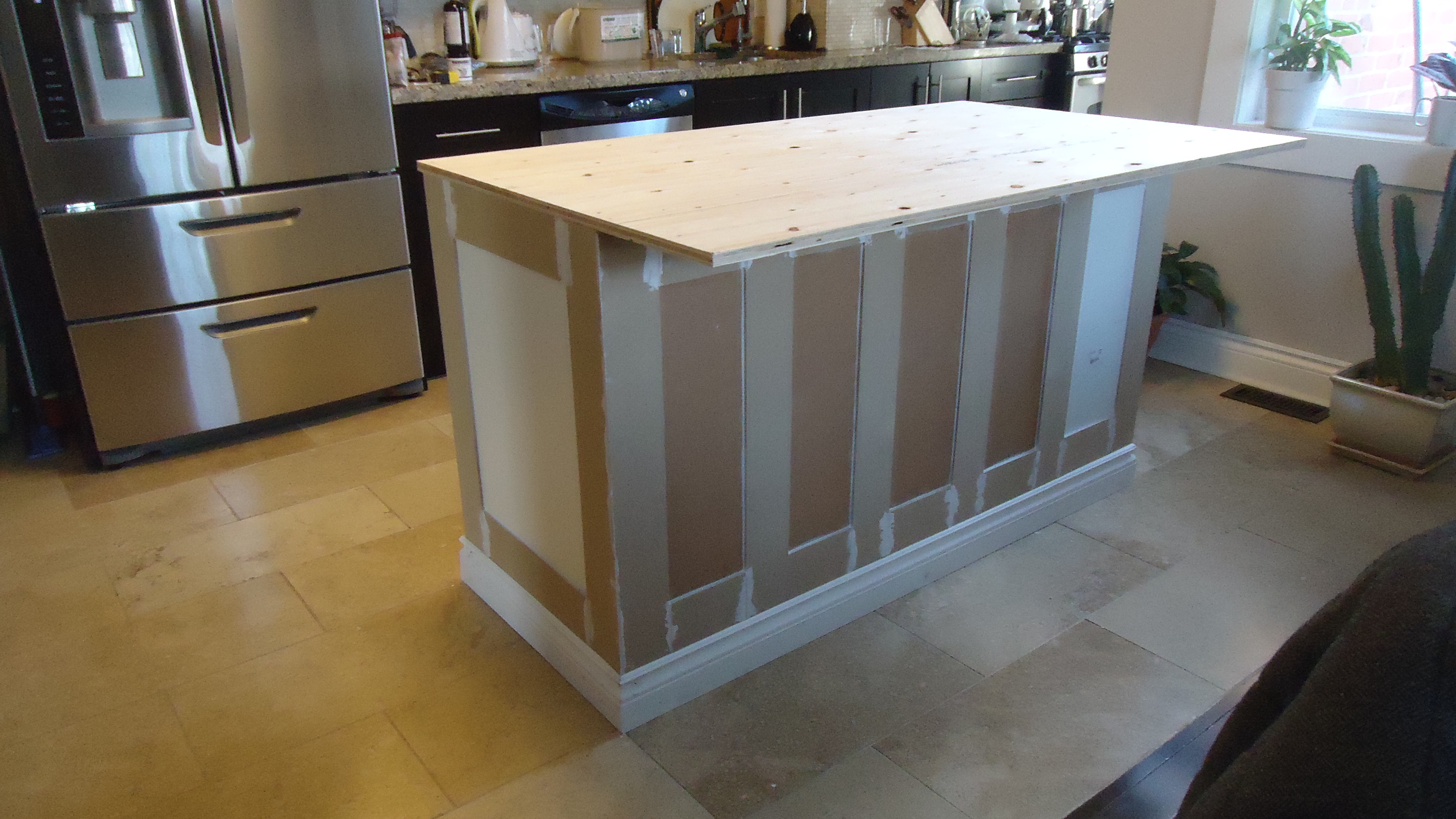
The next step was to add baseboards around the bottom, trim around the sides and a 3/4″ plywood top.


Then some brushed nickel handles and a coat of paint, Baby’s Breath, a white with a hint of gray.


The final step in this very simple project was to replace the plywood with a polished concrete countertop. Contemporary and a nice contrast to the granite counters in the rest of the kitchen.


Very simple, very clean and looks amazing!

Posted in Kitchen Makeovers | Leave a comment

Storage beds can be a life saver

I see a ton of condos and I still cannot get over how small the bedrooms are.

I looked at a two bedroom suite last week in Liberty Village (reclaimed railway lands that are being developed around King and Strachan) and the bedrooms are 9′ X 9′ and 10′ X 10′. When you consider that one wall has a window, one wall has a closet and another wall has the entry door, you have virtually no place for a dresser or an armoire.

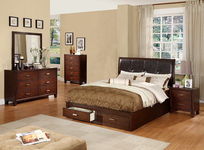
Thankfully, furniture manufacturers have responded and designed a wide range of storage beds. Some have drawers on either side, some have drawers on the end and in some cases the platform with mattress lift up with a hyraulic system revealing massive storage underneath (not great for daily use but perfect for extra bedding and items you don’t use very often).

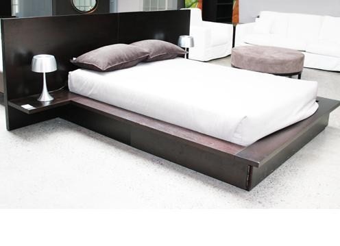
The Lexington is a fantasic bed with integrated floating nightstands and four huge drawers.


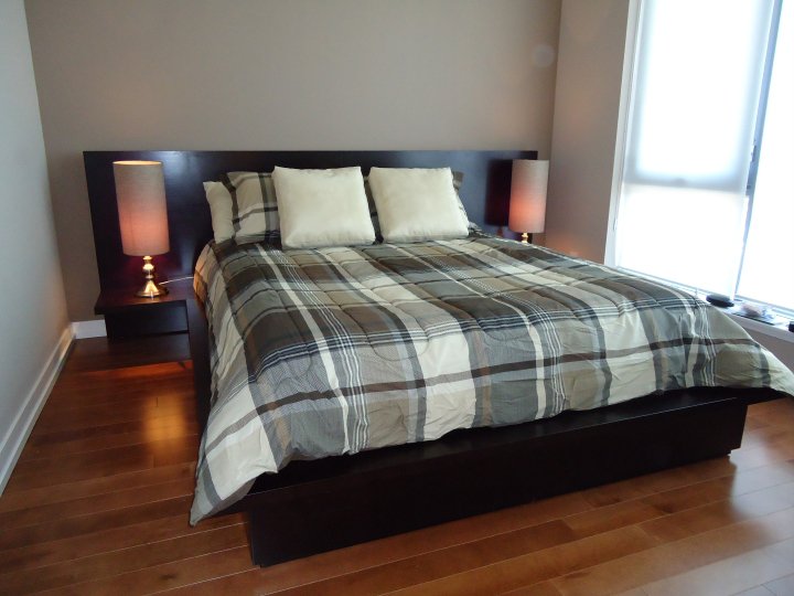
Another one that I love is the Gramercy which again has four drawers and optional floating night stands.


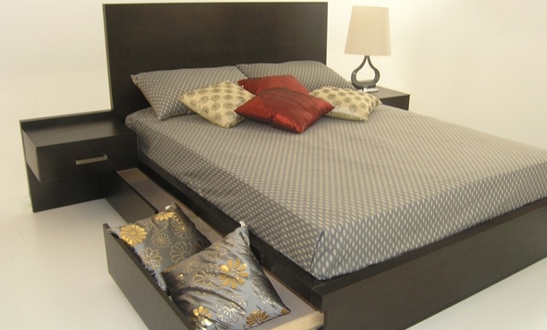
This one has two drawers at the foot of the bed for those rooms that just need a bit more storage.


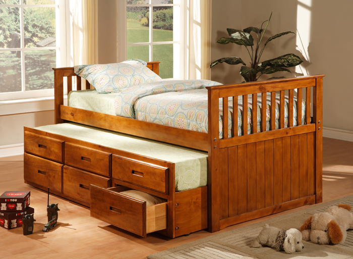
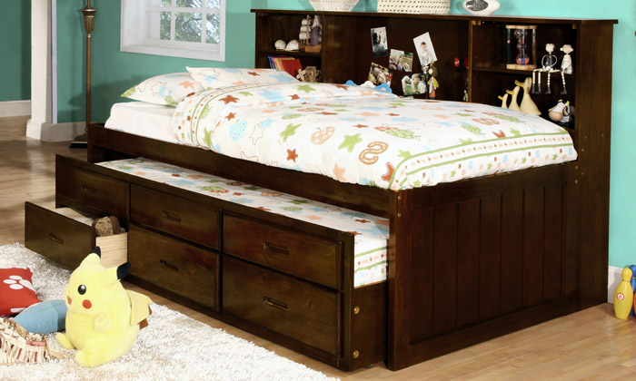
If you’re looking for storage for you child’s room and a place for the occasional sleepover, here’s a couple of options to consider:


So, if you are frustrated with your tiny bedroom, consder storage beds for a clean, uncluttered look and tons of storage.

Posted in Space Saving Furniture | Leave a comment

Creating a stunning photo gallery

I LOVE CHRISTMAS! I love everything about it. The food, the lights, the decorations.

This is the time of year when nostalgia really kicks in as we gather with family and friends to share some great food, drinks and fond memories.

Other than vacations and travel, this is also the time of year when we take the majority of our photographs to create tomorrow’s nostalgia and what better way to display our best work than with a stunning photo gallery.

A photo gallery is a great way to create art that means something to you. It’s an amazing conversation starter at gatherings and it’s something you can be proud of.

If it’s done right.

Every photo gallery is unique. That’s the best part. There are very few rules. For the most part, you can let your imagination go wild and have fun with it. Don’t over analyze it. Be creative. Be unique. Be yourself.

It’s your wall and it’s your life you’re showcasing.

Let me show you a few that I’ve done and give you some tips and pointers.

You may have seen some of these before in a previous post in a different context, like this gallery I did for a client recently to showcase the photos they had taken over the years in their travels around the world. I selected 10 photos from their collection and had them printed in black and white 8 X 10 and then matted and framed.


For photo galleries start by finding the horizontal centre of the wall, then measure up 60″ from the floor. This point will be the centre of the gallery. Use masking tape to mark your measurements so you don’t make a mess of the wall and have to do paint touch ups.

Here’s another gallery of client photos done a little differently. Still black and white, but this time I used different sized and shaped frames. Note also, the frames on the next wall on the photo ledge.

Don’t count out photo ledges as a great way to display photos. You can use different sized frames and overlap a couple for visual interest.


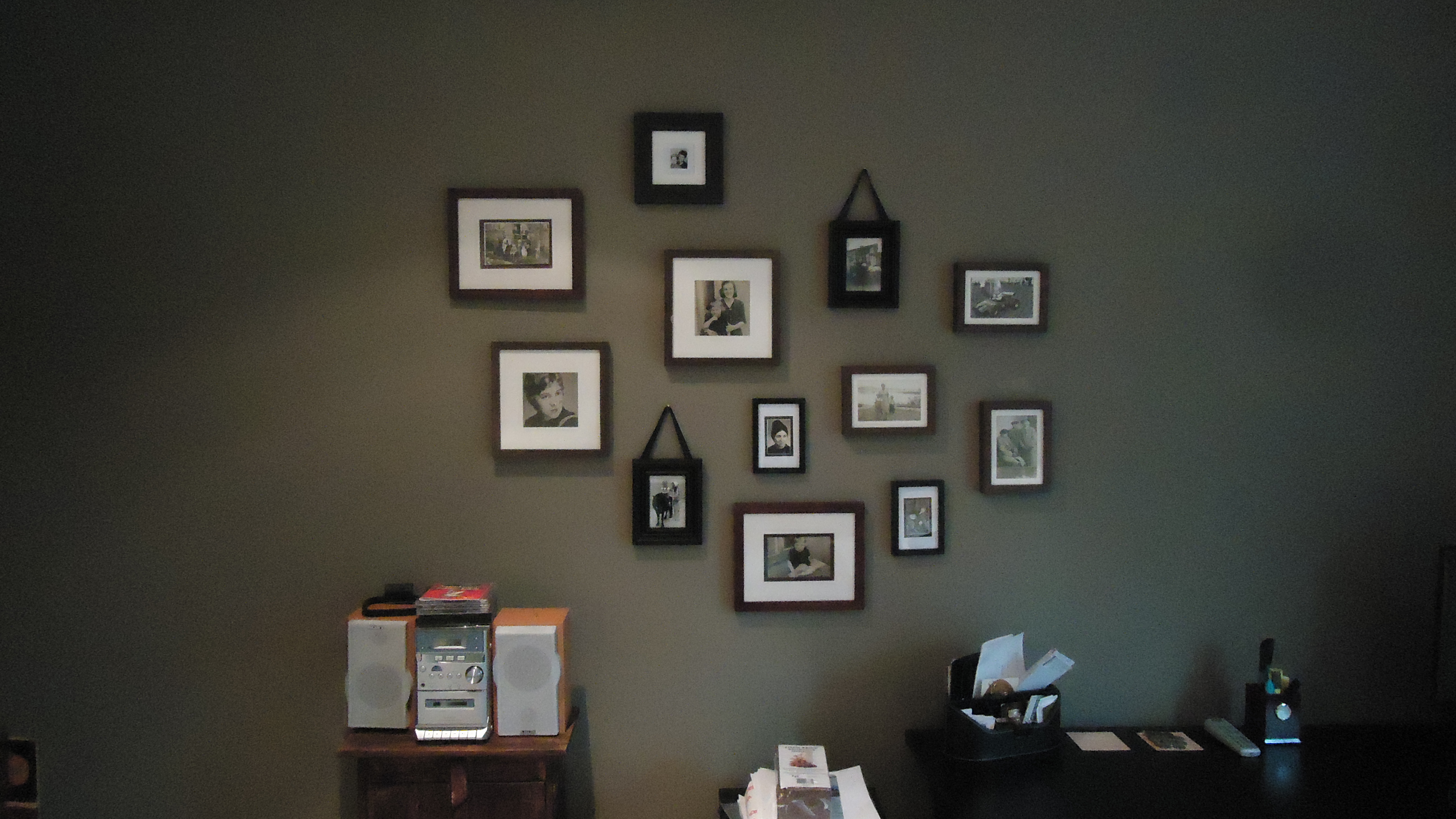
Here’s one where I used an assortment of different frames, different shapes, styles and sizes. Add a couple of frames hung from ribbon to make it interesting. Don’t be afraid to use a random selection of frames.


Here’s a similar one.


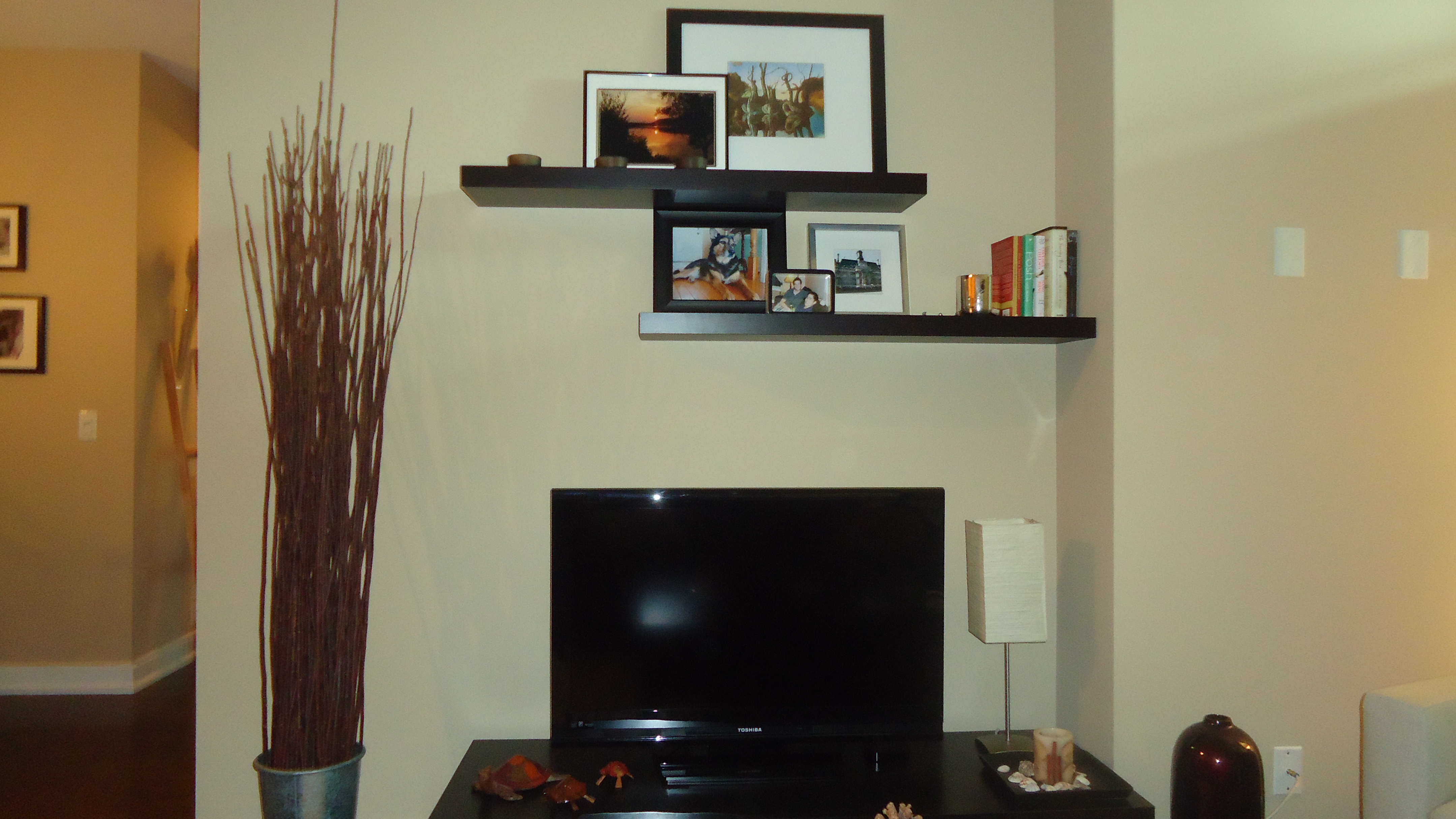
Another idea for you is to combine photos with art, books and decorative pieces on a shelf or shelves.


Hopefully these photos have given you some ideas and inspiration for creating your own photo gallery of memories that have special meaning in your life.


Posted in Art and Mirrors | Leave a comment

Area Rugs – artwork for your floor

In a previous post, Decorating Rules of Thumb, I wrote a bit about area rugs to the extent that most people have rugs that are either too large or too small for the room and gave some things to consider when choosing the size of a rug.

Some decorating Rules of Thumb

Today I’d like you to think of an area rug as artwork for your floor.

I often use rugs that I like to think of as “funky”, meaning that as opposed to going with a neutral, solid coloured rug, I’ll often choose one that has a pattern and brings in all the colours from my colour scheme, bringing all the different room colours together in one place.

In this photo, you’ll notice the arcs repeated in the rug, table legs, and chair backs. Repetition is a great way to unify a space.


Here I used a rug that brought in the two main wall colours (beige and brown for lack of more colourful names) and the silver in the accent cushions.


This isn’t a great photo of the rug but you can see the main cream colour and the brown and blue accent colours as well as a rust colour. The brown is in the furniture and floor, the blue is the bedroom colour and the rust is in the dining table accessories. Again, bring in all the colours and bring a bit of the bedroom out into the living room.


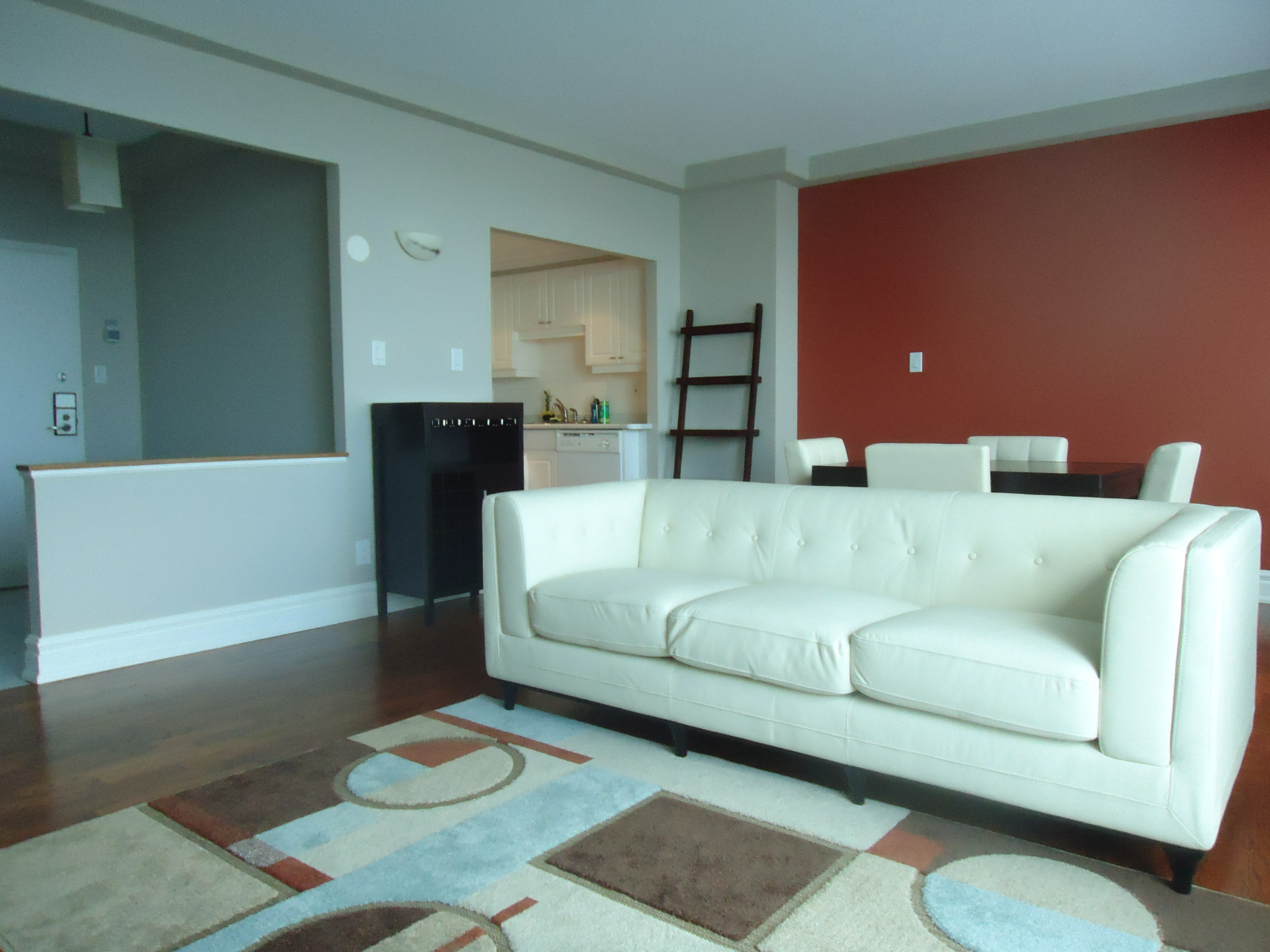
Here I used the same rug and brought the colour of the accent wall in the dining room and the bedroom into the rug.


These are just a few examples of where I’ve chosen rugs that bring all the colours of the home together in one place and provide a floor covering that is visually interesting.

Something to think about the next time you’re looking for an area rug for your home.


Posted in Art and Mirrors | Leave a comment