All Decked Out and Ready For Summer

Recently I took some time away from my design business to help a relative build a deck. The project was a bit of a challenge and the results are fantastic, so I thought I would share the pocess with you.

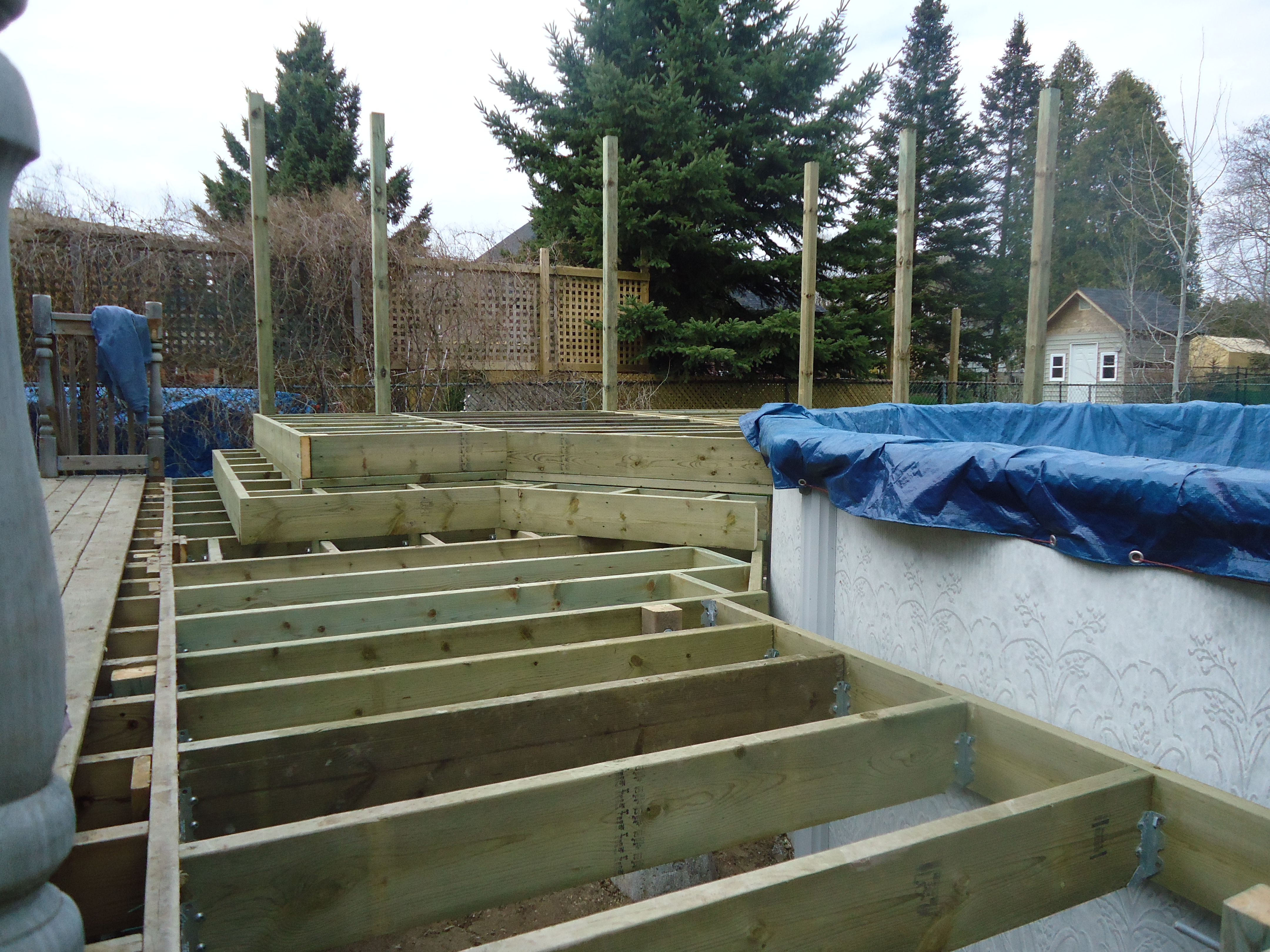
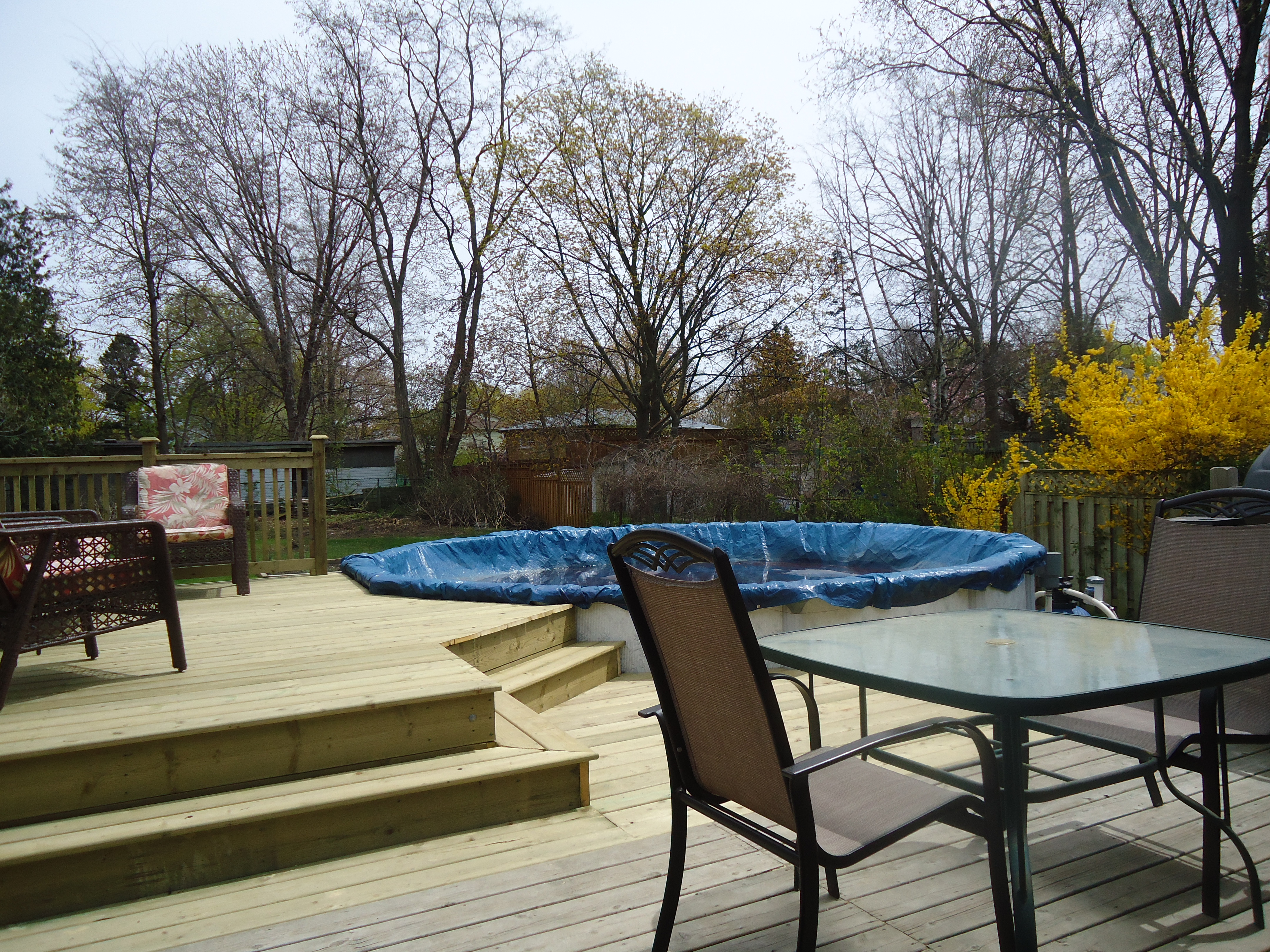
There was an existing deck on the back of the house that the homeowner wanted to addon to. It was fairly small and they wanted to add a deck around part of the above ground pool they had installed last summer. Our plan was to extend the existing deck out to the pool then add a step up to a higher level which would rest just under the top edge of the pool (leaving an allowance for seasonal shifting).
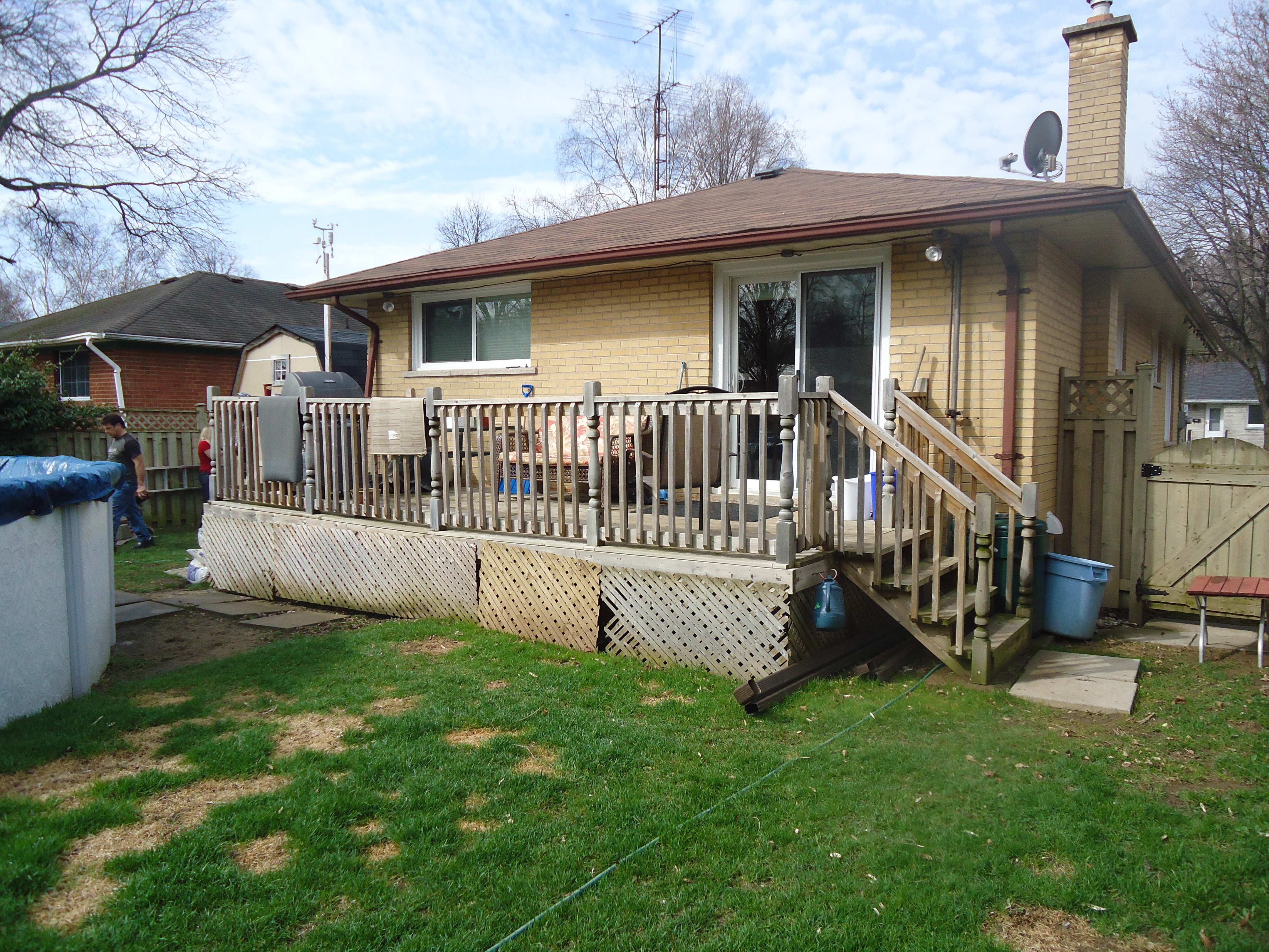
The deck was about 5 years old and had held up fairly well although upon closer examination we discovered that the deck had sunk about 2 inches in the middle. This would need to be addressed before the new deck could be added.

Our first step was to remove the existing railing, jack up the deck and add three new support posts to ensure strength and stability for the new addition.

Next we began setting our support posts and adding stringers to the existing deck. We dug holes 18 inches deep, filled them with limestone, then set the posts on deck blocks resting on the limestone. The next step was about a zillion stringers (joists).

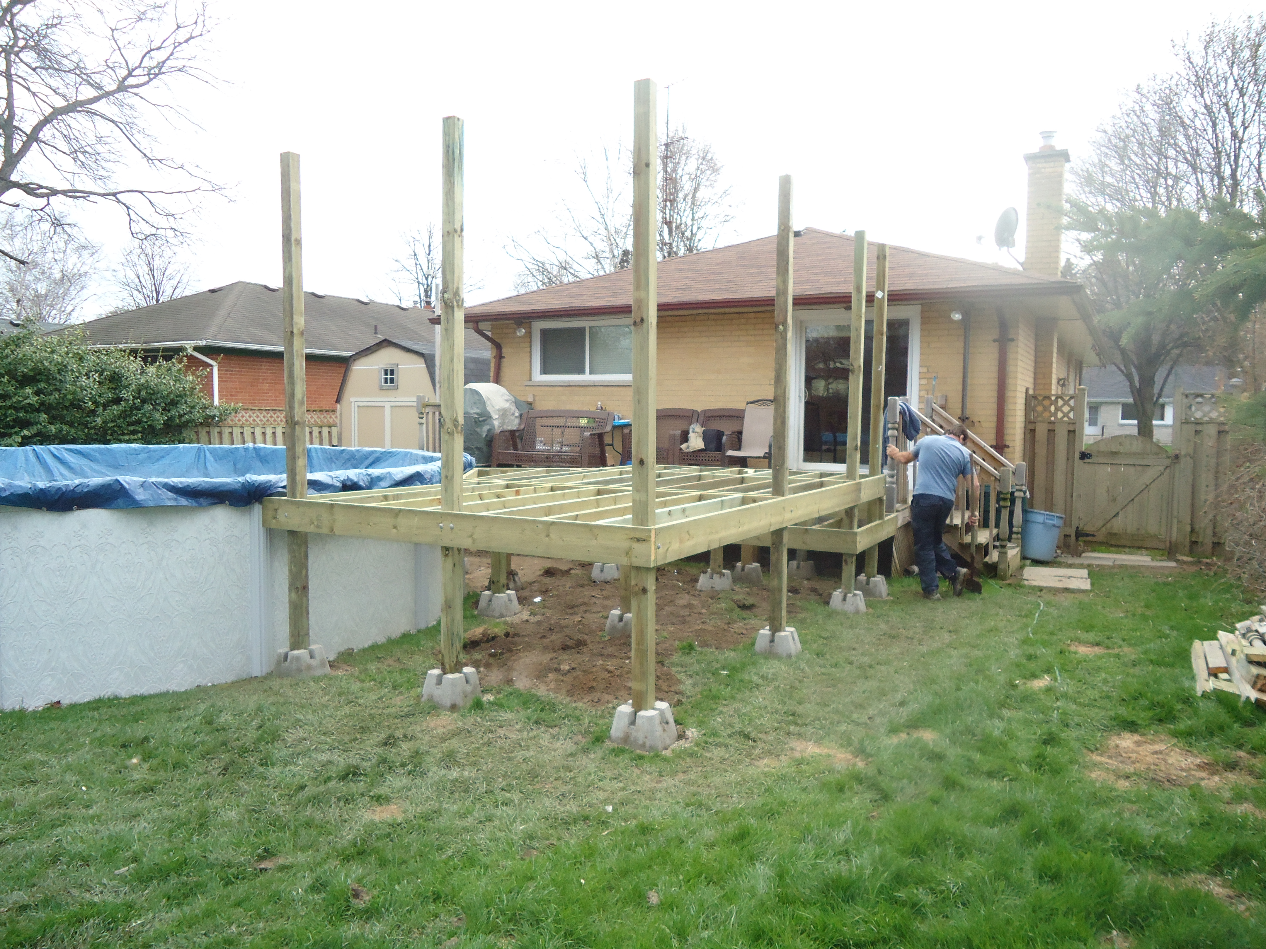
With the steps all boxed in we were ready for deck boards complete with about 100 zillion screws. This was kind of a round peg square hole deal as we had to fit square deck boards around a round pool. A few tricky cuts with a jigsaw and voila………
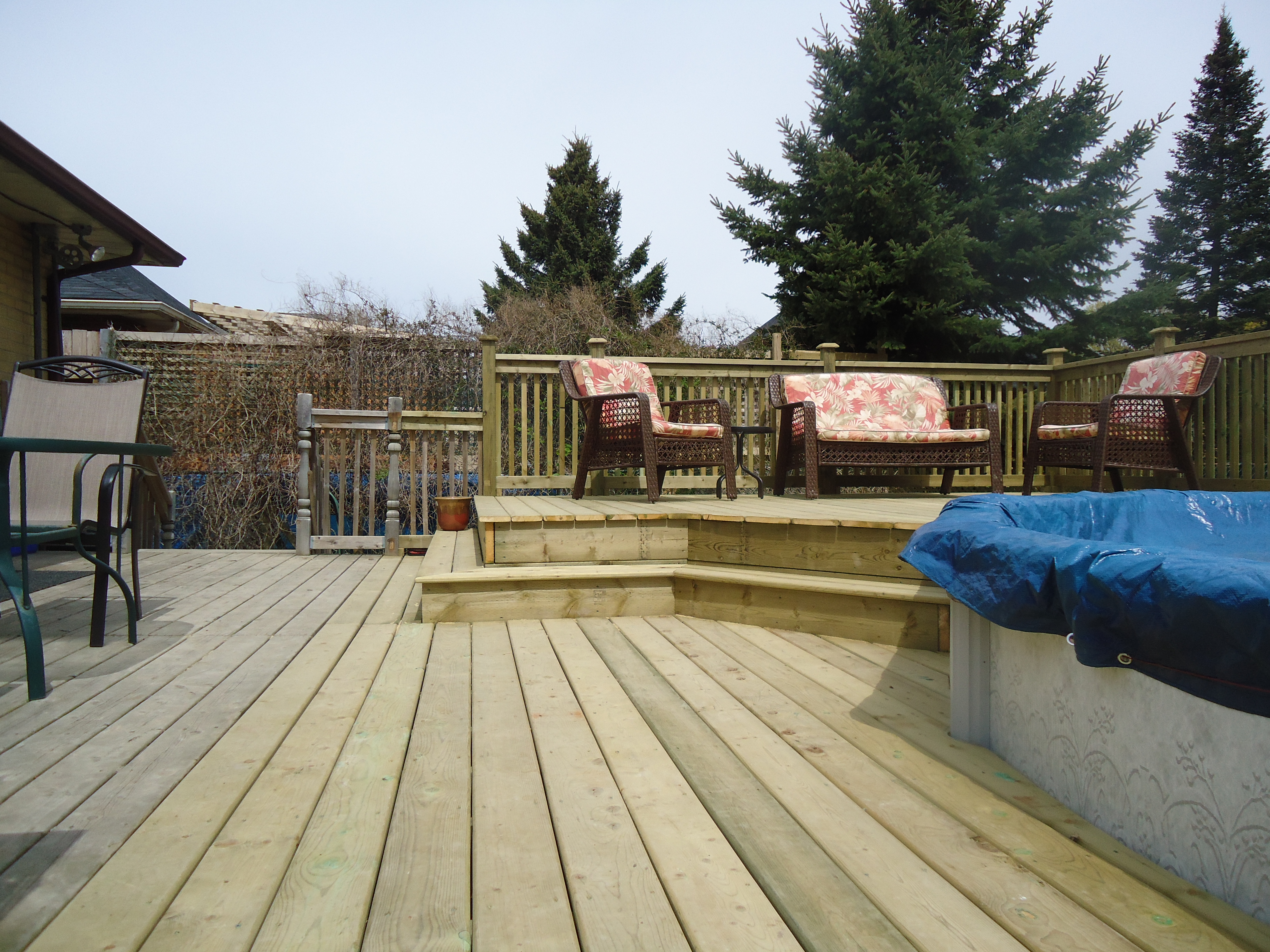
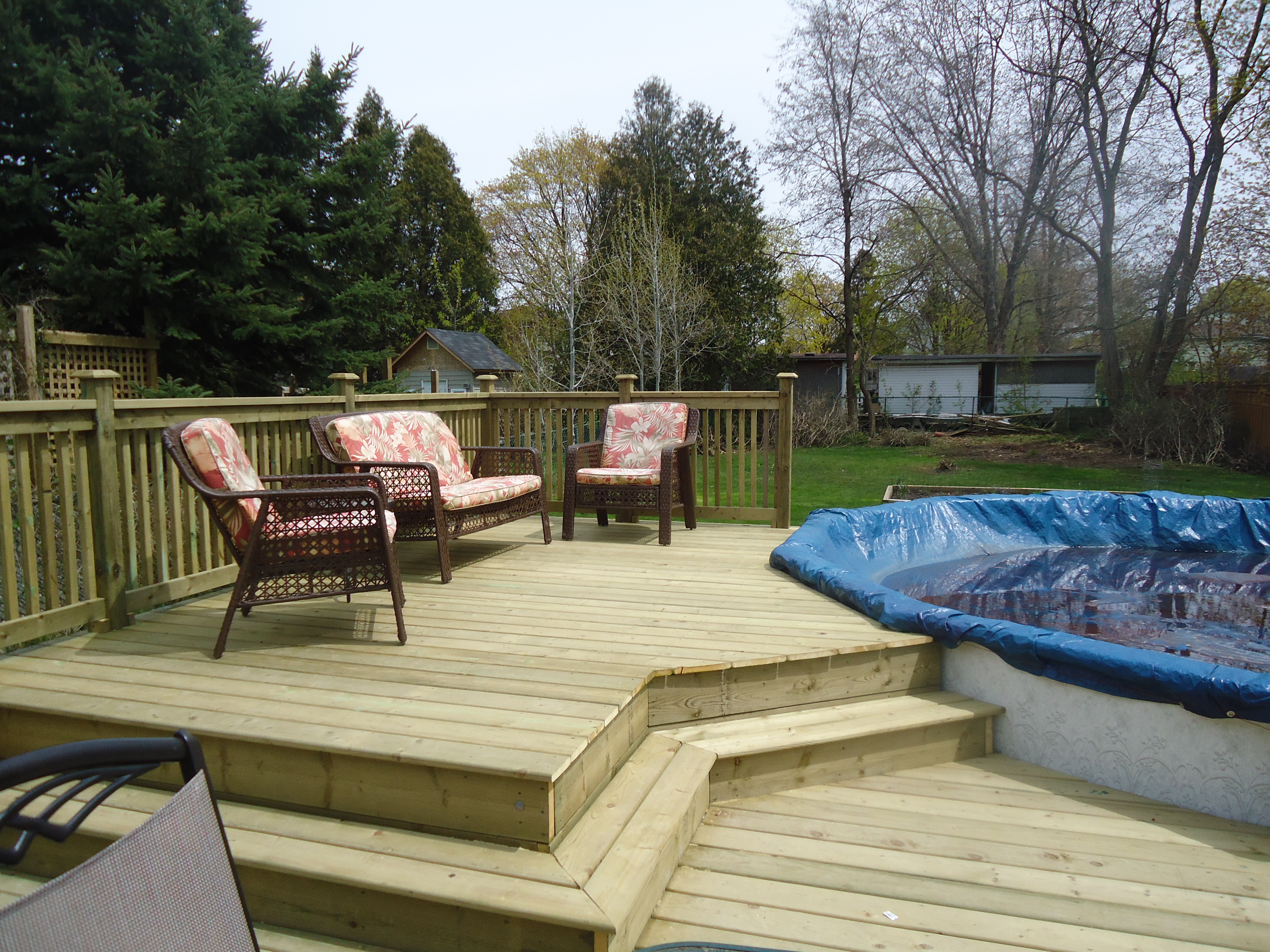
When it comes to furnishing a large deck, the principles are the same as when furnishing a large room; separate the area into zones. In this case we set up the upper deck as the relaxing/seating zone and the lower deck as the cooking/eating zone. This approach ensures the best use of space.

So there you have it, a deck all ready for summer BBQs and pool parties for years to come.
Posted in Uncategorized | Leave a comment

Everything old is new again

If you give anything enough time, it will come back in style. This has always been and always will be the case.

Maybe it’s just nostalgia that causes it. As people get older, they long for the things of their past. Or maybe it’s motivated by profit…new generations bring new customers. Whatever the reason, everything old is new again.

This is certainly true with one of today’s decorating trends, wallpaper.

Lately, I’ve had a lot of requests for wallpaper. Not an entire room, or thankfully, an entire house, but simply as an accent wall.

If you think about it, it makes a lot of sense and can add so much to a room.

Think of a single wall, papered in an amazing print with a fabulous texture, as nothing more than a huge piece of art. It creates a fantastic focal point for any room, adds visual interest and can add some drama to an otherwise dull and boring room. It’s a great alternative to simply painting a wall a different colour.

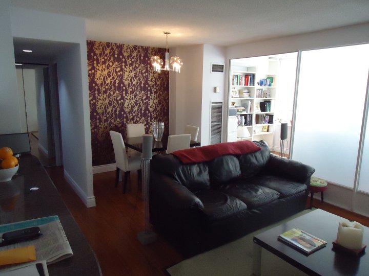
Here’s a dining room wall papered in a bold contemporary “forest” of gold on a deep purple background. So dramatic and so beautiful.


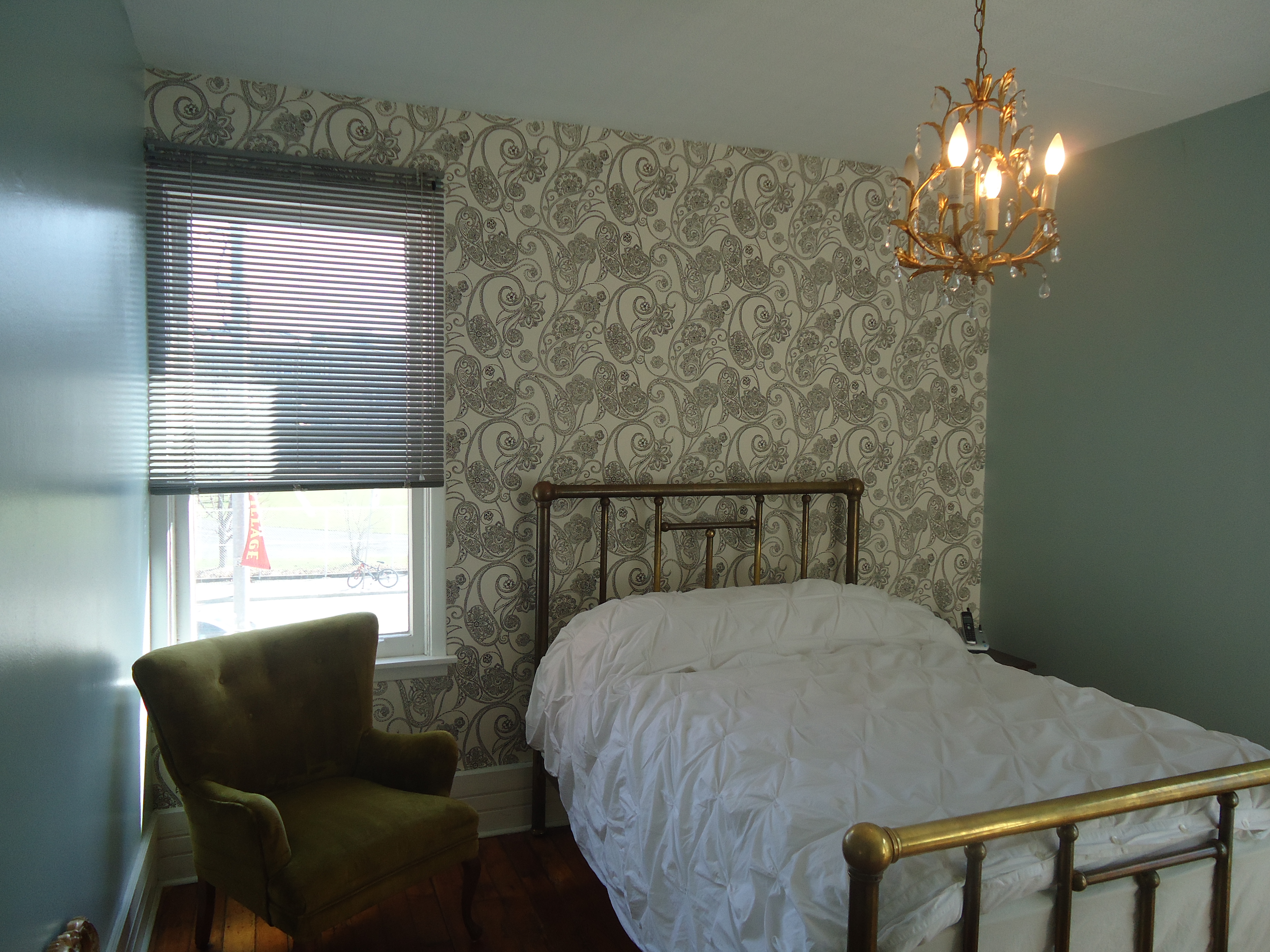
Here’s a bedroom wall I just did in a traditional black and white paisley pattern that provides a nice contrast to the soft blue walls and creates a subtle, focal point.


If you’re at all intrigued, start by having a look on line or in some decorating magazines. You can head to your local paint store as most have countless books full of in stock and special order papers to choose from. Lowes and Home Depot also now carry a wide range of wallpapers to suit any budget.

You can also take a couple of small pieces of leftover paper and frame them. 11 X 17 frames are a great size for this. Framed wallpaper, believe it or not, looks amazing. Hang the pieces on an adjoining wall or in the hallway as an to “introduction”.

So yes, I am slowly becoming a fan of wallpaper again. I still think it can be over used so I recommend sticking to one wall in a room as opposed to doing your entire home.

Thankfully, today’s wallpapers are much easier to remove down the road when it’s time for a change.

Yup, everything old is new again.

Posted in Wallpaper | Leave a comment

Mirrors can be your best friend

One of the best things you can do to open up and brighten your space and give the illusion that it is larger than it actually is, is through the use of mirrors.

There are a lot of tricks and techniques that can be tremendously helpful and a few things to keep in mind.

1. Use mirrors and artwork together

When I hang artwork, a general rule of thumb I follow is one large piece per wall. I don’t like to see multiple pieces of art on the same wall (unless it’s a grouping of smaller pieces) because I don’t want them competing for attention and taking away from each other. If I’m dealing with a long wall, I will hang one piece of art and one mirror. It provides some visual interest and contrast and lets each be their own focal point.

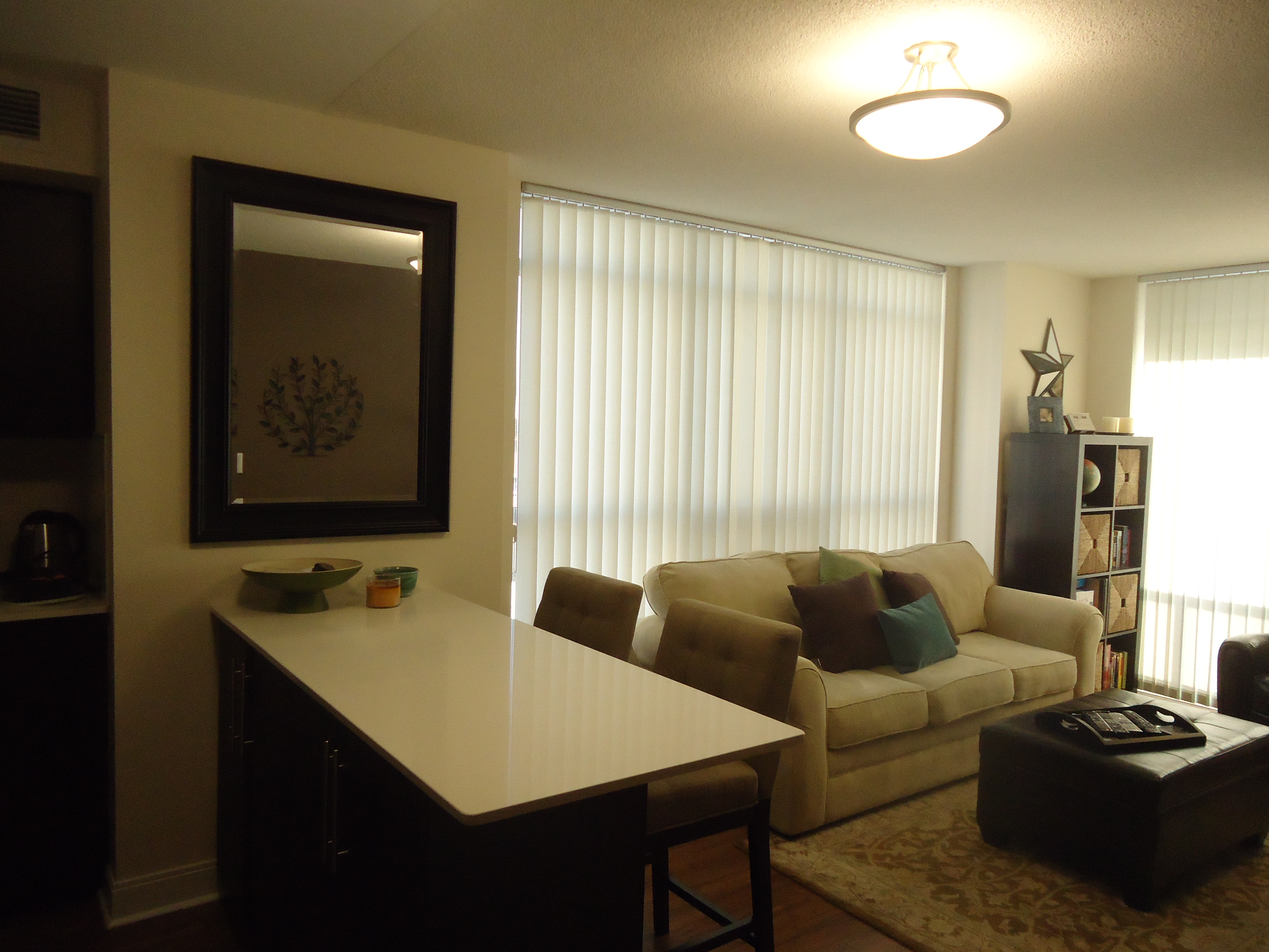
In this condo, I hung a painting over the sofa in the living area and a mirror in the dining area. This helps to define and separate the two spaces and the mirror makes the dining area seem larger.


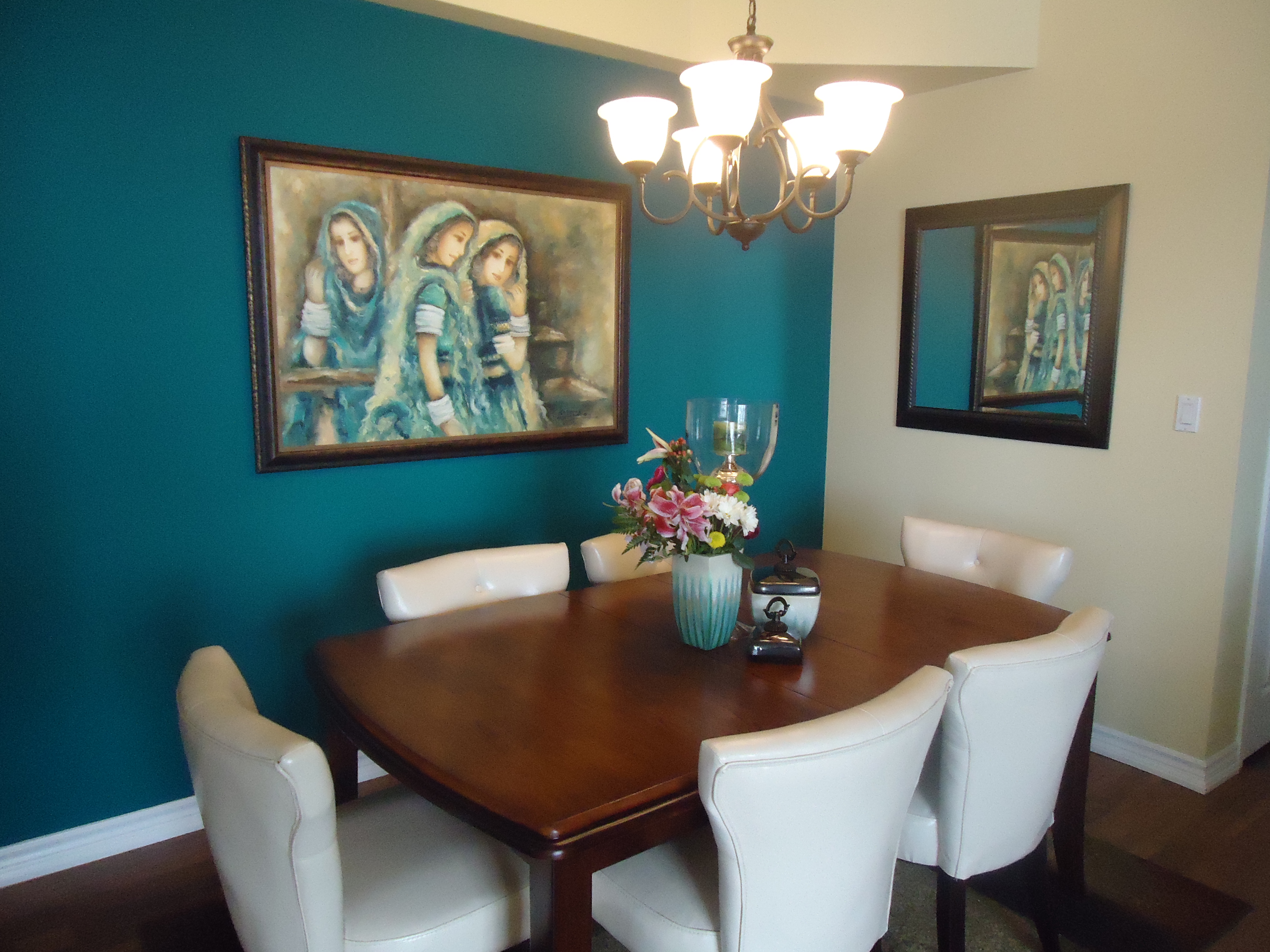
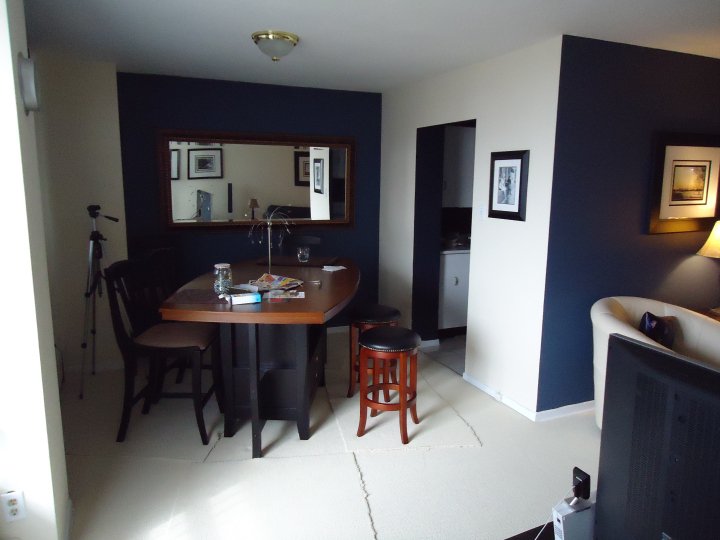
In this dining room, the mirror actually looks like another piece of art as it reflects the image of the painting on the adjoining wall.


Notice that in both of these photos, the mirrors and the artwork are hung at the same height, 60″ to the centre from the floor.

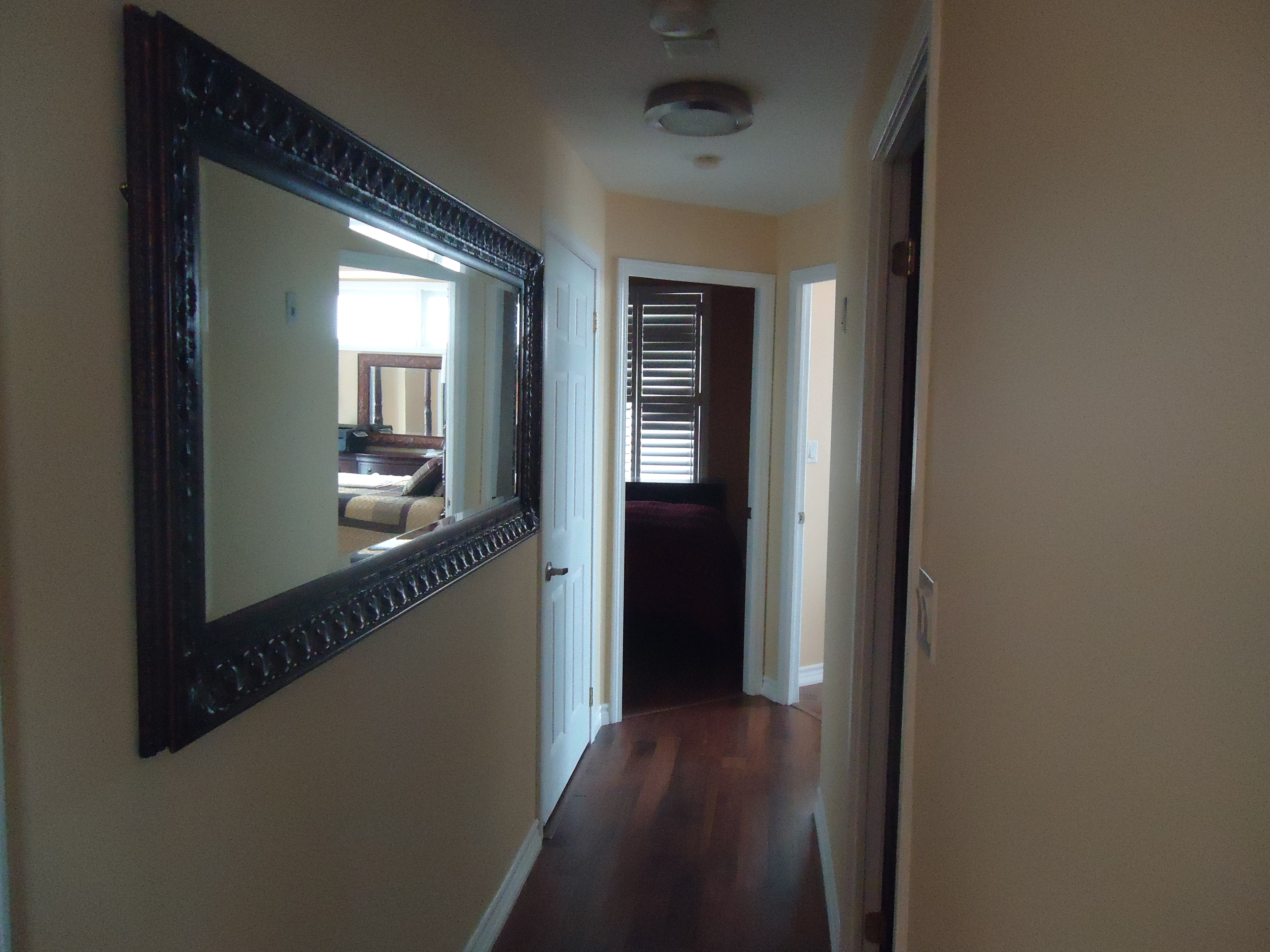
2. Use mirrors in a narrow hallway to widen the space


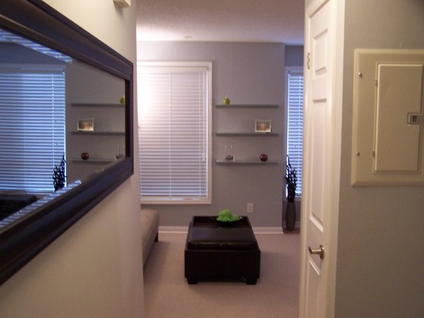
3. Use mirrors to open up your space and reflect light

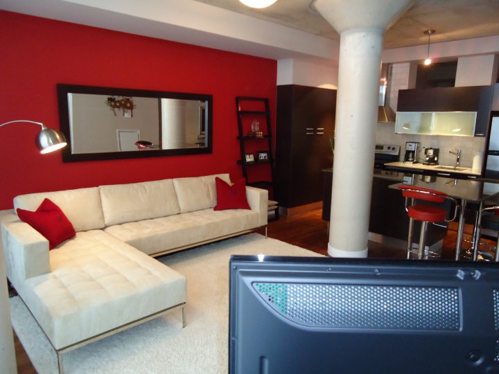
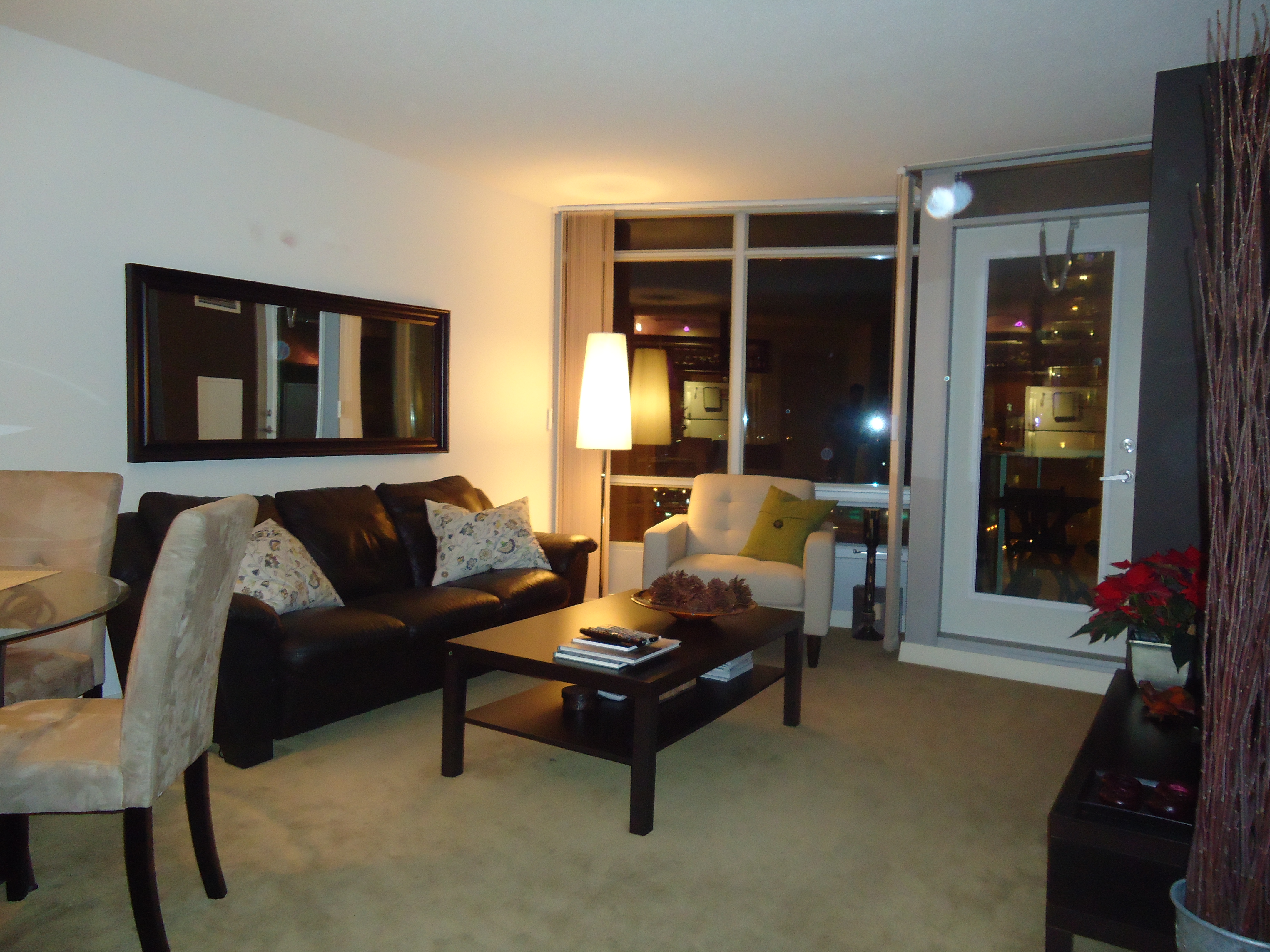
I use large mirrors over sofas (a personal favourite) to open up a space. It works especially well if the wall is adjoining some windows as the mirror will reflect the light and bring the outside in. In fact, depending on the positioning, the mirror can actually look like another window, which does wonders for making a room feel large and bright.


4. Use mirrors in dining rooms and kitchens.

Mirrors can be very helpful in a small narrow dining area or kitchen in opening up the room and adding interest.


Yes, mirrors are your best friend. They are inexpensive, come in many shapes and sizes and are a wonderful alternative or compliment to artwork.

Posted in Art and Mirrors | 2 Comments

A new design resource

Anyone who knows me knows that my two favourite stores on the planet are Williams-Sonoma and Pottery Barn.

I love everything about them, their product lines, their books, the layout and design of their stores and especially their websites.

If you haven’t been to either of their sites, they are an absolute must. Not only can you view their entire product lines, but both are full of amazing resources; recipes, entertaining and decorating tips, party planners including invitations, everything you need to find inspiration.

Pottery Barn just launched a new addition to their website and it is fabulous! Pottery Barn Design Studio, Ideas and Inspiration For Your Home is one of the best online resources for everything from decorating advice to entertaining ideas and offers photos, videos and PDF downloads.

Do yourself a favour and visit:

http://www.potterybarn.com/stylehouse/?cm_src=b1&cm_re=W3bc11-_-Bucket1-_-DesignStudio

You won’t be disappointed!

Posted in Uncategorized | Leave a comment

Creating Personalized Art (Part 2)

We all either have children or used to be children, so we are all familiar with the inherent desire children seem to have to want to write and draw on walls.

It’s a babysitter’s worst nightmare…the children in your care somehow get a hold of an indelible marker and begin to create their masterpiece on the living room wall and you panic trying to find a way to clean it off before the parents arrive home.

Well, here’s a way to bring out your inner child and create unique and reuseable wall art at the same time.

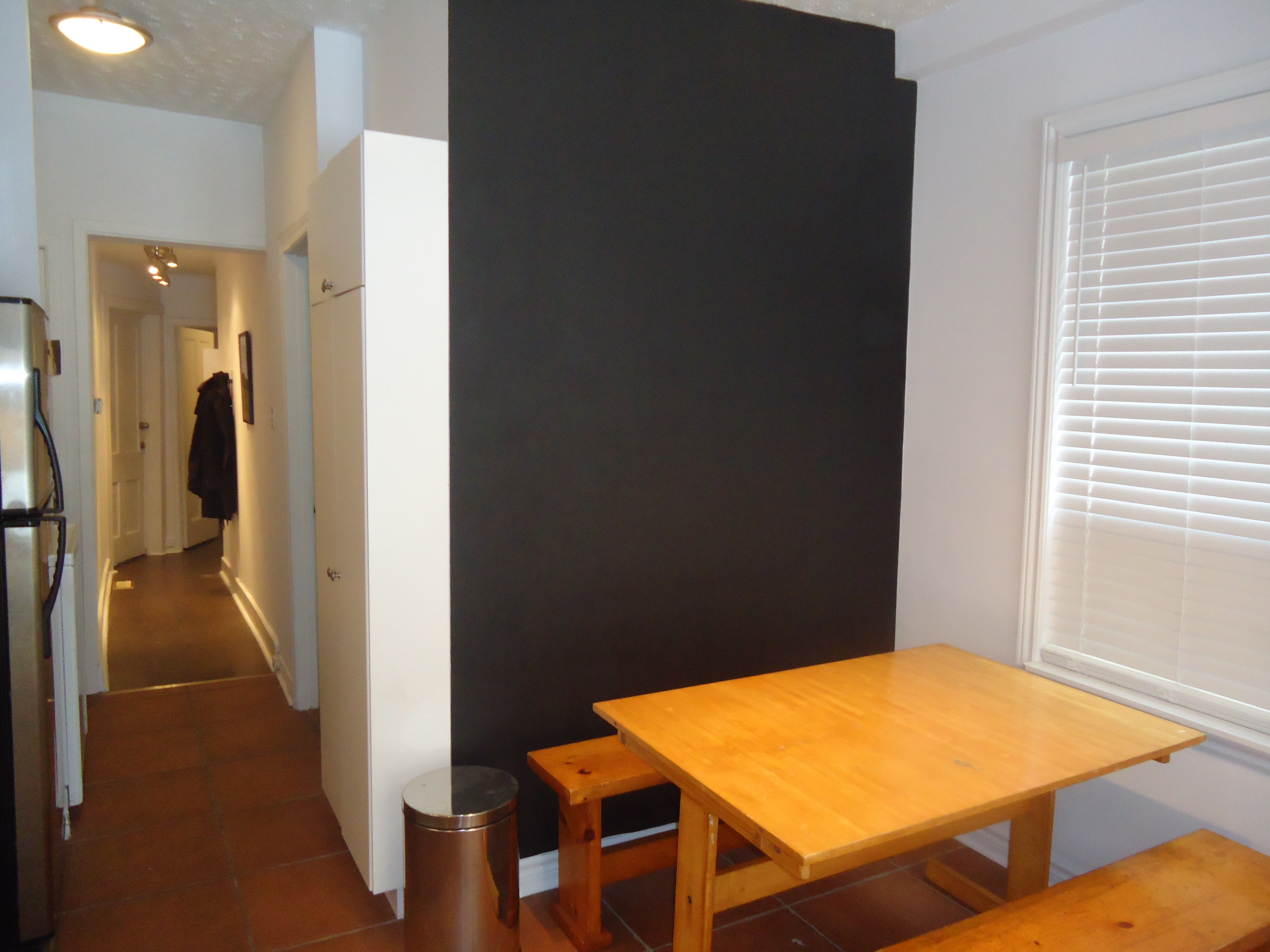
You simply head out to your paint store or local Home Depot and pick up a can of Chalkboard paint, that’s right, chalkboard paint.

For about $25 you can turn  any 100 square foot wall into a chalkboard.

A chalkboard wall can be used in a kitchen to write messages, recipes or shopping lists or it can be used in any room as a blank canvas for you to create your own masterpiece.  Draw cartoons, doodle, anything that flows from your heart, then when you want a change, erase it and start over.

It’s another great way to create unique and personal art, right, literally, on your wall.

Posted in Art and Mirrors | 5 Comments

Creating Personalized Art (Part 1)

I am a HUGE believer in, whenever possible, creating your own artwork rather than buying art off the rack. I find it has more meaning to you and is a way of commemorating special moments in your life. It also creates a fantastic conversation point when guests come to visit.

Now, you don’t have to be particularily talented or artisically gifted. You just have to be a little creative.

Here’s an example of how you can take your old record albums and display them in a way that creates a wall of art. Choose albums that mean something to you. As Roger Hodgson of Supertramp fame says “music is the soundtrack to your life” so try to choose albums that have meaning to you.


Another option for displaying your albums is to head out to Michaels or Urban Outfitters and for about $12 each, you can buy 12 X 12 frames designed to hold record albums. Create a wall of them with 8, 10 or 12 depending on the size of the wall and arrange them in a square or rectangle.

If you’ve lost track of your old prized albums, there are tons of used music stores in the city that have an almost endless selection of old vintage albums and as all things eventually do, records albums are making a resurgence and a lot of retailers are starting to sell current artists in LP format in addition to CDs.

All of us have favourite artists and songs that when we hear them take us back to another time and place. Use that as an opporunity to personalize your walls and create one of a kind artwork that will bring a smile to your face everytime you enter the room.

Stay tuned for more ideas on how to create personalized art for your home……………


Posted in Art and Mirrors | Leave a comment

Making use of a useless space

It amazes me sometimes what architects add when designing a space.

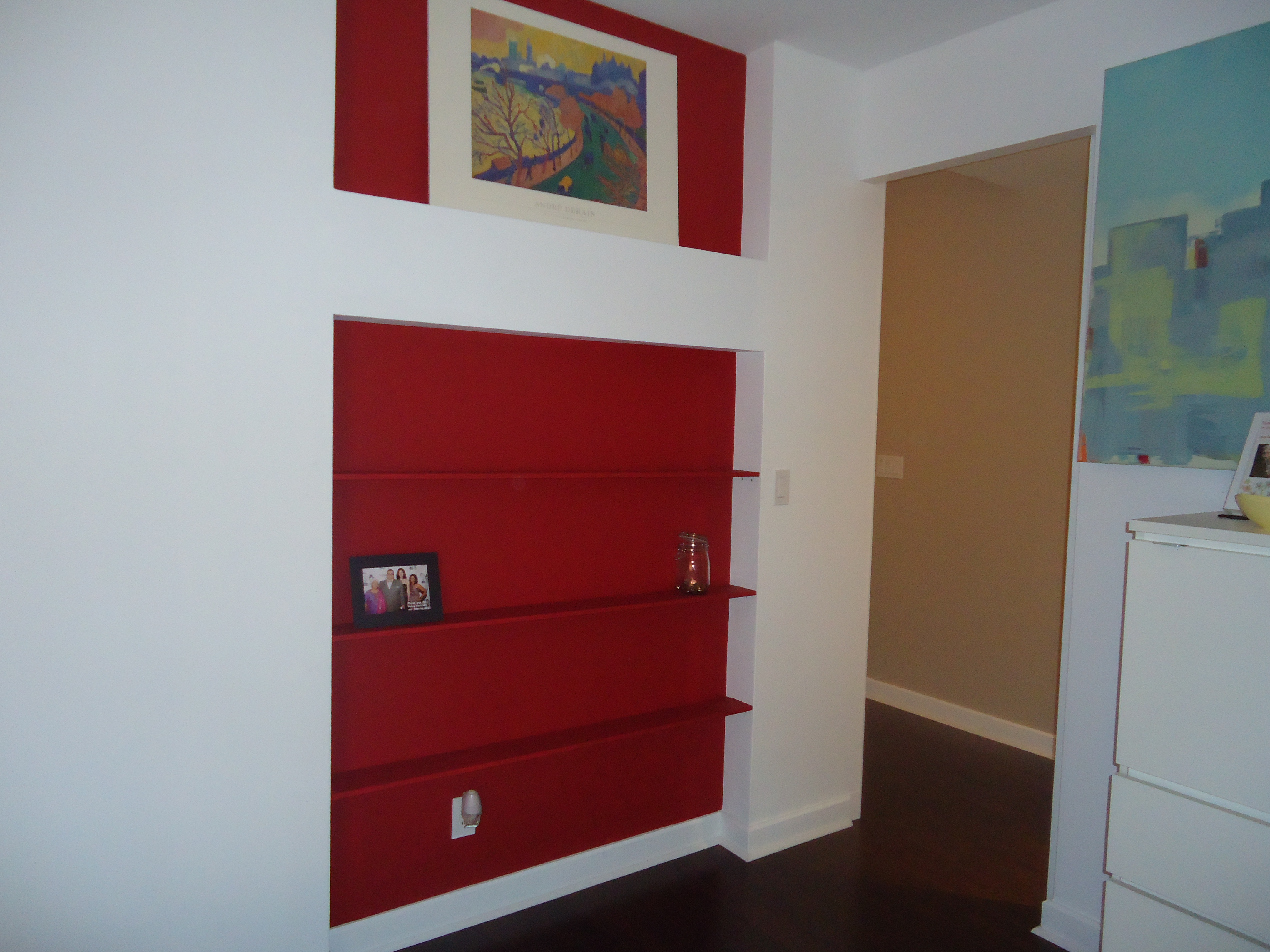
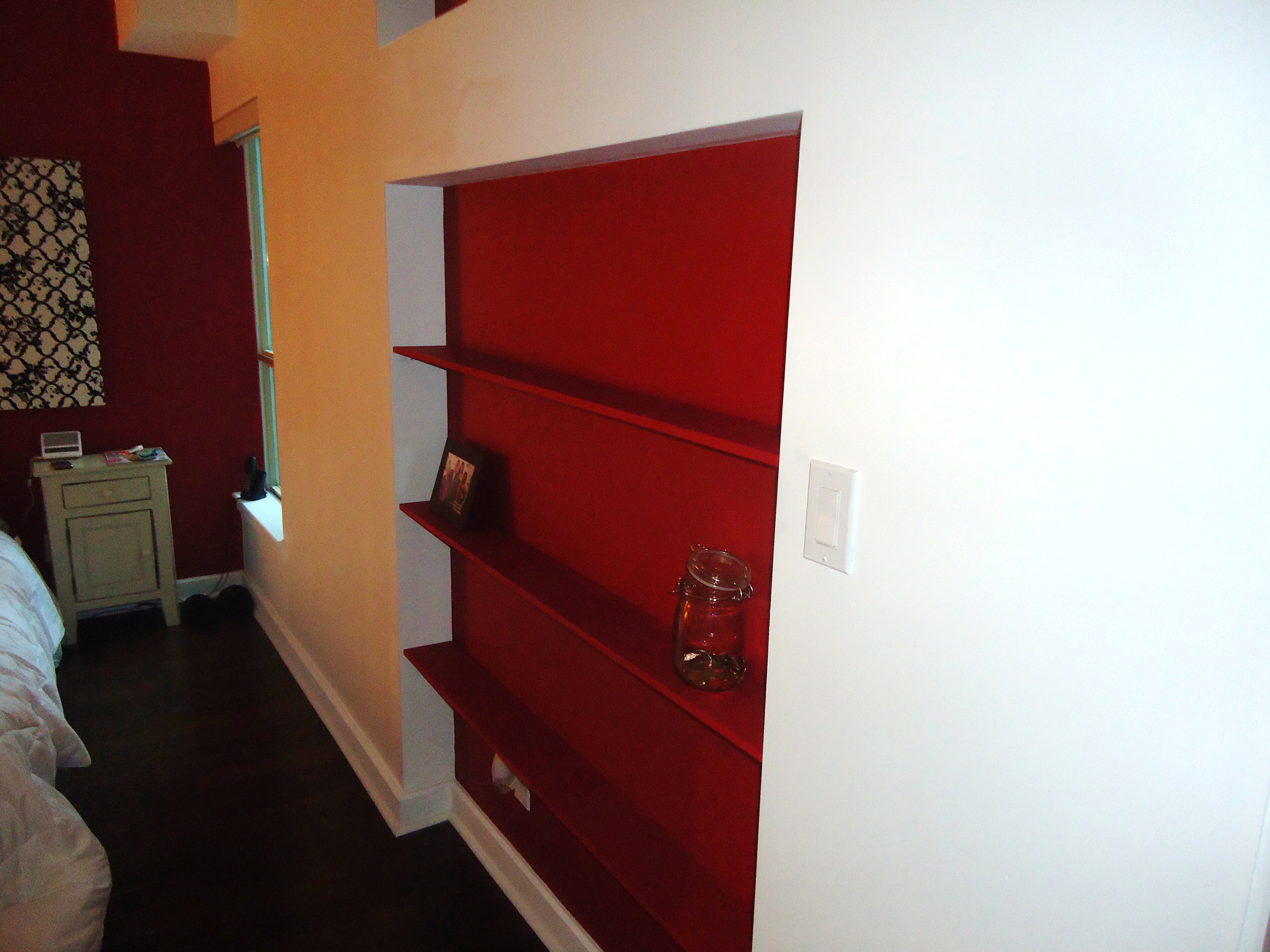
The bedroom in a recent project I completed at SOHO Metropolitan had a small nook on one wall about 5 inches deep. It was basically unuseable space with no real purpose.

To add some visual interest and provide purpose to the space, I painted the back wall of the nook red to match the accent wall and added some shelves to house paperbacks and decorative accessories.

The result is very, very cool.


Posted in Art and Mirrors | Leave a comment

Adding an island adds definition

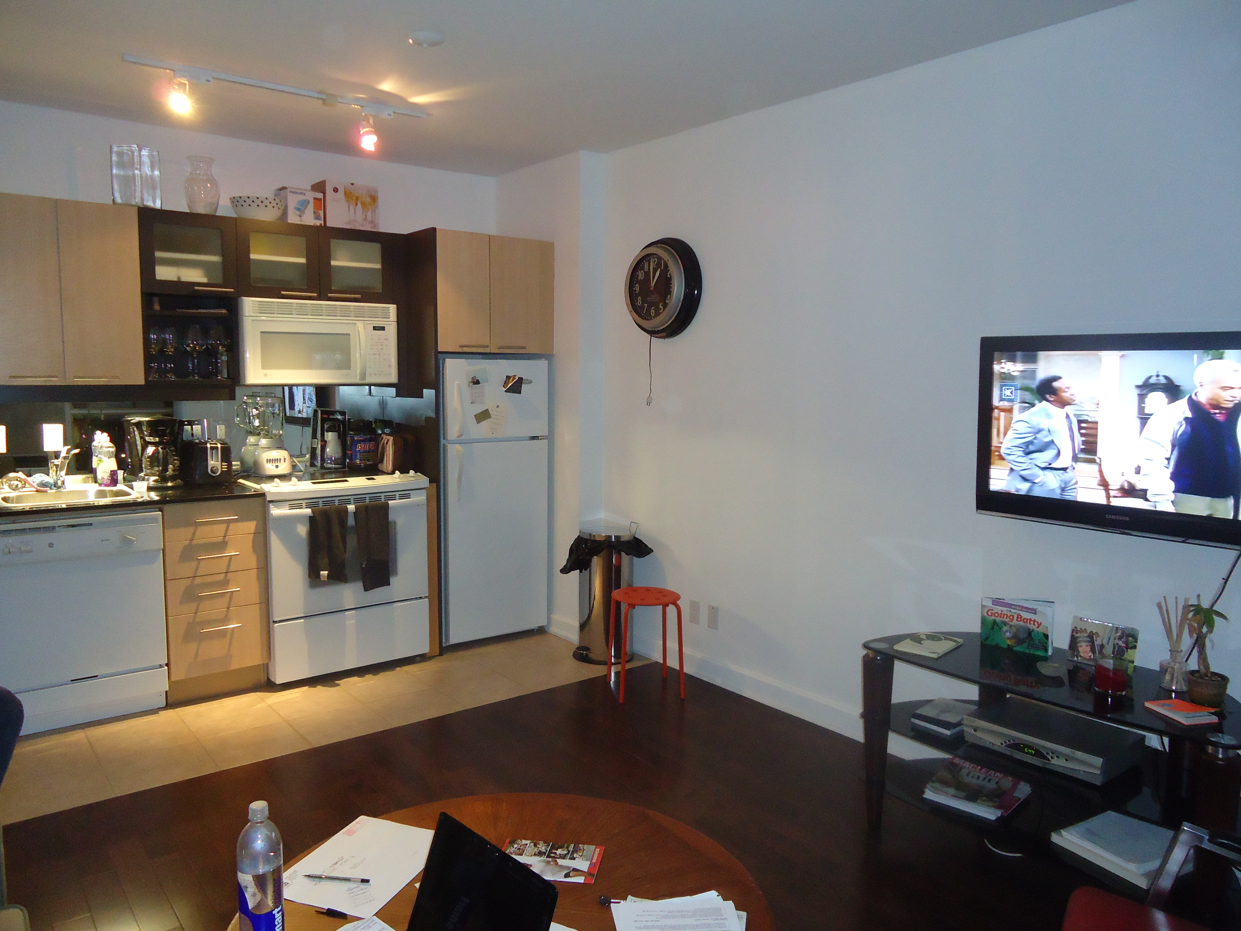
I do a lot of condos, almost exclusively, and what I’m finding more and more (more so with the newly built ones) is that the kitchen, living and dining areas are simply housed in one large square room with the cabinetry along one wall. There is nothing to separate or define the different areas of the room.

This was the case on a recent project at the SOHO Metropolitan, a condo/hotel just north of the Rogers Centre.


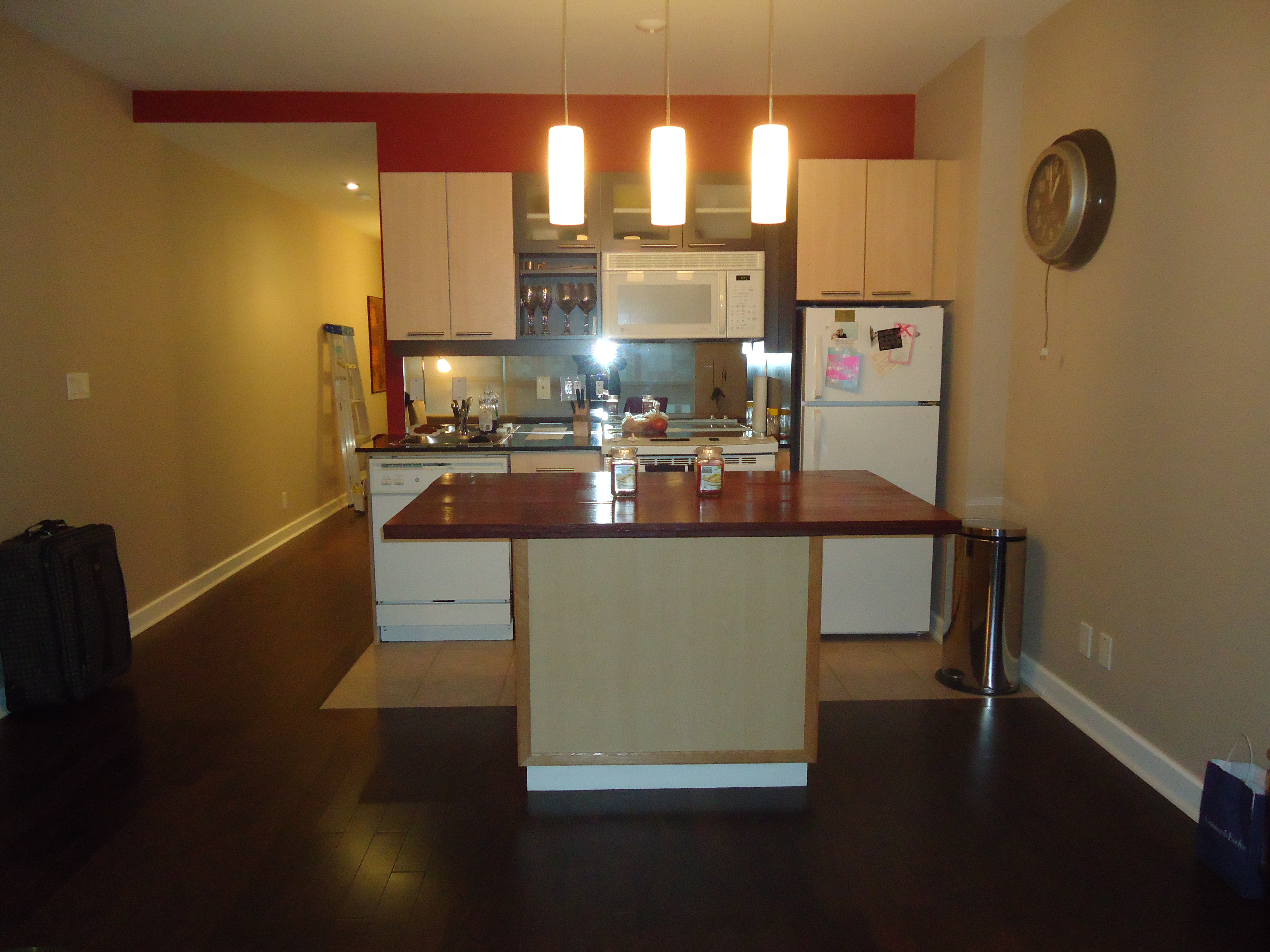
To help define the space and provide separation between the kitchen and living areas, I built an island large enough to seat 4 comfortably. It was actually pretty simple.

I started with a stock kitchen cabinet mounted on a platform and added a top made from MDF and solid oak.


A coat of dark stain, a few coats of varathane and some brushed nickel pulls finished it off.


To complete the visual separation between the kitchen and living area, I replaced the track lighting with a pendant light fixture that hangs over the island.


A simple project with great results.

Posted in Kitchen Makeovers | Leave a comment

Colour contrast can add visual interest

Normally I’m not a fan of colour contrast. I find that contrasting colours is a significant contributing factor to a space feeling small. A room with a red sofa against a red wall will not feel as small as a room with a white sofa against a red wall. This is simply due to the fact that your line of vision stops when it hits the white sofa but would continue when hitting the red sofa.

It’s the same reason I use sheer blinds in small spaces instead of dark heavy draperies. With sheer blinds, your line of vision continues past the blinds and out the window, making the space feel larger.

Every now and then though, I use contrast to achieve visual interest. It all depends on the mood I’m trying to create.

Last year, I completed a project that used contrast very effectively.

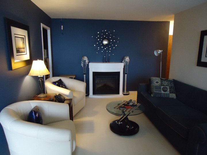
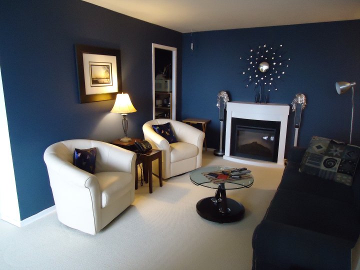
I chose a colour scheme of cream and blue. We had the flooring covered in off white wall to wall burber carpeting and painted the main walls in a soft cream with just a hint of yellow and painted a couple of walls blue as accents. We then positioned the blue sofa against the cream wall and 2 cream accent chairs against the blue wall.

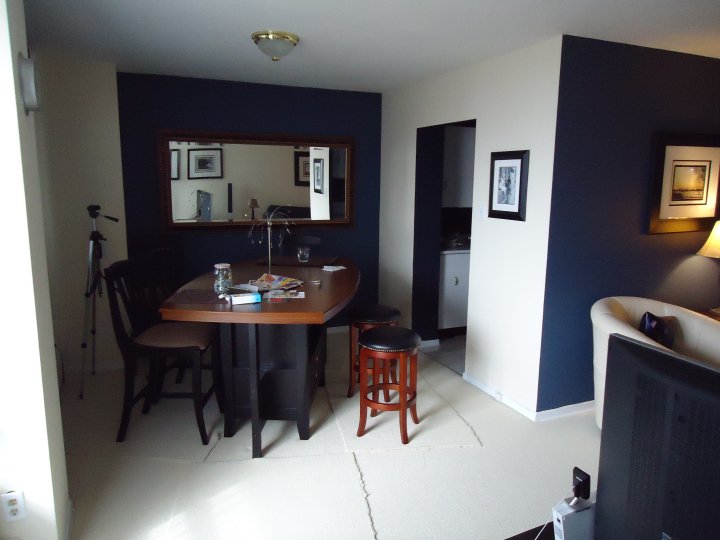
We used the same blue on the dining room wall and a darker blue in the kitchen to contrast with the white cabinetry

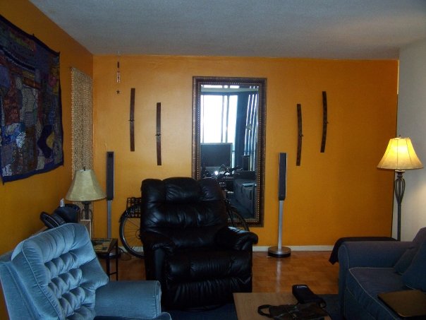
Just for fun, here is the same room before we started.

Posted in Colour and Paint | Leave a comment

Another Fireplace Makeover

Nothing creates a warm, cozy and inviting room like a fantastic fireplace but it needs to be the right scale for the room.

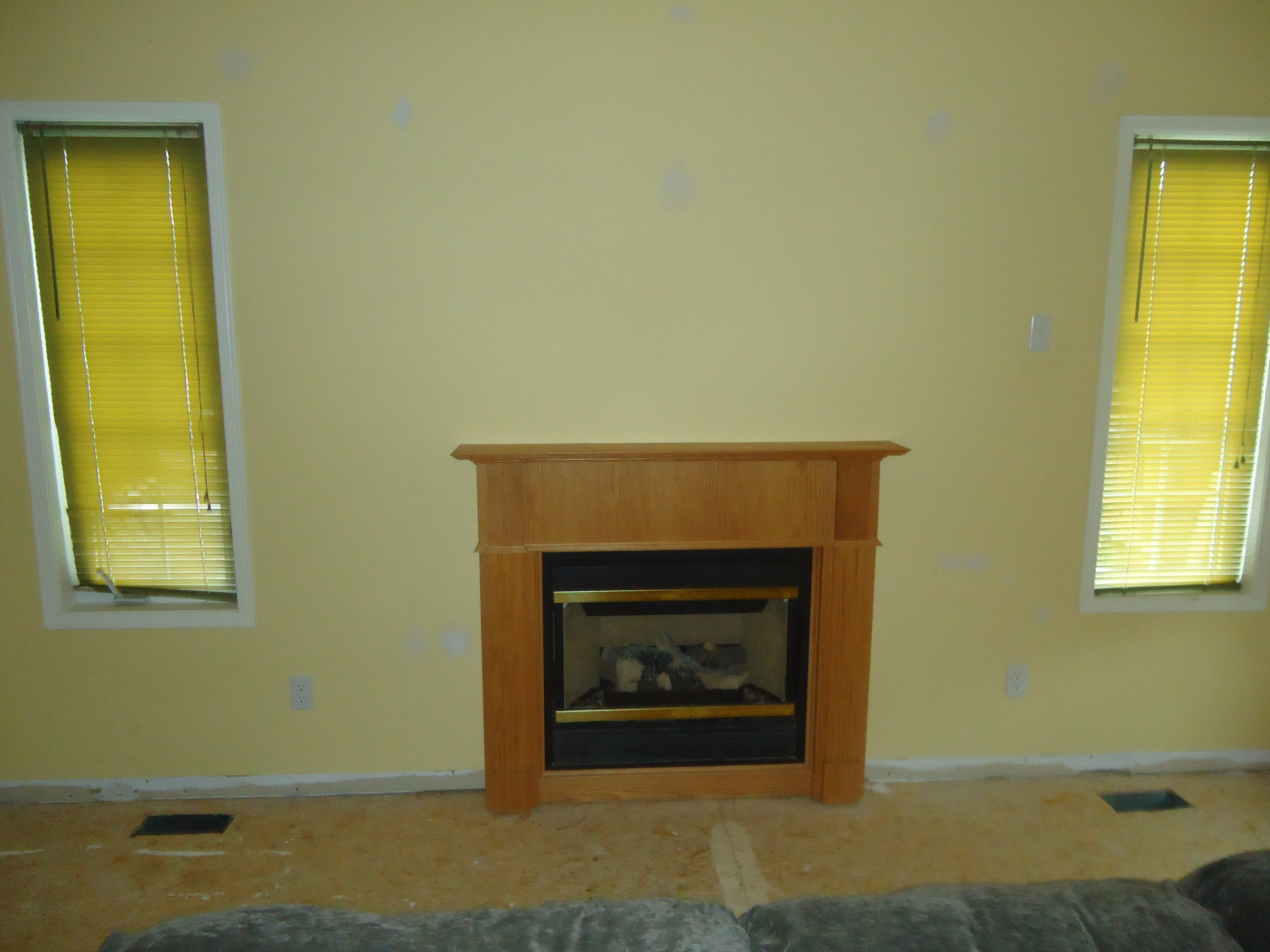
I recently made over another fireplace for a few reasons. It was way too small for the room, it was dated and , yes, I’ll say it, ugly and we wanted to make better use of the space. My first thought was to build up the existing fireplace to make it more substantial but in the end, it made more sense to tear it out and start over from scratch.


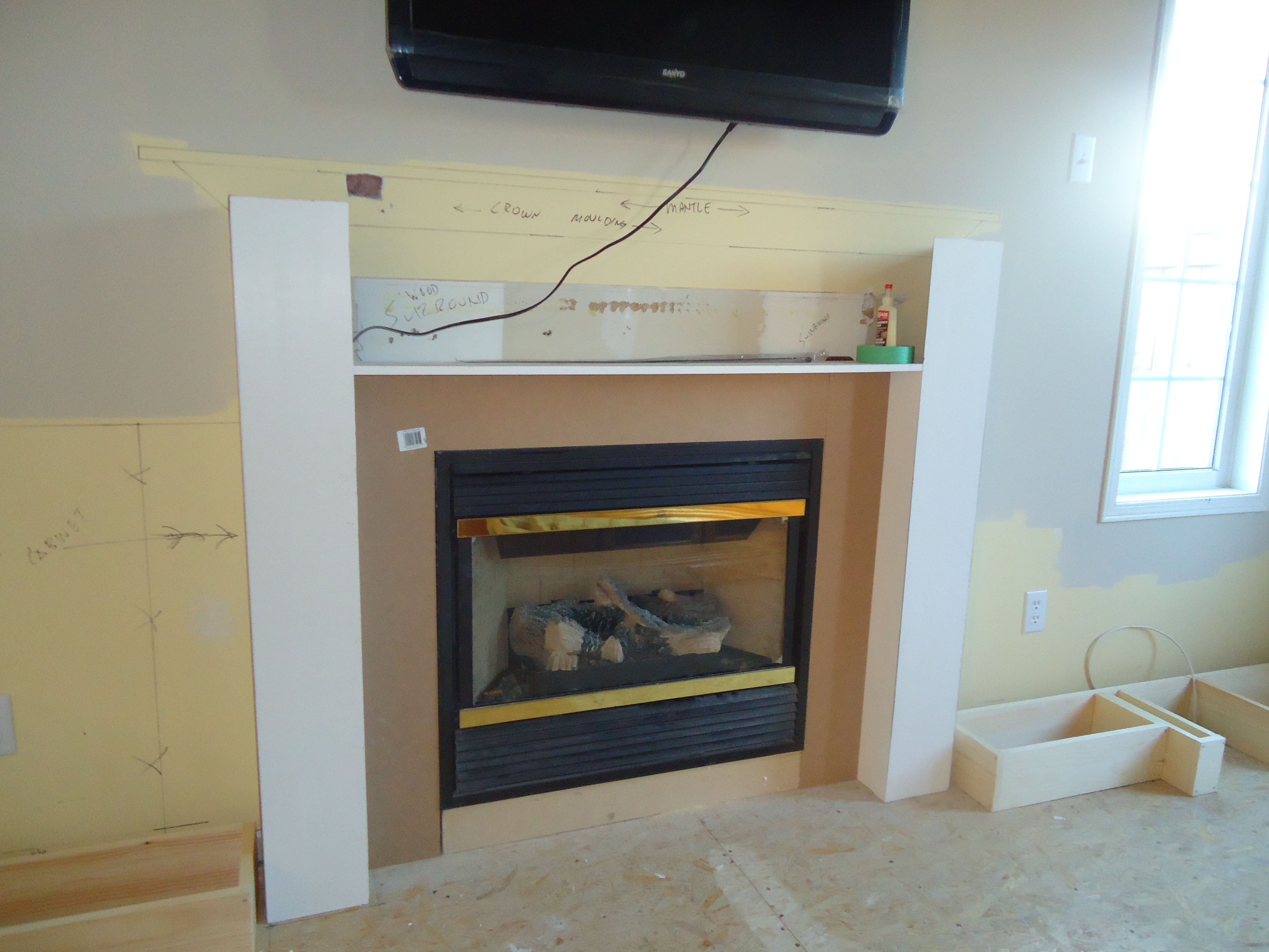
After the existing fireplace was removed, I laid out the plan on the wall, built a box around the firebox and installed the bases for the soon to be added cabinets.


The next step was to cut holes in the wall for the AV wires and to begin building the new surround and mantle. Then the new flatscreen was mounted above the fireplace.


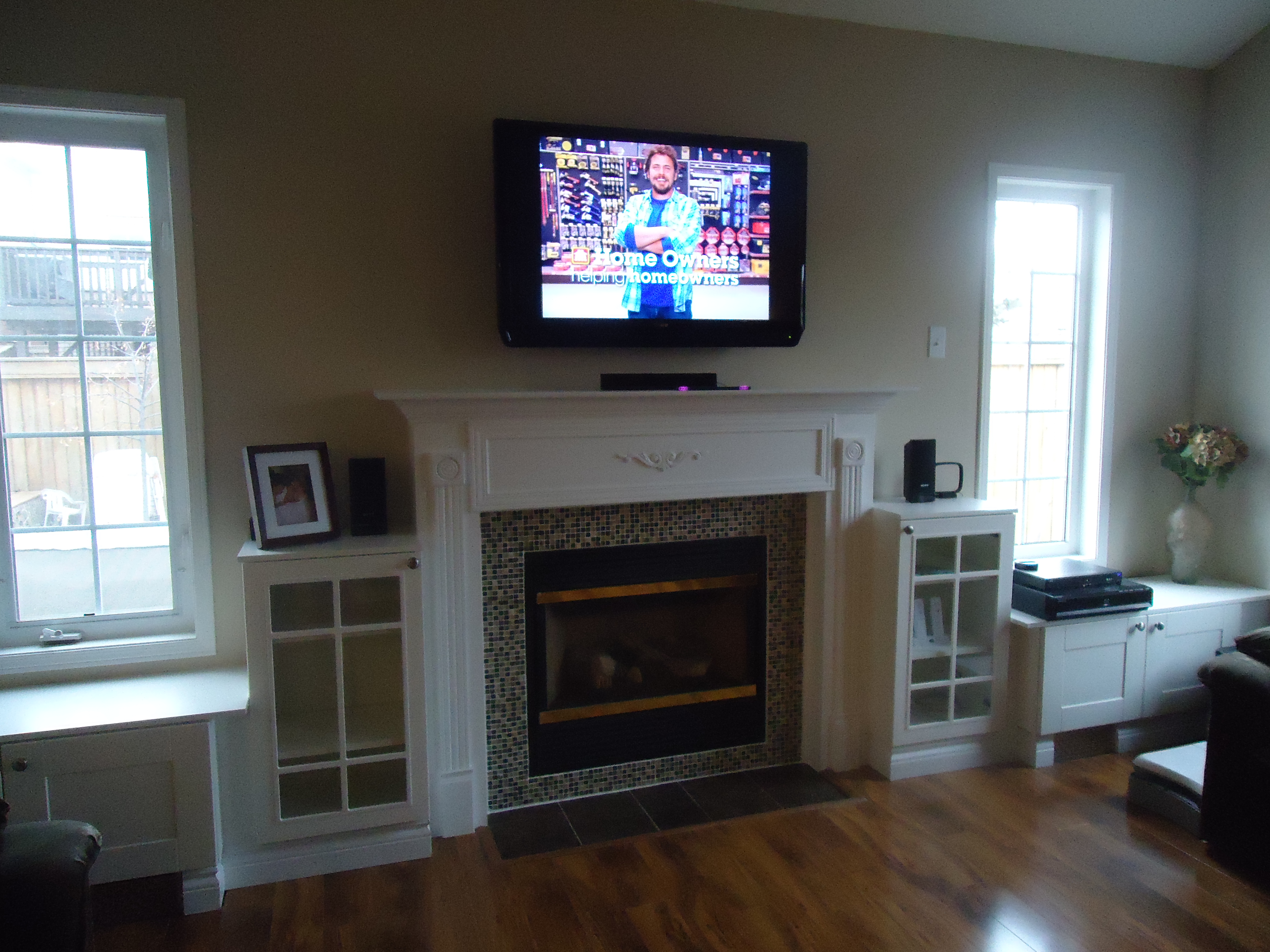
I took some stock kitchen cabinets, mounted them on the bases, ran the wiring through the holes down behind the new surround and behind the cabinets to the receiver. Some trim, some beautiful new tiles, some baseboard and a fresh coat of paint and voila, a new fireplace which is a much better scale for the room and much more functional.

Posted in Fireplace Makeovers | Leave a comment