Space saving sleeping solutions for your bedroom or den

Here’s a question; Who remembers the Murphy Bed, the original fold up bed patented and first manufactured in San Francisco in 1916?

I’m sure most people have heard of it but here’s a history lesson.

Apparently back around the turn of the century, courting customs prohibited a man from inviting a woman into his bedroom, unless they were married. It seems a young man by the name of William Murphy was smitten with a young lady but since he lived in a one room apartment at the time, he was unable to invite her over.

Necessity being the mother of invention, William designed a mechanism by which he could fold his bed up into a closet and transform his one room apartment into a proper parlour fit for entertaining young ladies.


He applied for and was granted a patent for his design in 1916 and the Murphy Wall Bed Company was born. Still in business today under the leadership of William’s grandson Clark, it is one of the oldest furniture companies in the U.S.

As people’s lifestyles and needs have changed, the wall bed has evolved and  more companies have entered the marketplace.

In Canada, there are two companies worth checking out, Cabinetworks and B.O.F.F.

Cabinetworks, based in Nova Scotia, manufacturers, among other things, a very innovative hidden desk bed, a large desk unit that transforms into a double bed, perfect for a den.


This thing is absolutely brilliant!  You can leave everything on the desk, even a full cup of coffee and fold it down into a bed without spilling a drop. It’s the perfect piece to transform your den/home office into an inviting guest bedroom. You can learn more at:

http://www.deskbeds.com/

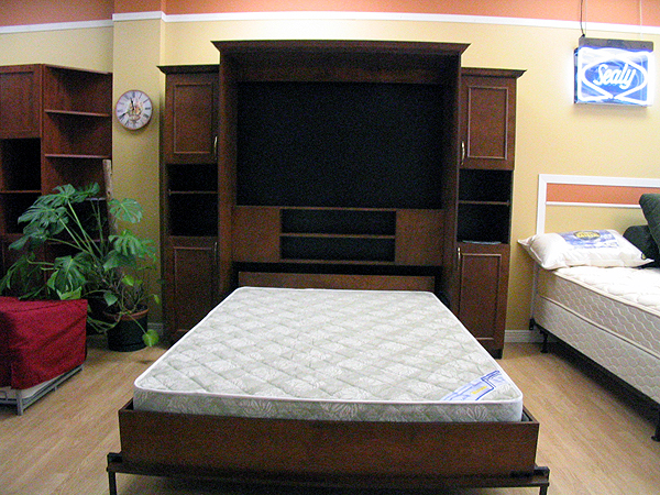
B.O.F.F. Wall Beds has a complete line of wall beds, everything from desks to cabinets to dining tables, all of which convert to a comfortable bed.


Check out their product line at:

http://www.boffwallbeds.ca/

If you are space challenged, the ol’ Murphy Bed might be just the thing you need to make the most of what space you have.

Posted in Space Saving Furniture | 4 Comments

Transforming a “walk-in closet” into a bedroom

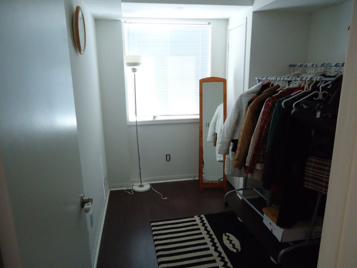
Okay, I’ll be honest, it wasn’t actually a walk-in closet but rather a bedroom that was being used as a walk-in closet.

Last summer I completed the smallest space of my career, a one bedroom town home that was no more than 300 square feet. To make matters worse, the client was a bit of a shopaholic, having amassed a collection of 60 pairs of shoes, 12 pairs of winter boots, 6 bathrobes and more belts, sweaters and scarves than I’ve ver seen outside of The Gap.

Her only solution (she thought) was to use her small bedroom as a walk-in closet and then sleep on a futon in her living room. She had three portable clothing racks full of clothes and boxes upon boxes upon boxes of boots and shoes stacked against the wall. The two tiny bedroom closets were packed full of everything else.


She had met with a few designers before me and every single one of them told her that the only solution to her tiny bedroom was to blow out the wall and go to an open concept home. I was the only one who emphatically disagreed.

“No one is ever going to pay you $300,000 for a bachelor apartment. Your bedroom HAS to stay a bedroom, but it has to BECOME a bedroom.”

She was completely skeptical but not wanting to tear her place apart, she blindly threw her faith in me and let me give it my best shot.

I asked her to first spend some time de-cluttering, going through all of her clothing and bagging those items that could be donated. After almost a week of what I can only imagine was a very painfull and traumatic experience, she presented me with a garbage bag 1/3 full and told me that that was the best she could do. UGH.  Really? I guess the rest was up to me.

The first thing I did was reorganize her furnace room, a closet sized space off the kitchen. I installed two closet rods one above the other at about 3 feet and 6 feet from the floor and moved all of her seasonal and not often worn clothing there.

I then took the two tiny closets in the bedroom and moved both the wire shelves/rods up to about one foot from the top. There is so much wasted height in a closet, space that is rarely utilized effectively. In one closet I installed a second wire shelf/rod so that I could double hang shorter clothing items. In the other closet I installed two shoe cubbies that would hold 30 pairs of shoes. Luckilly she had a lot of sandels and flats and I was able to get three pairs into one cubby. All the boxes were gone.

I then installed a shelf between the two closets over top of what would be the head of the bed and bought four sweater boxes to hold boots, belts, sweaters and anything else that didn’t need to be hung and wasn’t worn all the time.

I wanted to create a feminine bedroom and she loved bright colours so I painted the back wall of the bedroom is a nice soothing shade of blue called Denim Wash. To soften the look, I hung draperies over the window, leaving the blinds for light control.

I found the perfect bed and  a couple of side lamps and that was all that the bedroom would hold. No room for dressers or armoirs.


Now, in a very small space you have to get creative and think “outside the box”. Her socks, underwear and garments found a home in the dining room in the sideboard. Yes, I know, it’s a tad creepy, but had she been more effective at de-cluttering, I would have been able to find a different home for them. She and I (and now you) are the only ones who knew the truth about where the under garments were stored.


Oh and here is what the dining room looked like before. It was actually her living room. I opted to stwitch the living and dining areas to give her a larger space for entertaining and turned the tiny dining room into a sitting area. Here you see the futon which used to be her bed.


This was one of the most challenging spaces I’ve done in terms of storage and space planning. A rousing success, my client was completely blown away and could not believe that she actually now had a bedroom and a large dining area.

Think outside the box. Throw away all your pre-conceived notions about where and how things should be stored. In a tiny condo you often have no other choice.

Especially, if you are terrible at de-cluttering, the first rule of living in a small space.


Posted in Closets and Storage Solutions | 1 Comment

Creating an urban dining area

What the heck do you do for dining when your condo is basically a great big square room with a kitchen along one wall?

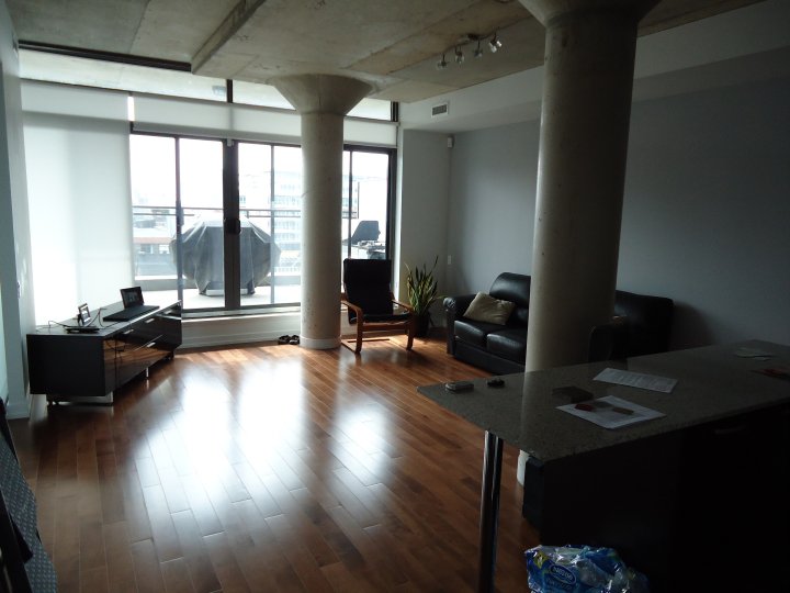
A couple of years ago I worked on a loft in the fashion district and you can see from the photo below that there was really no practical place for a dining table and chairs. The island was too small to seat more than one or maybe two people comfortably and the client really wanted to be able to entertain friends and family.

The pillars, while very cool, posed a real challenge when it came to space planning.


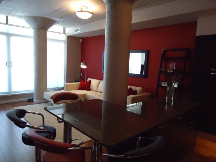
What I decided to do was to replace the counter top on the island with a larger L-shaped top that would “wrap around” the pillar and provide seating for four. Matching the existing granite would have been a challenge so I opted to go with a darker granite on the island that would provide a nice contrast to the granite on the other counter. I replaced the one chrome leg on the island with three new ones to support the larger counter top.


To compliment the red accent wall and provide some visual interest , I chose two red stools and two black ones.

Now my client had an island that was visually appealing and very practical.


Posted in Kitchen Makeovers | Leave a comment

Making a bold statement with grasscloth wallpaper

I’ve written previously about the resurgence in popularity that wallpaper is enjoying and how I’ve used it on feature walls. A beautiful wallpaper adds so much glamour and drama to a room and is really nothing more than a wall sized piece of art.

Recently I’ve used grasscloth wallpaper when I wanted to make an even bolder statement.

Grasscloth wallpaper is a natural product that is made from individual strands of grass (often sea grass) that are woven together and then glued to a backing often of rice paper. The beautiful thing about grasscloth is that because it is a natural element, it has so many imperfections that add to it’s uniqueness. It has a wonderful texture and comes in a wide range of colours and patterns.

Like most wallpapers you should avoid using it in bathrooms and places with a lot of humidity or moisture and try to avoid high traffic areas as it can damage fairly easilly.

If you want the look of grasscloth in your bathroom, there are many vinyl faux grasscloth wallpapers that look amazing although they don’t have the texture of the real thing.

Here are a couple of examples of where I’ve used real grasscloth.

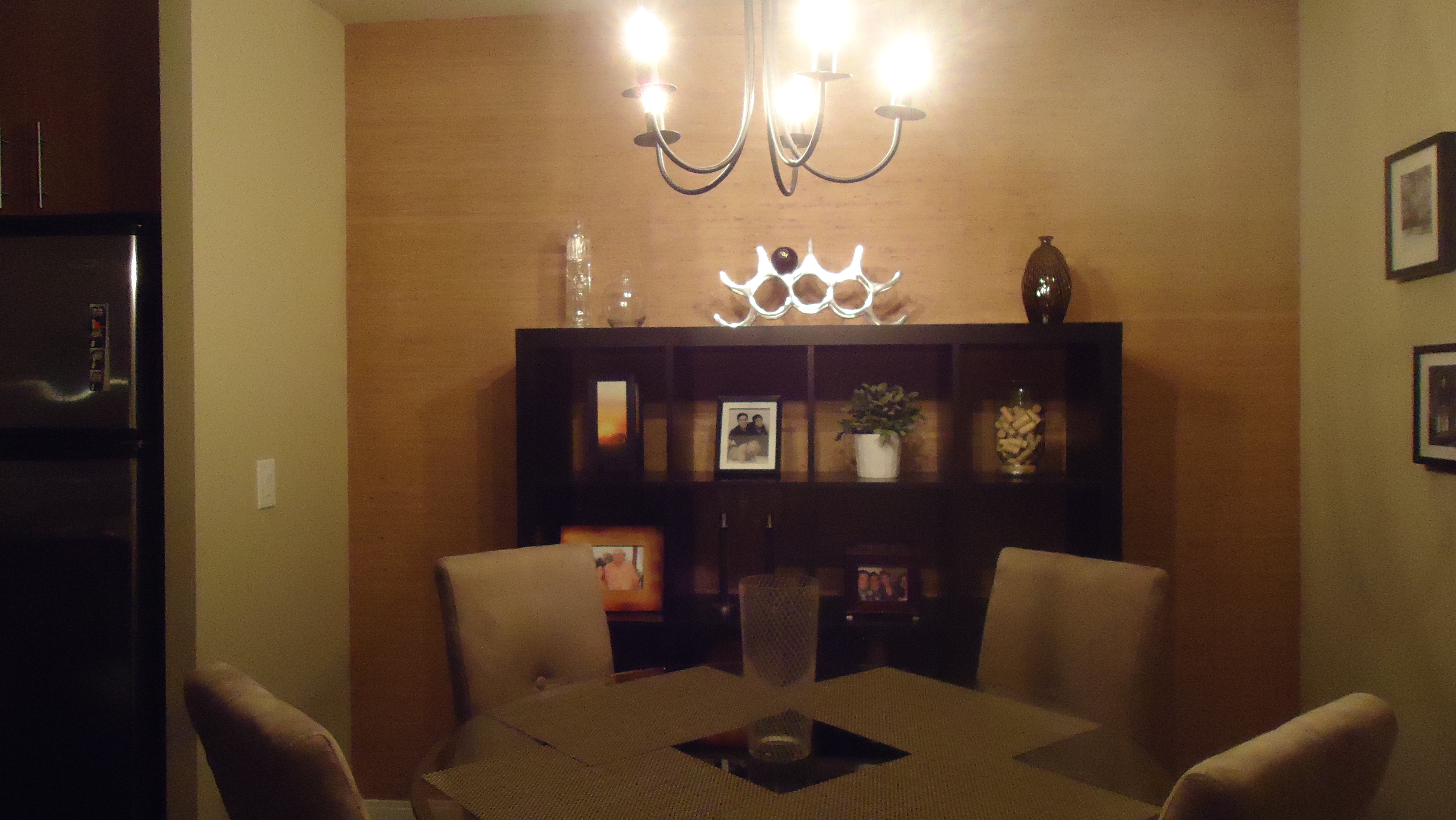
The first is the dining room of a small condo where I wanted to do an accent wall but wanted something unique and different.

This beautiful wallpaper provides the perfect backdrop for this casual dining room and because it is similar in tone to the kitchen cabinetry (to the left) it actually helped to make the space feel larger.


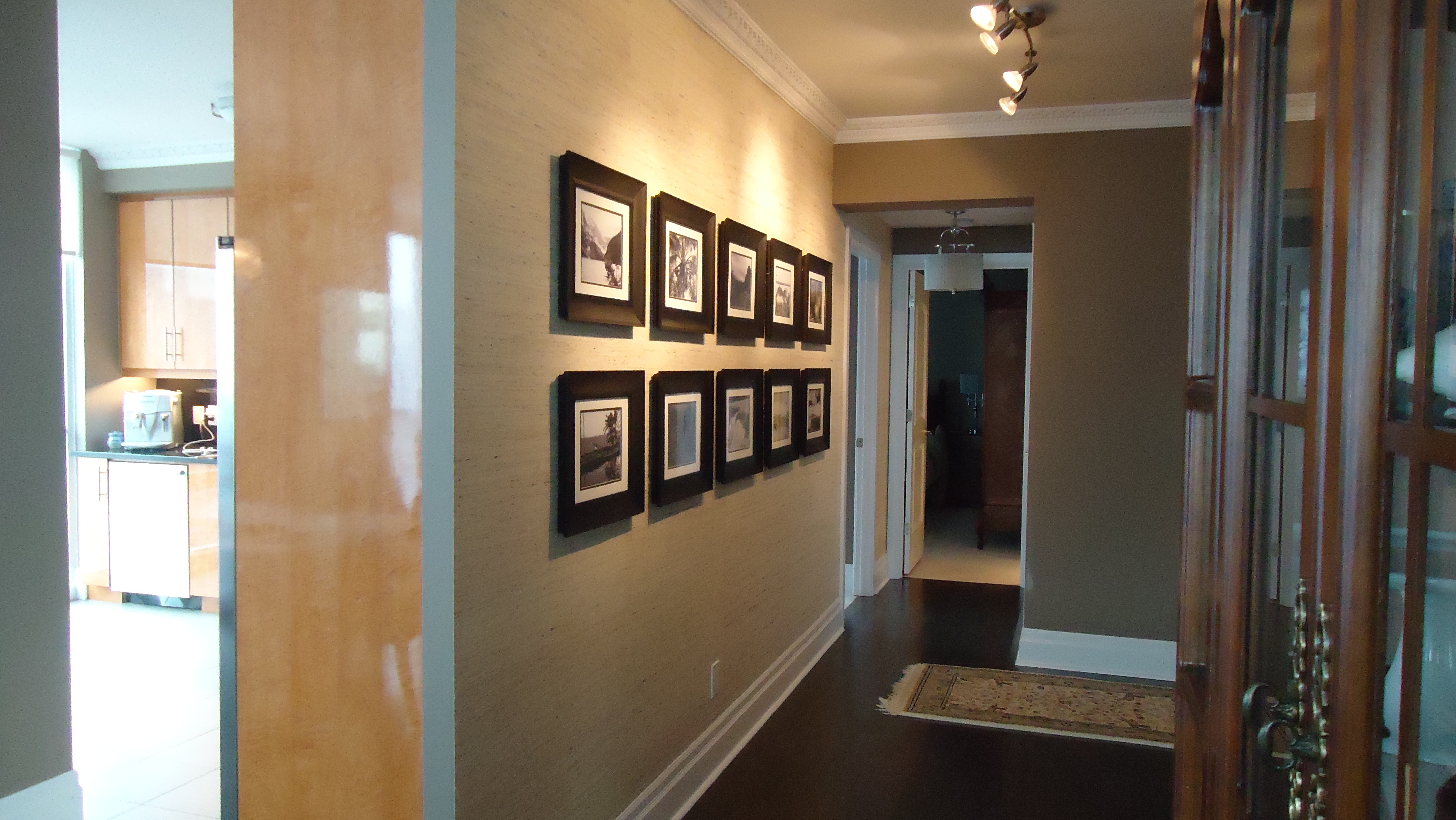
In this next condo, I was looking to make a feature wall to showcase photos the clients had taken on their world travels. I wanted something that would make an impact and be a conversation piece.

Together we chose a beautiful paper and then I selected ten photos from a collection of hundreds, had them printed in 8 X 10 black and white then matted and framed. The track lighting fixture that had been in the kitchen was moved to the gallery to light the feature wall.


If you are looking to make an impact in your home, consider the unique beauty of grasscloth wallpaper.

Posted in Wallpaper | 1 Comment

Another fireplace makeover, thanks Ikea

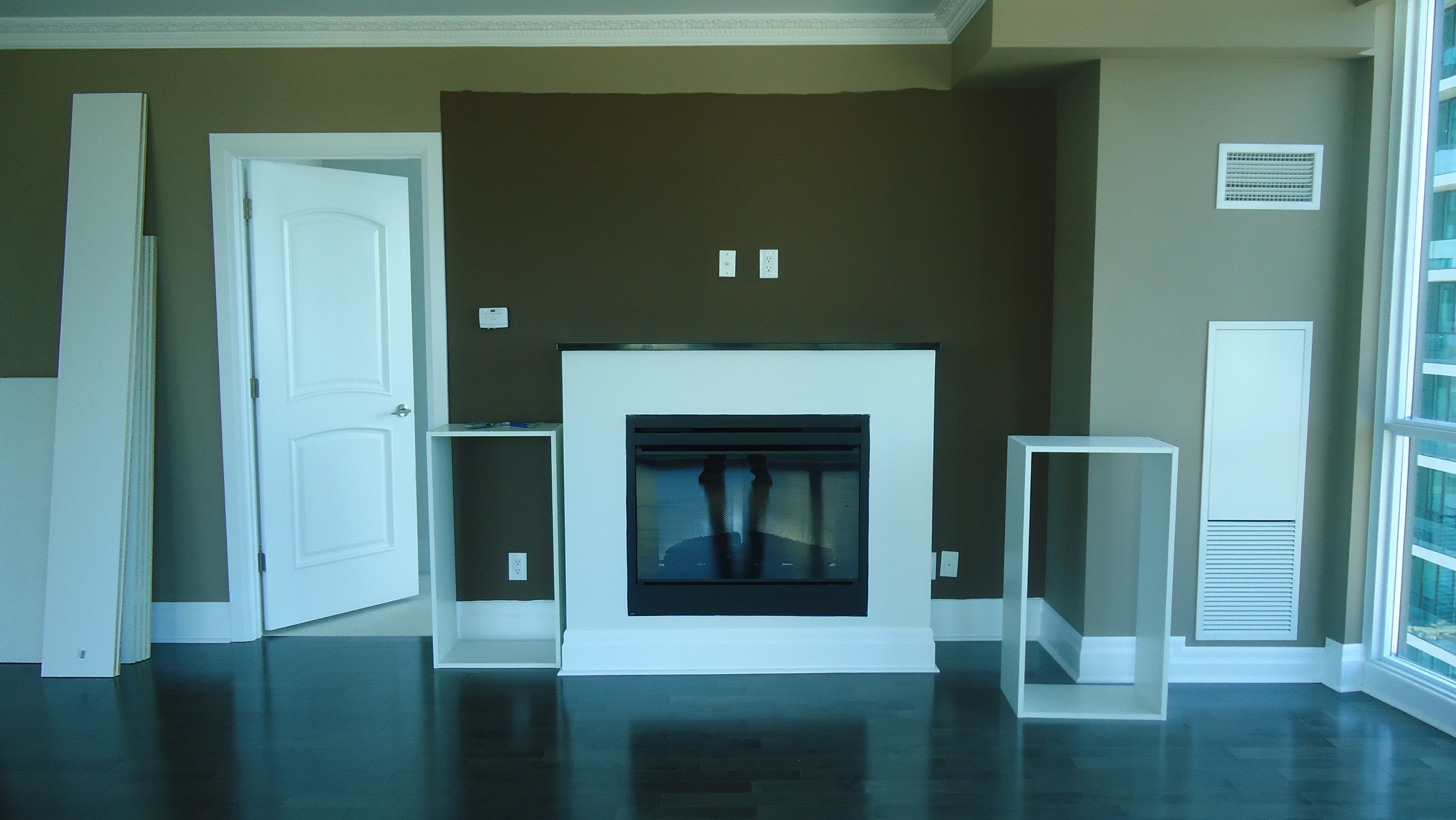
Yup, here I go again, singing the praises of Ikea cabinets. Here’s a project where I built custom built-ins around a fireplace using Ikea upper kitchen cabinets.

This condo unit came with an electric fireplace, thankfully a Dimplex, which in my opinion is the only brand to buy, but, unfortunately it came with nothing but a drywalled box as a surround.


The first step in this project was to paint the wall behind the fireplace a darker colour. I wanted the back of the shelving to pop and provide a real focal point for the room and to draw the eye in.


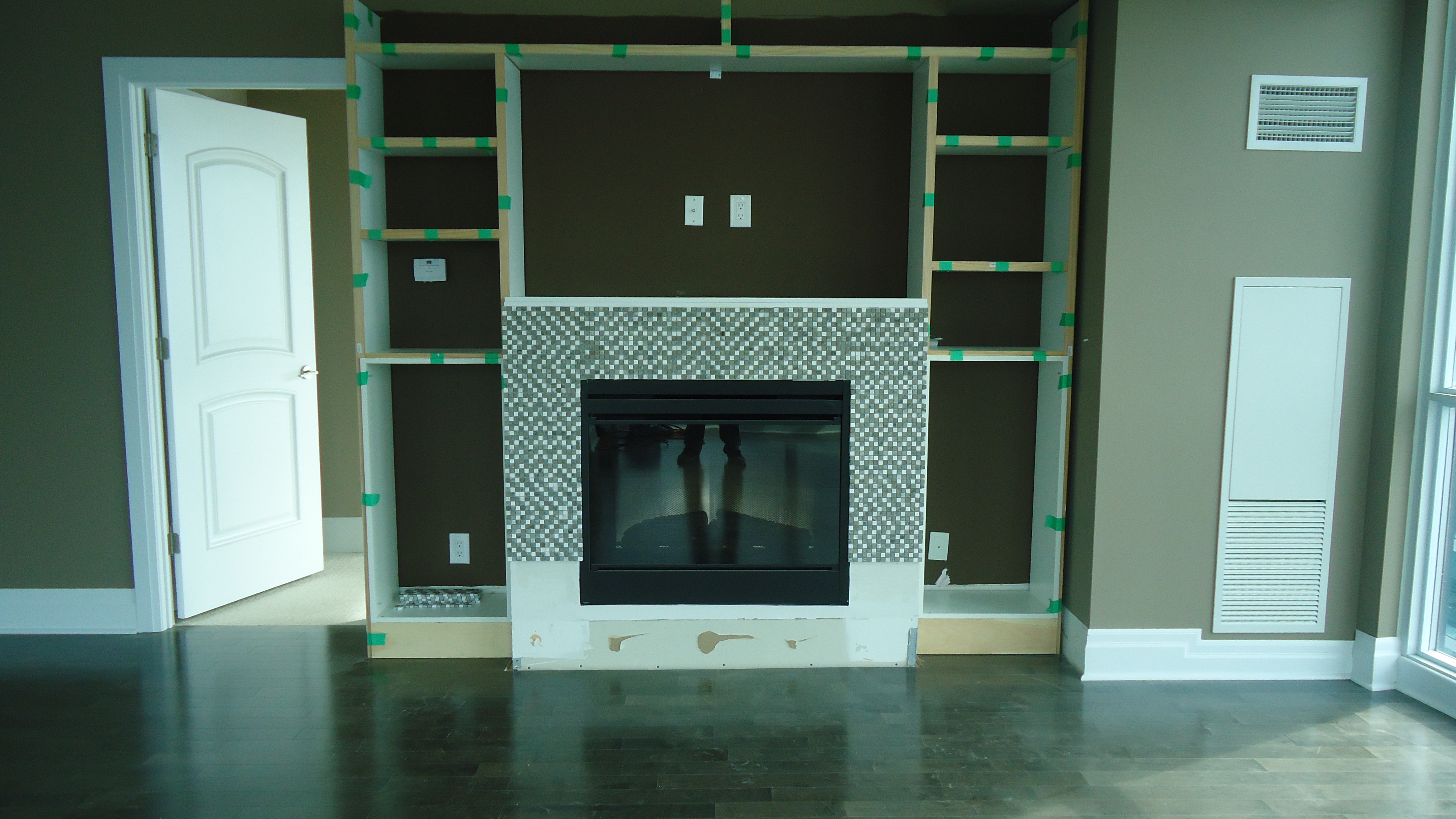
Next I removed all the baseboards so that they could be reinstalled around the built-ins and made a base out of 1″ X 6″ pine on which to mount the cabinets (shown). Then came the vertical panels cut from stock laminated shelving and began adding the horizontal shelves.


Supporting the shelves was a very simple process. Glue a small piece of shelving board on either side, add the next shelf on top, add two more pieces of shelving board, another shelf and so on. Then double up the shelves. What you end up with is vertical and horizontal lines that are twice the thickness of the shelving board, giving the unit a more substantial look and adding strength and durability.

Next the fireplace surround was tiled in 1/2 inch mosaic marble tiles and the entire unit was painted white.


New baseboards were installed and some trim was added to the top of the unit. Here’s the finished product:


A boring drab fireplace transformed into a custom built in unit with tons of storage, lots of shelving to display decor accessories and a dramatic focal point for this stunning condo.

All using Ikea kitchen cabinets and stock shelving from Home Depot.

Posted in Fireplace Makeovers | 6 Comments

Let’s talk trim, and not the Christmas tree kind

Okay, I have a huge pet peeve! It drives me crazy when I see trim, whether it’s doors, windows, baseboard or whatever that is any colour other than white.

I see mixtures of white and natural wood, I see baseboards painted the same colour as the wall colour, which I may add is different in every room in the house, I see ceilings painted the same colour as the walls, I see it all. And it makes me crazy!

Here’s the deal. Trim is white. Ceilings are white. Period.

Here’s why.

White trim throughout the entire home creates flow and unifies the space. It brings all the different room colours together. It frames the wall colour like art.

White ceilings lift the room and give it a light airy feel. Dark painted ceilings make the room feel like a cave.

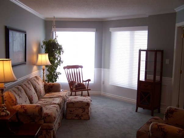
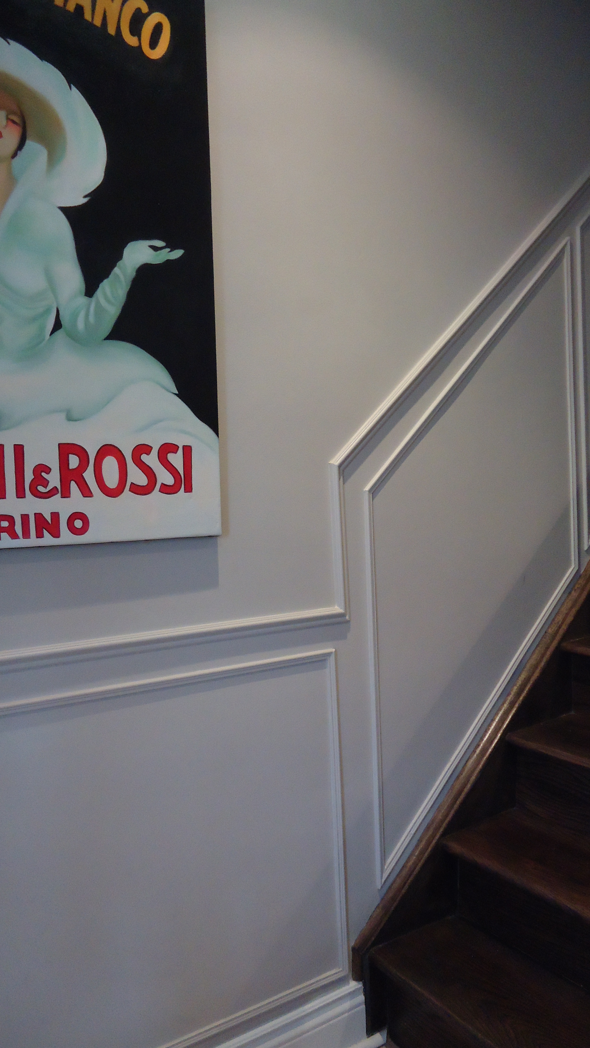
Here’s a before and after of a home where all the baseboards and door frames were white and the window trim was natural wood. The wood looked completely out of place. Now we added a few things to make this home special. We added wainscoting and crown moulding as well as painting out the window trim.


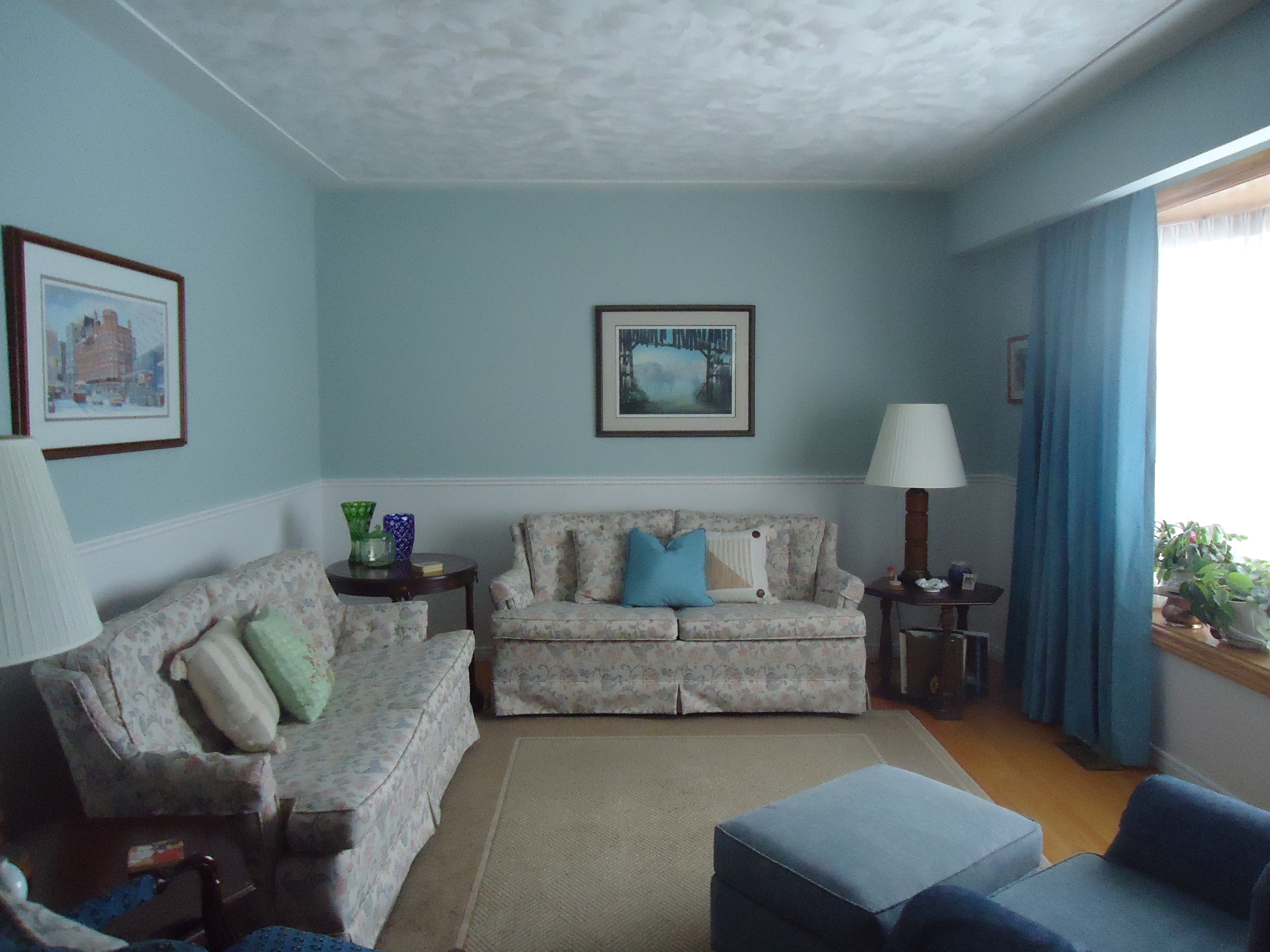
White ceilings, white trim, white crown moulding, white wainscoting, this home now looks warm, elegant and traditional, with a unified feel.

When you have or add wainscoting, make sure that it is white…not the same colour as the wall and for all that is holy not some other random colour. Wainscoting is a very traditional element and you can’t make it contemporary by painting it something other than white. If you don’t want a traditional feel in your home, don’t have wainscoting.


Much nicer! The white wainscoting makes the space feel larger and makes the wall colour stand out.

Many people think it is blasphemy to paint wood. Wood is not sacred and it can be painted. It’s not a sin!

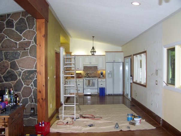
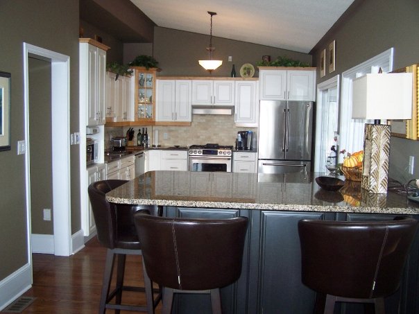
This next home is a lakefront property that at one time was a cottage. The new owners wanted to rid the home of the cottage feel and the best way to achieve that was to “gasp” paint the wood trim.


Sure, a lot of other things were done…new appliances, new lighting and an island, but the white trim made a significant contribution to ridding this home of it’s cottage feel.

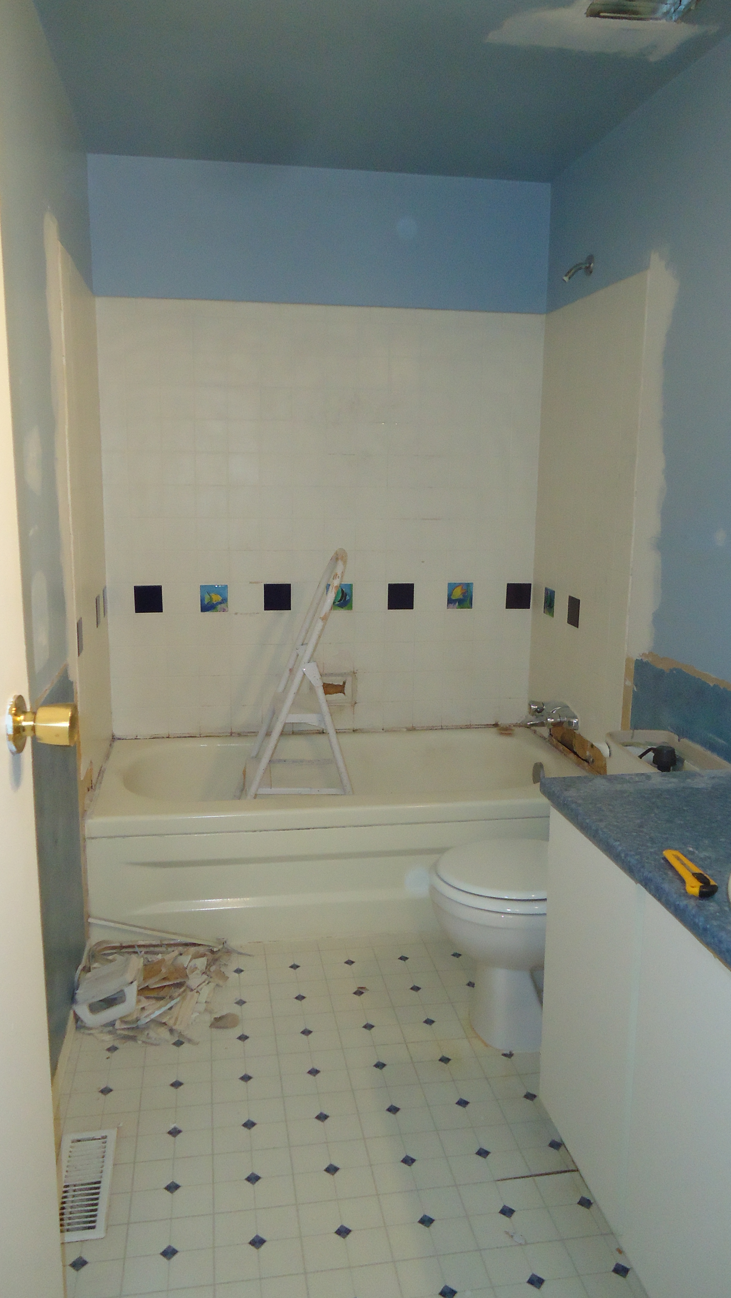
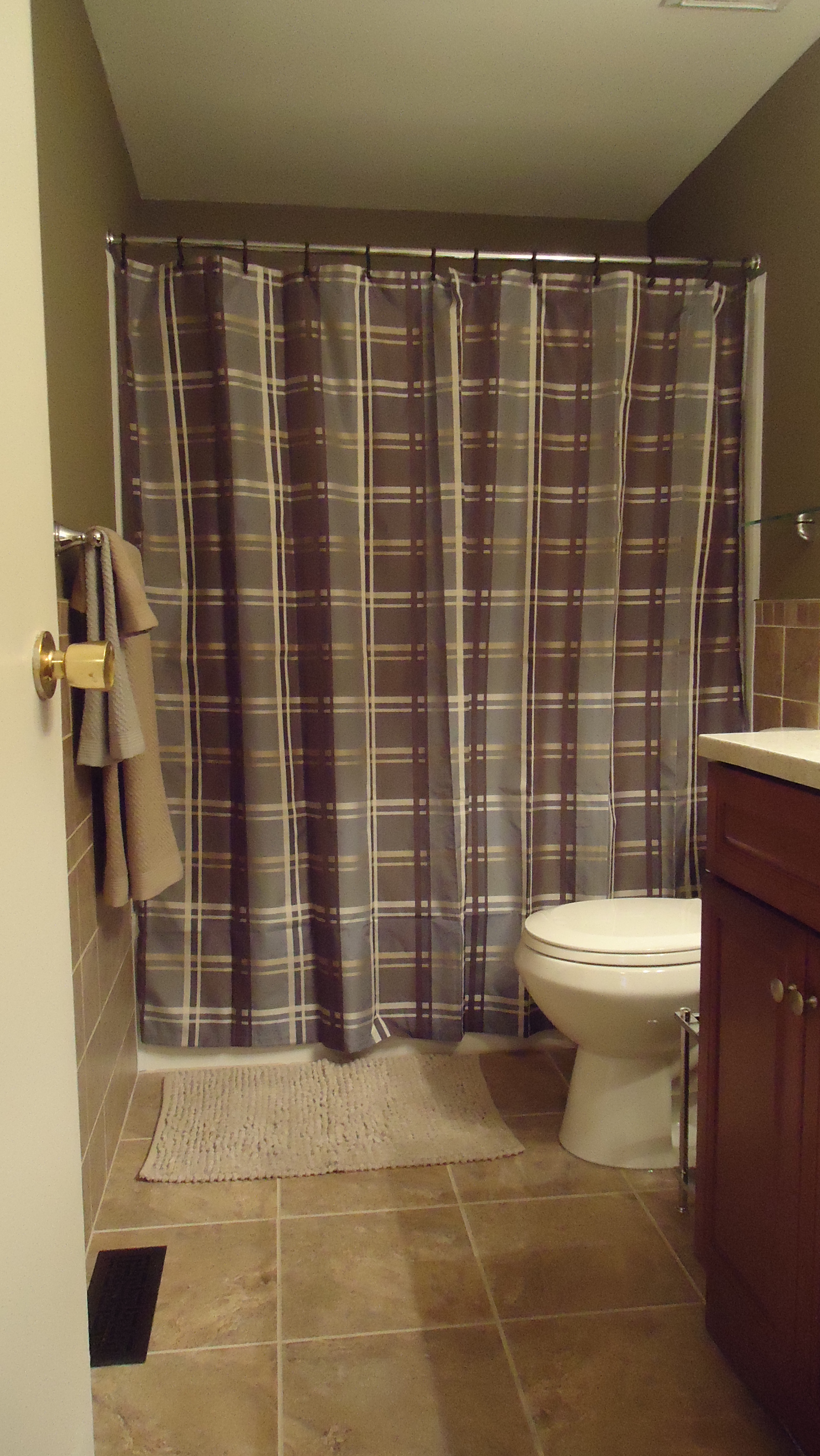
Here’s a bathroom where the old ceiling was blue, the same colour as the walls. After the makeover, the white ceiling made the room feel so much larger and much more elegant.


Hopefully, I have presented enough evidence to convince the doubters that trim and ceilings are WHITE. That’s it. No debate, no but what ifs, trust me on this, take it on blind faith and paint your trim and ceilings white.

You will thank me!

Posted in Colour and Paint | 2 Comments

Sometimes Ikea just gets a bad rap

I like Ikea. Go ahead, shoot me…see if I care. Sure, some of their stuff is junk, but, they also have some great things that are a terrific value and as good as anyone else’s.

I wouldn’t buy their sofas (after a year the cushions are flatter than flat) but I’ve used their Billy bookcases a zillion times and their kitchen cabinets are fantastic. The best thing is that a lot of their stuff can be customized either by purchasing the things you need to make them fit your lifestyle or by customizing them yourself.

That’s what I do. I take stock Ikea cabinets and bookcases and customize them into something fantastic.

That’s the subject of my next few blog posts. I’ll show you how I’ve taken stock items and made fully custom built-ins from them.

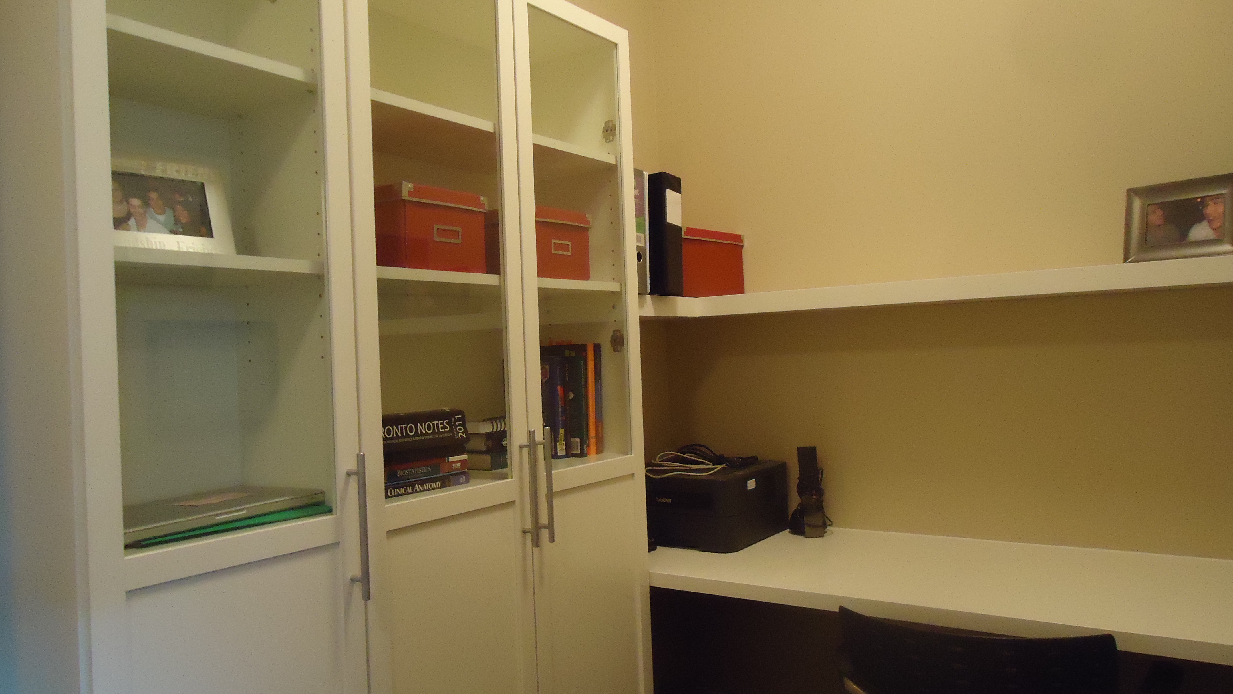
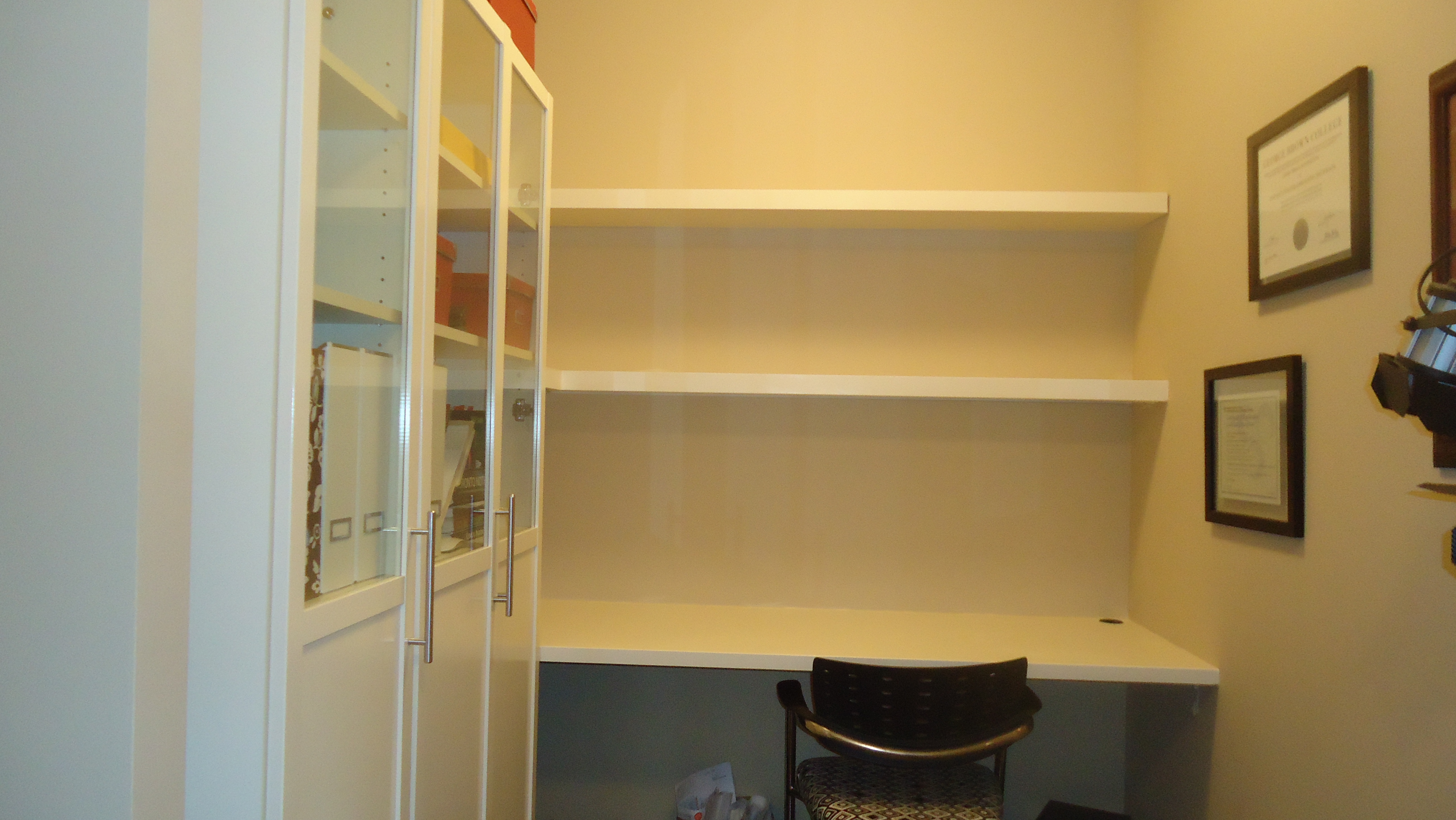
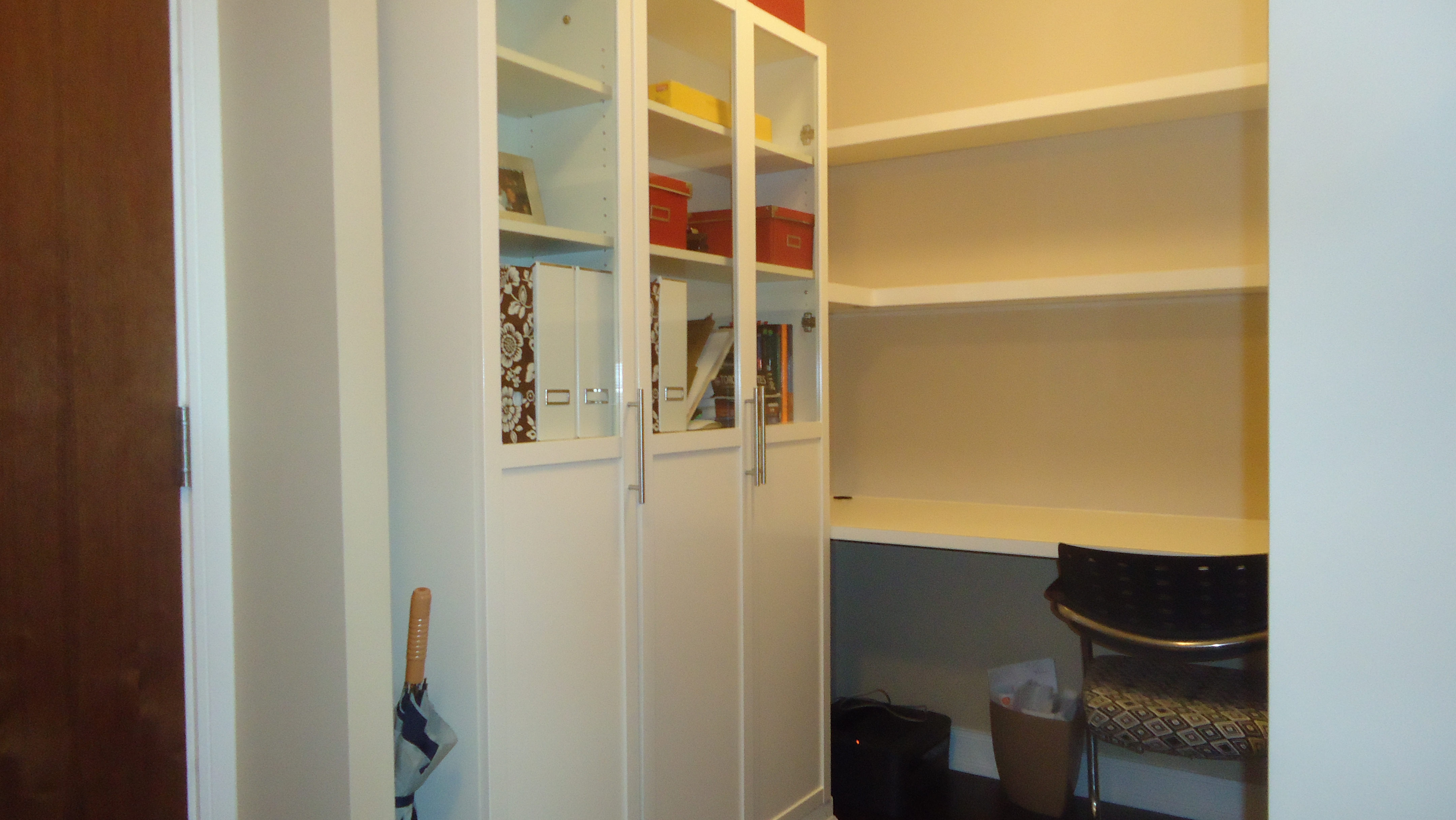
The first one is a very small den (the size of a walk-in closet) that I did. It was a bit of challenge trying to fit lots of workspace and storage into such a small space and have it look appealing, but in the end Ikea came though.

The plan was to build a built-in desk unit with storage and shelving.


The first thing I did was to remove the baseboards on the left side of the den to allow the cabinets to sit flush against the wall.

Then I installed 2 Billy bookcases (one wide and one narrow) and installed doors. I then re-installed the baseboards running them around the base of the cabinets to give a built-in look.


I took a stock Vika desk top and cut it to fit the width of the back wall, then mounted a lack wall shelf, with a small piece added to make an L-shaped shelf.


To take advantage of the height I added a second shelf above the first.


The result is a built-in desk unit with tons of storage and ample work surface simply by using and modifying Ikea Billy bookcases and Lack wall shelves.

Posted in Custom Desks and Wall Units | Leave a comment

Toning down “The Ingalls”

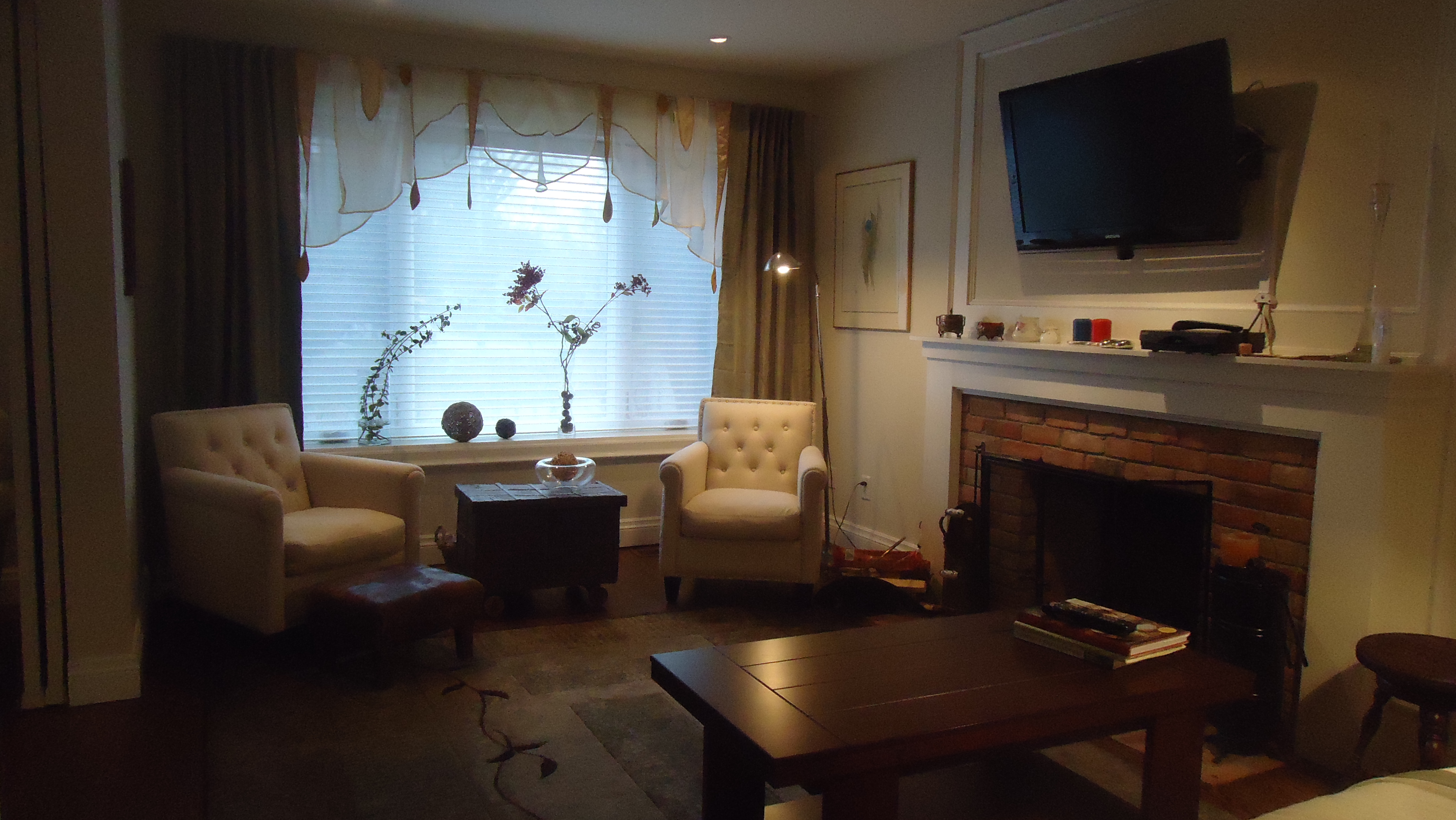
Remember Little House on the Prairie? Yes you do, even if you won’t admit it! Well, recently I took on a new client and as soon as I saw her fireplace I immediately thought “this thing belongs in the Ingalls cabin”.


The whole thing looks so out of place. There is way too much brick going on for an urban home, the wall trim doesn’t relate to it at all and the flat screen TV above just looks odd.

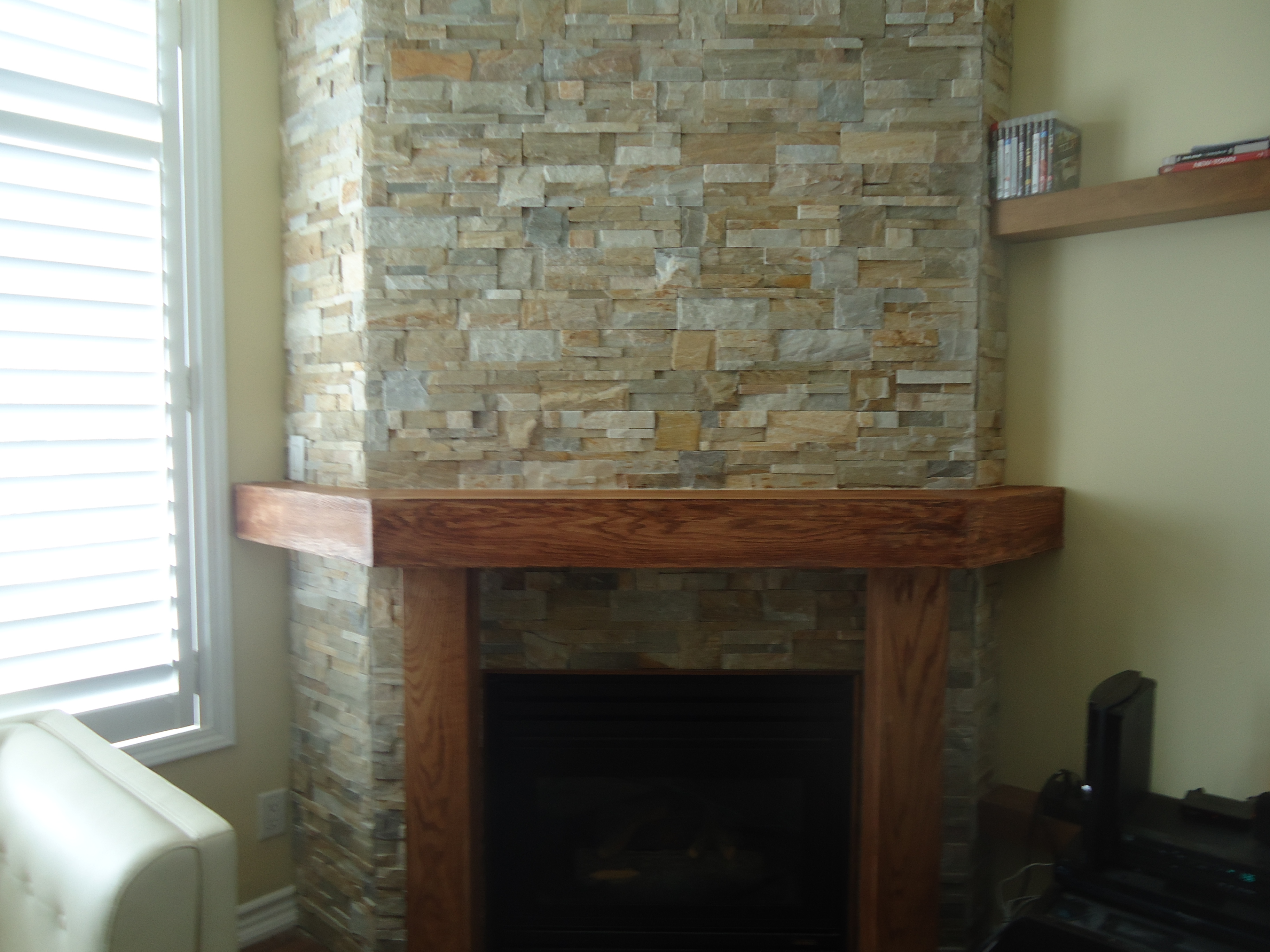
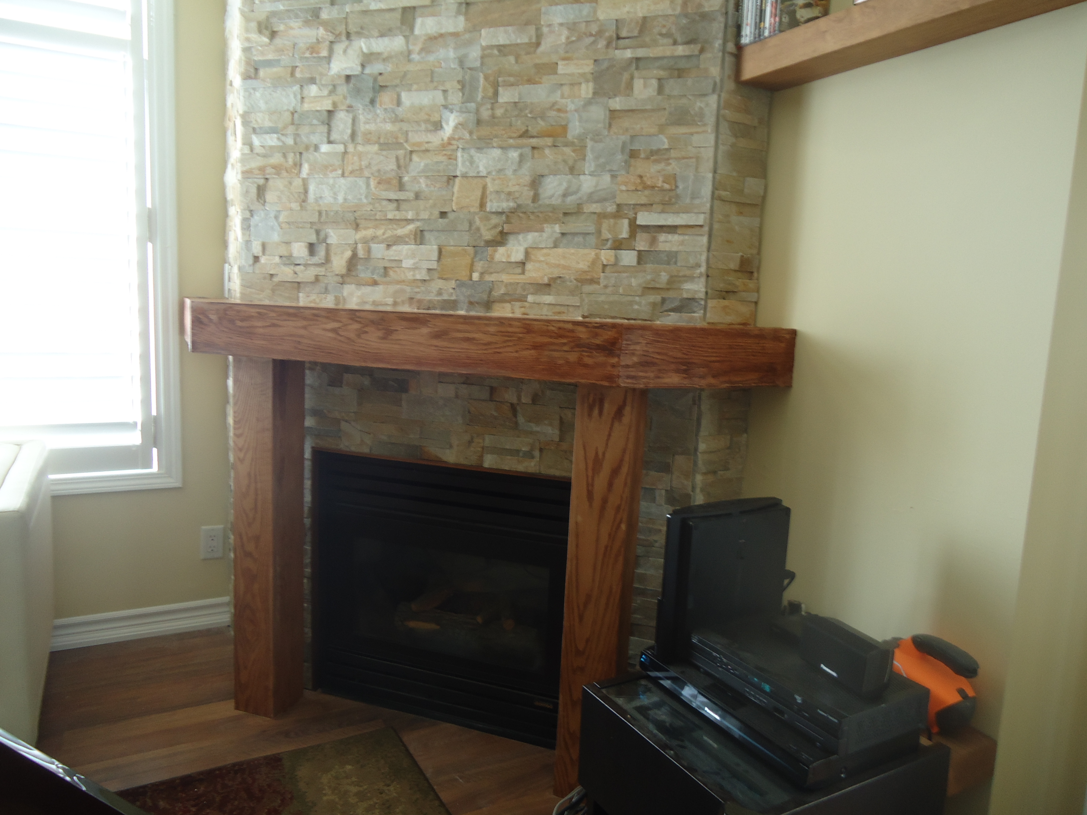
I don’t mind a little brick showing so to tone down the pioneer feel I decided to add some cladding to the fireplace and integrate it into the wall trim and then paint out the oak mantle.


The result is a fireplace that is much more inkeeping with an upscale urban home. It was easy, simple and best of all, very inexpensive.

Posted in Fireplace Makeovers | Leave a comment

Another fireplace makeover, of sorts

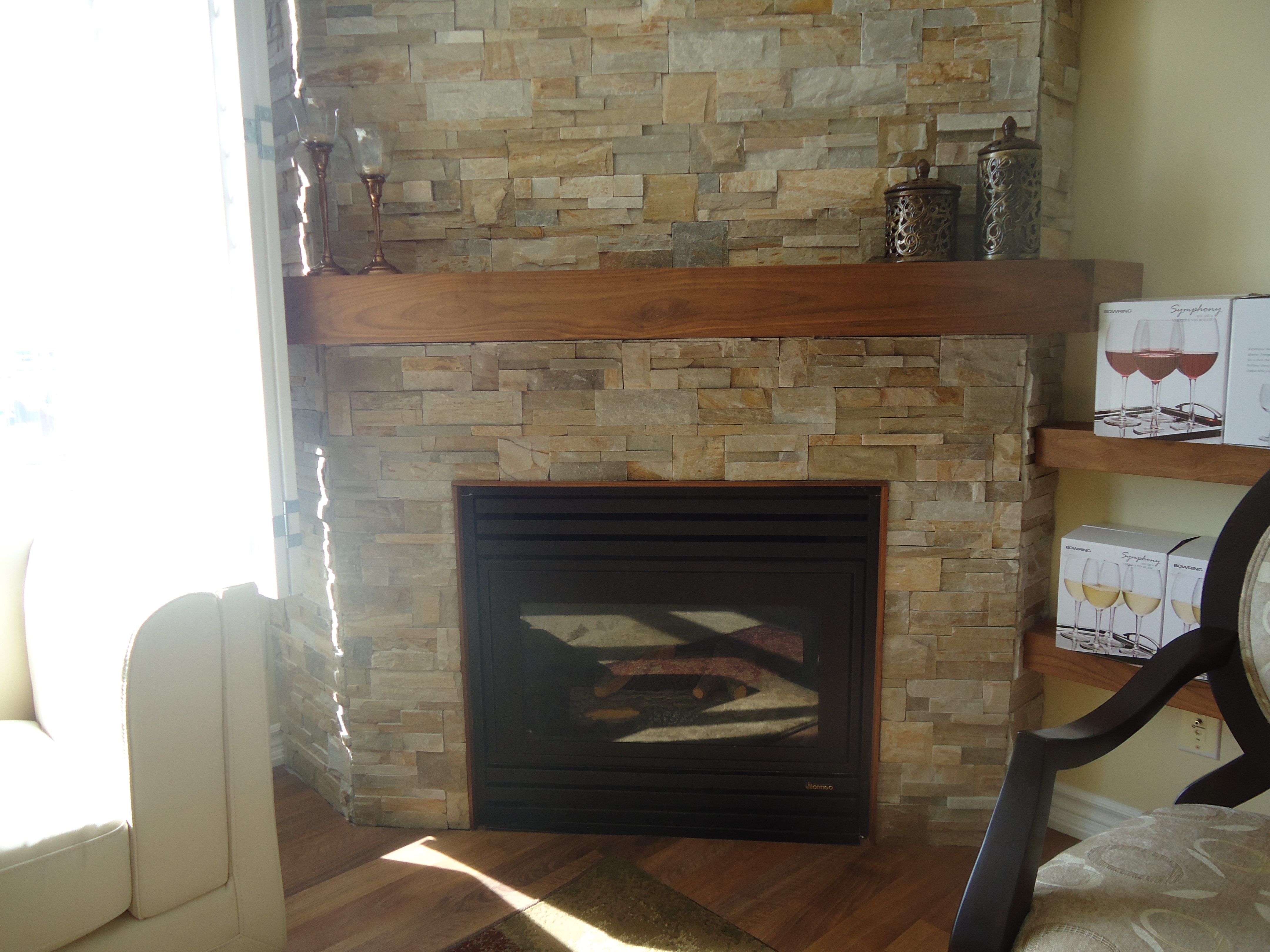
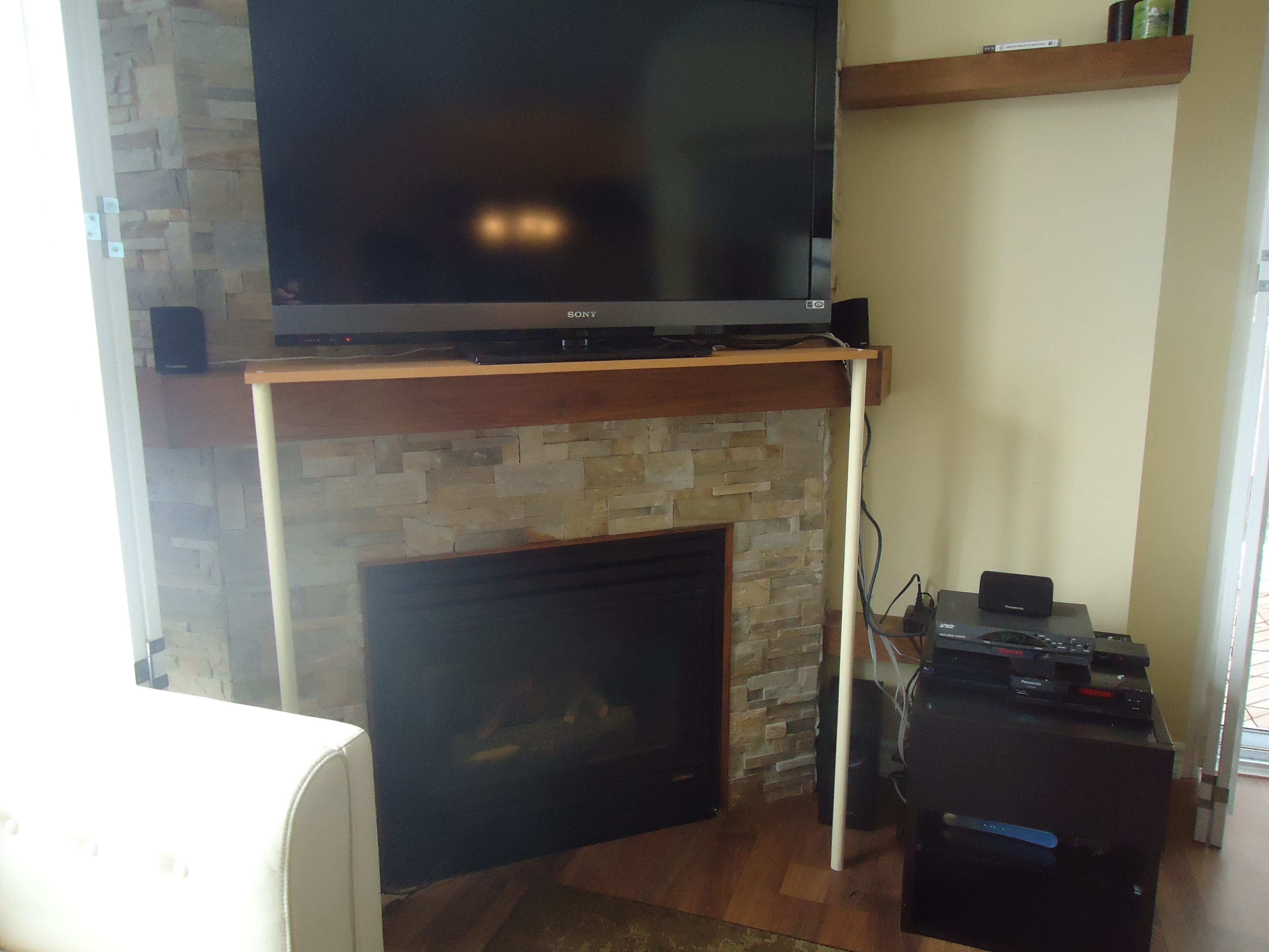
Last summer I completed a home for a client and one of the issues we faced was how to mount the TV over the fireplace. Since the fireplace was faced in a faux brick facade, we were unable to determine what was behind, so mounting the TV on the wall presented a unique challenge.


We considered the option of simply sitting the TV on the mantle. Of course, the mantle was too narrow, so a shelf had to be added with two dowels for support. A reasonable temporary fix, although not overly attractive.


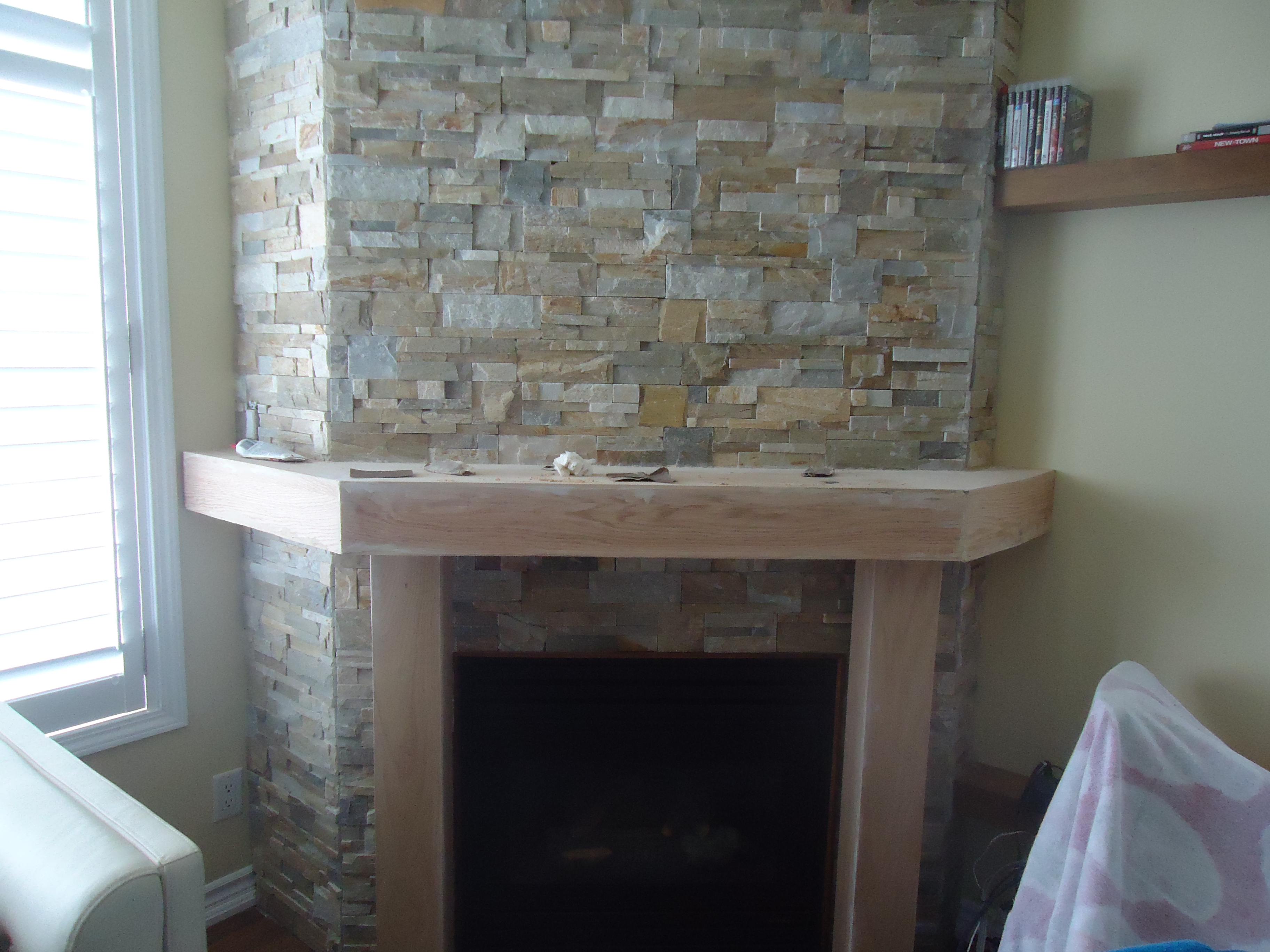
This past week I went back to construct a more attractive, more permanent solution.

I removed the shelf and extended the front of the mantle by about 6 inches, giving us 12″ front to back in total and then added two columns underneath for support.


Posted in Fireplace Makeovers | Leave a comment

Some decorating Rules of Thumb

As an Interior Decorator, I see a lot of homes…A LOT…and I am continually amazed by what I see, and not in a good way. Too often I am left in awe wondering to myself “what were they thinking” or “who thought that was a good idea”.

The biggest single complaint people have about their homes is that there is no flow and the place feels disjointed, it doesn’t feel cozy or relaxed.

Sooooo, here are some general rules to follow that will help you achieve a coherent look to your home and create a relaxed, inviting space.

1. Artwork.

Boy, is this a struggle for most people. I see artwork that is hung too high, hung too low, too big for the wall, too small for the sofa, every single inch of wall covered by something. Frankly, what I see more often than not is an absolute mess. It’s as if the artwork is hung by new owners on nails left there by previous owners.

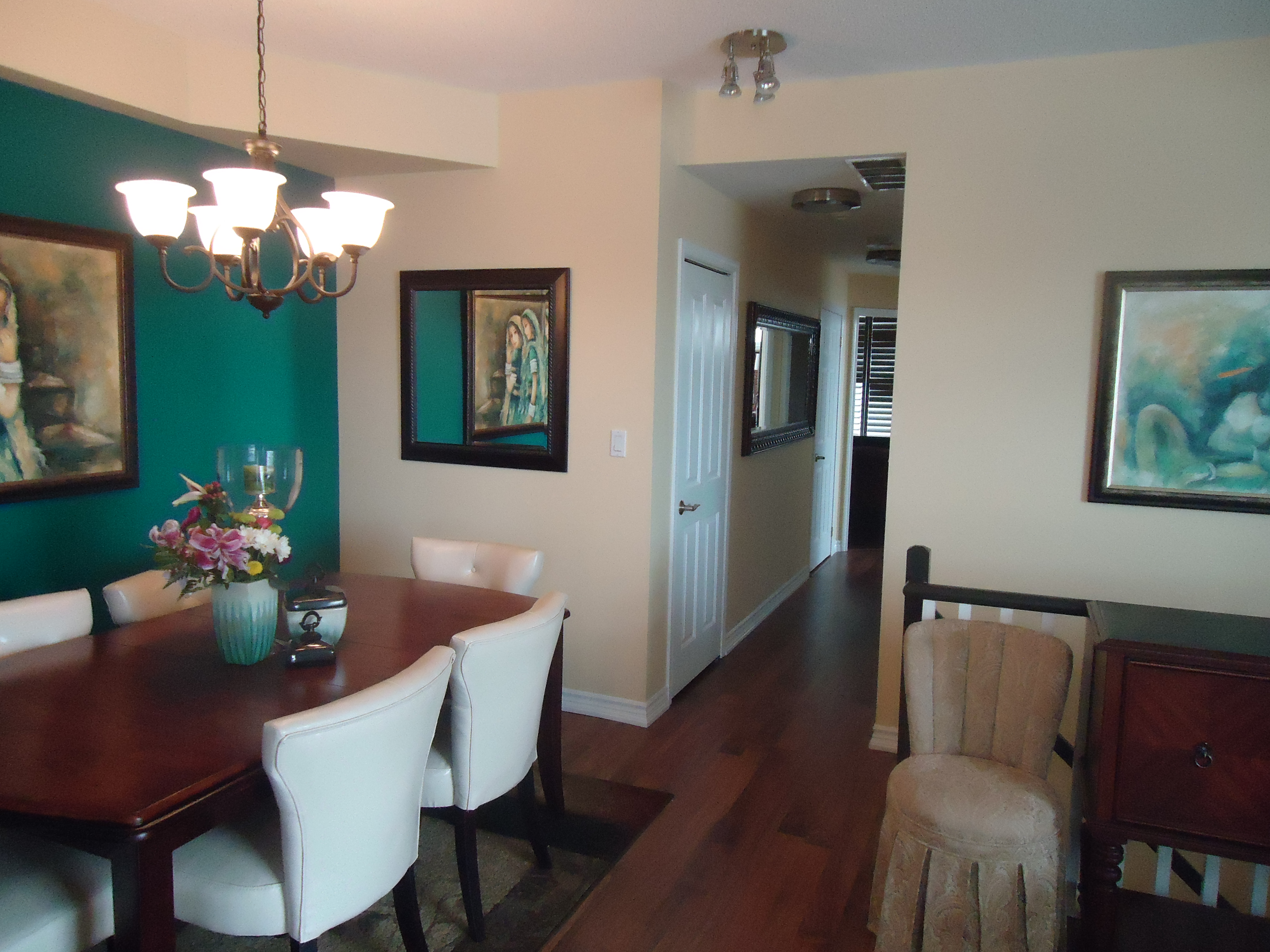
So keep these tips in mind. Hang all your art (and mirrors) 60″ from the floor to the centre of the piece. This will ensure that all your artwork is at a comfortable viewing level for most people and that there is a consistency and a flow.

If you’re hanging a piece over your sofa, make sure it’s width is about 2/3 of the width of the sofa. Your 8 X 10 graduation diploma does not go over the sofa, no matter how proud of it you are. It’s simply too small. Hang art at about 10″ above the sofa (or other furniture piece).

Choose one piece for each wall as a focal point and don’t hang multiple pieces together unless they are part of a grouping. If you are doing a grouping, the centre of the group should be 60″ above the floor. If you have a long wall, use one piece of art and perhaps a mirror. You don’t want your art competing for attention.


2. Rugs

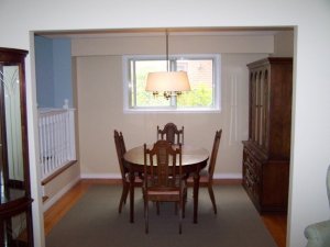
Most people have area rugs that are waaaaaaaaaay too small. An area rug is to anchor and define a space (i.e.) living area, dining area. In the living area, the rug is not supposed to fit just under your coffee table. At least the front legs of the sofa should be on the rug and opposite that, if there are chairs, their front legs should be on the rug. Ideally an area rug should  end up about 18″ away from the walls. When this isn’t feasible, then follow the previous rule.
If you are putting a rug in your dining area, the rug should be 24″ larger than the table. This will ensure that the chairs stay on the rug when they are pulled out.


3. Patterns

Don’t mix too many patterns too close together. A checkered sofa mixed with with paisley cushions and poka-dot draperies is just confusing and can actually make you feel agitated (or maybe just me).

If you have a solid sofa and draperies, you can go with a patterned rug and cushions. Conversley, if your sofa has a bold pattern, go with a solid rug and draperies. You might be able to get away with a subtle stripe, but that’s as far as I would go.

4. Lighting

I do a lot of condos and you would not believe the amount of track lighting I see. Perhaps, it’s because track lighting is a fairly contemporary look which bodes well for condos. Track lighting is far too directional to provide overall illumination for a room. Track lighting works well as task lighting (over a counter or cook top) or to highlight a piece of art, but for general lighting, it just doesn’t work AND if you happen to look up at it, you will be temporarilly blinded.

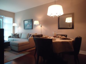
For general illumination choose a flush or semi-flush ceiling fixture, then add some table lamps or a floor lamp for mood lighting and a small lamp as accent lighting. Rooms should have multiple light sources.

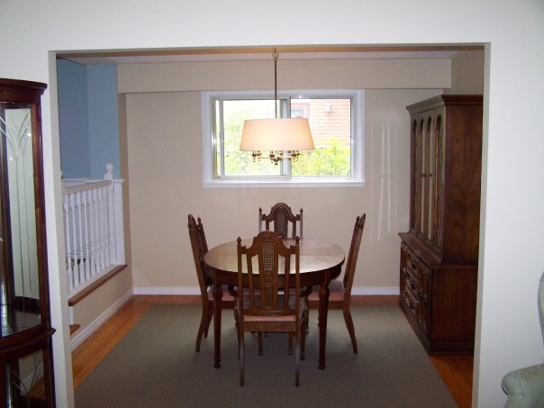
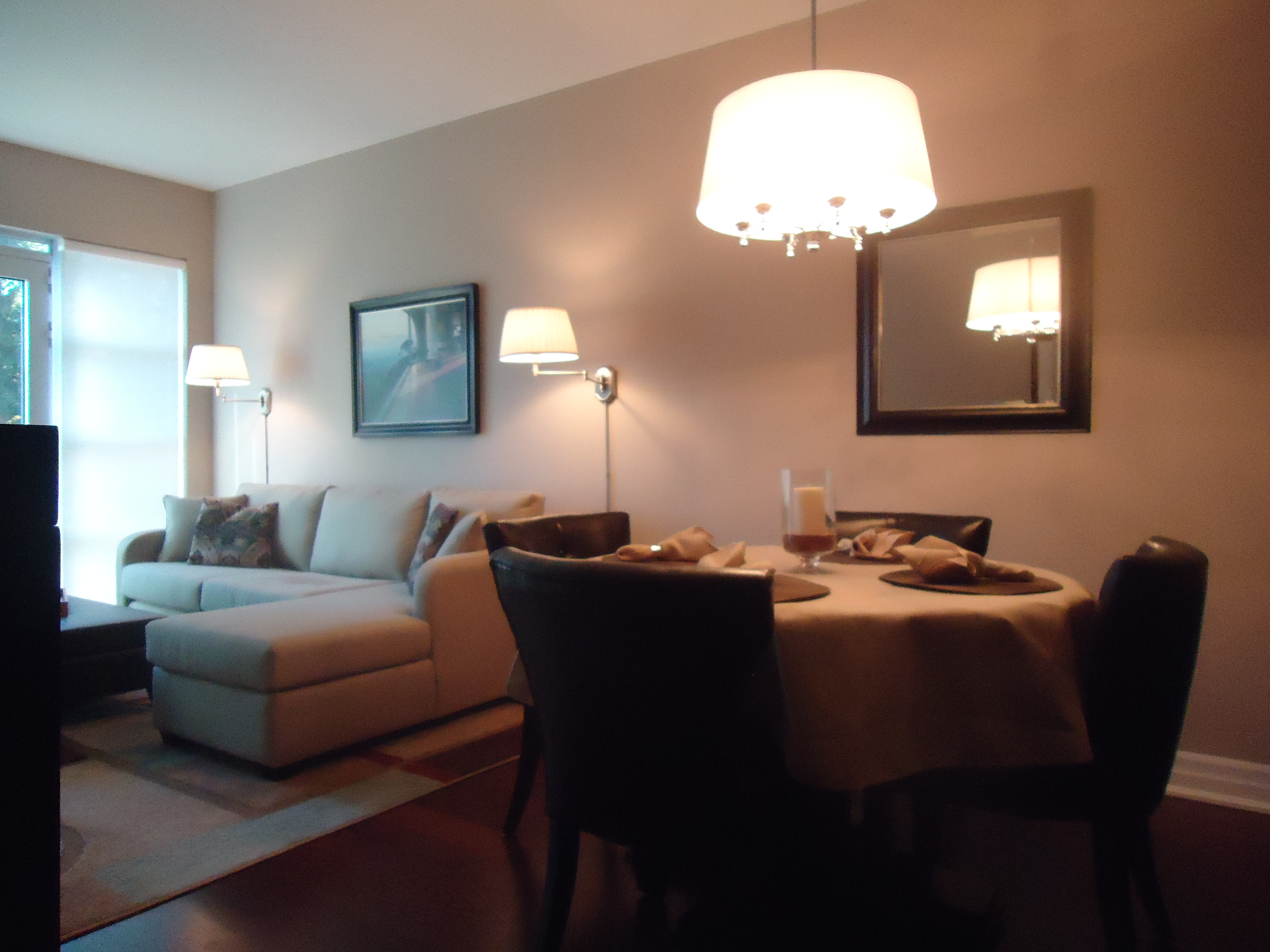
In the dining area, the chandelier should hang 30″ above the table for average ceiling heights and 36″ for 9 or 10 foot ceilings.  This ensures that the 2/3 rule is followed (the chandelier will be 2/3 above the floor).


So there you have it. Four simple rules that will reduce your stress (and mine) and help you achieve a cohesive look in your home, creating a relaxed, inviting environment.

Next time, a few rules to follow when it comes to trim work and paint.

Posted in Uncategorized | Leave a comment