Custom closets by Schulte

I’ve done a lot of closets in my time, but usually I’m replacing the cheap metal racks with something more practical and frankly, usable.

This is the first time I’ve designed and installed closet systems in a new construction home.  Well, newly renovated at least.

This is a hone that I’ve done a lot for work on in the past and was called in by the client to design and install closet systems for five upstairs closets in her newly renovated second story.

See my prior posts for more on this beautiful home:

http://smallspacestyle.org/2011/12/03/toning-down-the-ingalls/

http://smallspacestyle.org/2012/04/01/1920s-etobicoke-two-story/

What made this project particularly challenging was that the home is actually a story and a half not a full two story, so the closets had sloped walls and/or ceilings. They were odd shapes and odd sizes and only one was what most people would consider “normal”.

In the design, I had to account for towel and linen storage, shoes and boots, purses, short and long hanging items and  sweaters and tops and I had to account for the odd shaped closets.

There are a lot of system on the market, but there are a few that I really like.

Easy Track http://www.easytrack.com/easytrack/ is a wall mounted system that is extremely versatile as is the similar system available through Home Depot from Martha Stewart http://www.marthastewartclosets.com/

The only problem with those systems for this project is that they are full height systems and wouldn’t fit in the closets due to the sloped walls and ceilings.

The best system I could find for this project was a system available through Solutions from SCHULTE http://www.marthastewartclosets.com/

Like the others, it is a wall mounted system but it is completely customizable and much more versatile and would work well with my odd shaped closets.

This first closet is in the master bedroom and has shelving for purses and sweaters and a four foot hanging rod for long clothing items.
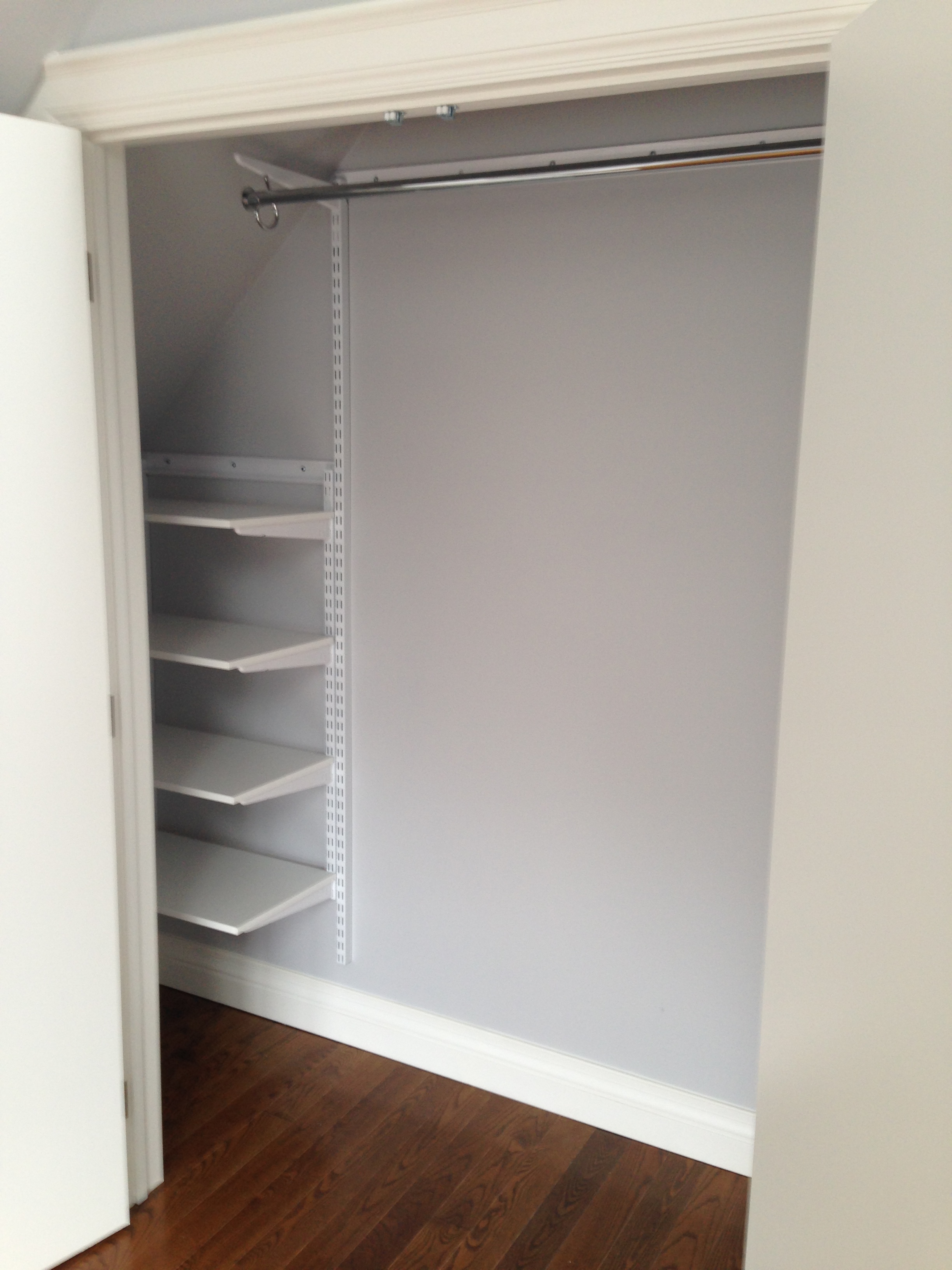
IMG_0639


This closet is also in the master and has one shelf for smaller items and a low hanging rod for shorter clothing items.
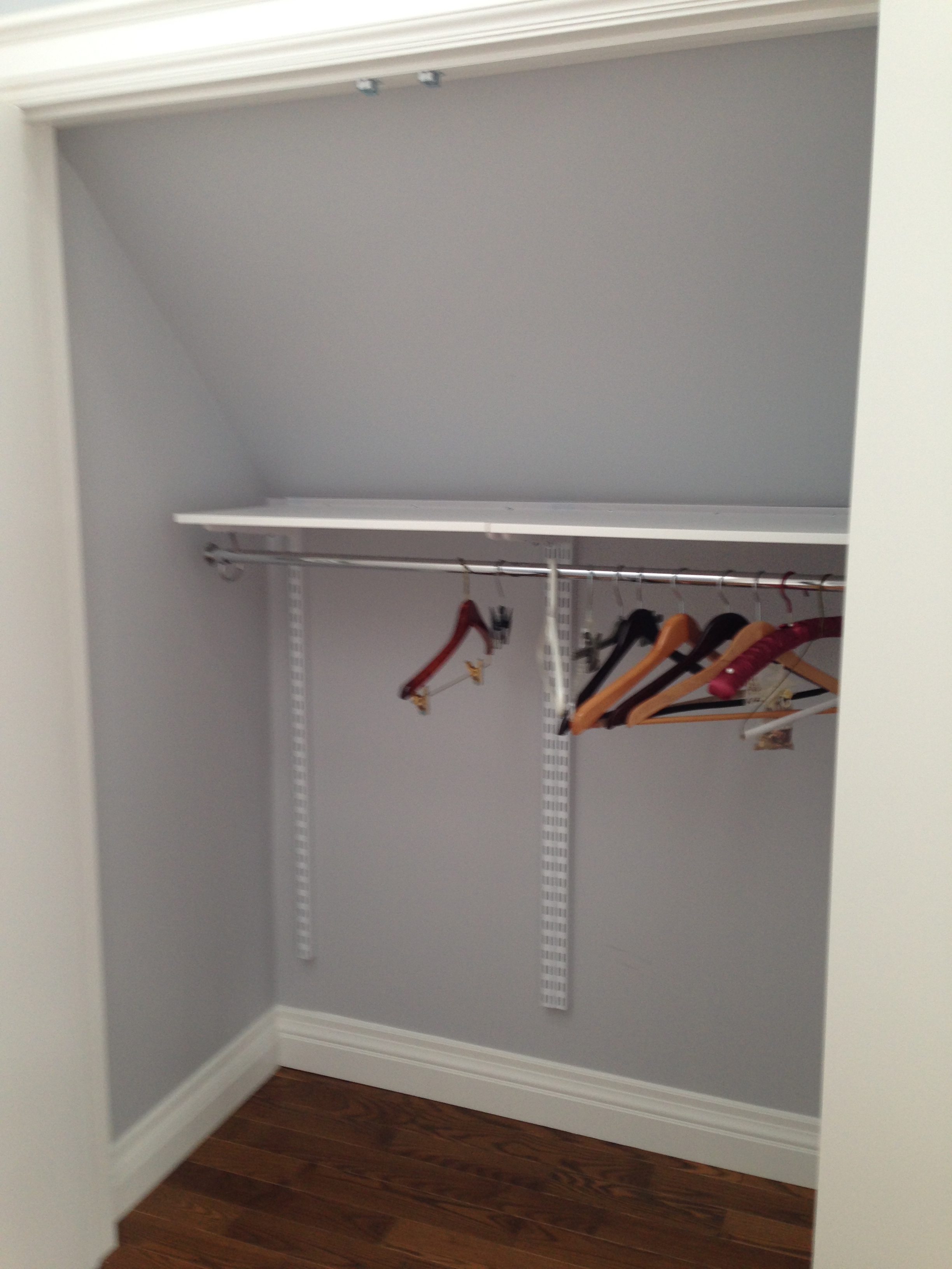
IMG_0637


We decided to use the crawl space, which is also in the master bedroom, for shoes, so I installed a shoe storage rack system from Rubbermaid available at most big box stores  http://www.rubbermaid.com/Category/Pages/ProductDetail.aspx?CatName=ClosetShelving&SubcatId=ConfigurationsClosetKits&Prod_ID=RP091160&Redirect=1

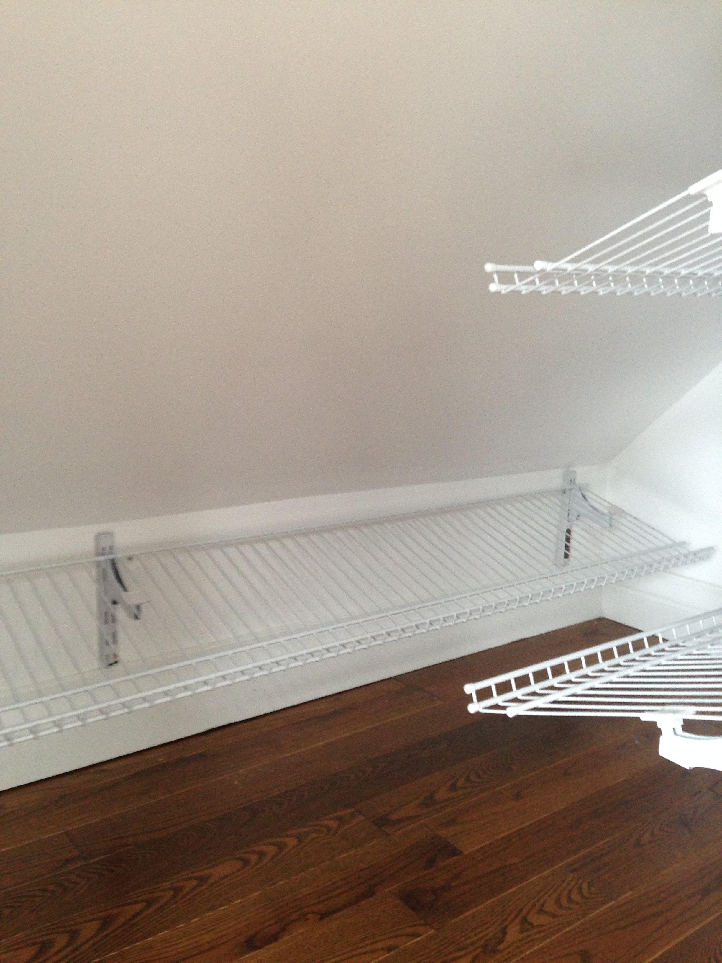
IMG_0640 IMG_0641


In the guest room closet (the only normal closet), I was able to install two rows of shelves for sweaters and tops, a long rod for hanging items and a stack of shelvng “boxes” for towels and linens.
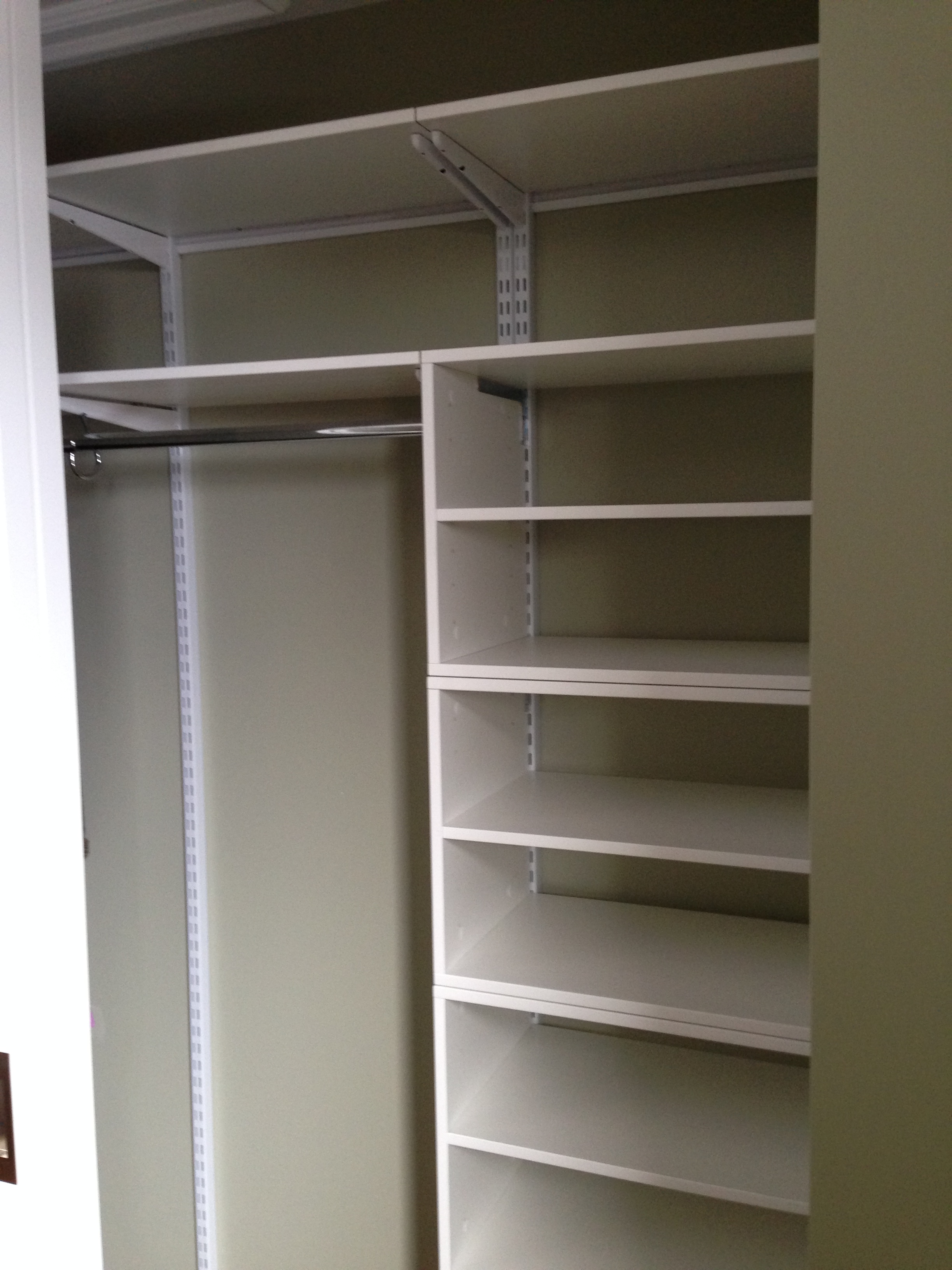
IMG_0660


The best part about these systems is that you can change them over time as your needs change. You can simply add more rods, more shelves, some drawer units, whatever your needs dictate, simply and economically. No need to tear everything out and start again.

Before you begin ANY closet makeover, make sure you have a good handle on your needs so you don’t end up with too much of one thing and not enough of another and do a little research to see which system will best suit your needs and your home.

Posted in Closets and Storage Solutions | Leave a comment

Bayview Mills Part 1

I’ve seen a lot of bathrooms in my time as a designer, but this one was definitely the worst.

Reminiscent of what you see in a dark, dingy, seedy 1980s night club (so I’ve heard), there was not a single redeeming quality about it.

From it’s gold trim and black painted wallpapered walls and ceiling (yes, I said ceiling) to it’s vanity counter top with faux water puddles (yup), it was absolutely horrible.

Everything single thing had to go.

IMG_0446


The original plan called for removing the wallpaper, but after uncovering a second layer of wallpaper (pink roses likely from the 1970s) under the first, we soon realized that the quickest and easiest solution would be to tear down the walls and start again.

IMG_0533


With the old walls gone, we could now hang the new drywall. A special shout out goes to Kyle Bounds of KB Contacting and Carpentry who we sub contracted to do the drywall.  He did a fantastic job and I would highly recommend him. Contact me for his information.

IMG_0549


Next was a few coats of primer and paint.

IMG_0601


When we brought in the new vanity, we discovered, as I had suspected, that it didn’t entirely cover the tile floor and part of the sub floor was exposed. Not wanting to go through the time and expense of replacing the tile floor, we found a fantastic floating vinyl floor that locks together, goes right over the existing floor and at only 1/8″ thick, was the perfect solution.

We chose a floor that looked exactly like travertine.

If you’re looking for an easy and inexpensive way to update your tile flooring, have a look at this product:

http://www.lowes.ca/vinyl-flooring/versaclic-12-in-x-24-in-travertine-marble-floating-vinyl-tile_g1536191.html?isku=10668420&linkloc=cataLogProductItemsImage&linkloc=reCanonical

With the new floor installed, we could bring in the all the fixtures and finish the trim.

The result is a bathroom that is clean, modern and tasteful. A stark contrast to what it was before.

IMG_0782


IMG_0783


IMG_0784


Posted in Bathroom Makeovers | Leave a comment

The Domain – Part 2

It’s funny how one thing leads to another.

I had done a home office, bathroom makeover and fully furnished this condo in midtown Toronto, when my client approached me with an issue.

He was having to run his dishwasher twice a day and he was very frustrated.

At only 17″ wide, it would only hold a pot or two and a couple of plates. While it would be perfect in someone’s basement bar, it really wasn’t practical in a condo.

I suppose, in an attempt to conserve space, the builder supplied almost ALL undersized appliances, not just the dishwasher. The stove was 24″ wide but had a 30″ wide microwave above it (oddly, the only full szied appliance) and the fridge was, again, perfect for a family’s bar.

I was asked to weigh the options for replacing the dishwasher with a standard sized model.

The challenge of course is that you can’t just replace a small dishwasher with a larger one, not without changing cabinetry. To make room for a larger dishwasher meant stealing space from the adjacent sink cabinet, which meant a smaller sink and sink cabinet and a new countertop.

But, since you have to replace the countertop anyway, you may as well upgrade the stove from 24″ to the standard sized 30″ and also include a full sized fridge. And since the fan in the microwave was barely sucking anything, we could replace that with a range hood and then use a small counter top microwave, fine for defrosting.

So, out of my client’s frustration with his dishwasher, a complete kitchen renovation was born; 5 brand new full sized appliances, all new cabnets, a new granite countertop, a new sink and faucet and new lighting.

The result is a kitchen that functions properly, looks fantastic and has significantly more value to potential buyers. Have a look at the before and afters of not only the kitchen, but the main living space as well:


Posted in Before and Afters, Kitchen Makeovers | Leave a comment

Home Staging makes a HUGE difference

It’s a known fact that most people are unable to visualize. As children, we have no problem with it but something happens as we get older, and we seem to lose part of that ability.

When prospective buyers look at a home to purchase, they have a very difficult time seeing beyond what is there and visualizing what it could be.

That’s why there are model homes and suites; to help people see what the space can be.

Recently, in partnership with Jayne Lynde of House to Home Staging and Decorating, I did a small home staging job in a home that’s been on the market for two months. After a huge de-clutter it still needed some TLC to make it appealing to potential buyers. That’s where we came in.

With a very tight budget and no money to rent furniture, we used a lot of the home owners existing furnishings and employed a ton of creativity in order to fill the empty rooms.

In the master bedroom we used a double air mattress mounted on four Rubbermaid containers to create a bed and found a couple of old side tables in the basement that we used as night stands.

The second bedroom we filled with leftover furniture from the living room and created a nice sitting room.

We turned the third bedroom into a home office by building a desk from a couple of bookcases and some plywood and adding a couple of extra dining chairs. It may not be the prettiest thing you’ve ever seen, but at least it filled the room and will give people something to look at besides an empty room.

On a shoestring, we were able to transform this house into a home. The living room became warm and inviting and the empty bedrooms were brought to life.

What a difference………….

1 2 3 4 5 6 7 8 9 10 11 12

Posted in Home Staging | Leave a comment

The Printing Factory Lofts

For me, the best part of designing a loft is that, for the most part, you can throw all the rules out the window.

Just about anything works. You can combine styles, colours, design elements and nothing looks out of place. Go subtle, Go bold. Go crazy. It’s all good.

My most recent project was a converted “hard” loft at The Printing Factory. Built in 1913 to house the printing presses of Rolph Clark Stone, this Leslieville landmark blends the original 3 story factory with an 8 story glass tower and a cluster of townhomes.

The original features of the building were fully restored including the spectacular Carlaw entrance with it’s grand staircase and vaulted ceilings.

printing-2

This basement loft unit had all the features you would expect in a “hard” loft; exposed brick, polished concrete floors, concrete ceilings, exposed duct work and my client had a vision for his place that it was my job to bring to life.

He envisioned a space that would be rustic and charming, having a bit of a cottage feel but was concerned about how it would look in the end; would it look awkward and out of place?

Together we came up with a plan that combined rustic elements contrasting with modern features and vintage inspired furniture pieces and elements.

We wanted a feature wall but rather than simply have a painted accent wall, as the previous owners had done, we decided on a feature wall of barnboard which I sourced through http://www.barnboardstore.com a company that scours the country gathering up the remnants of fallen barns. For contrast, I mounted a silver vintage mirror and two contemporary brushed nickel wall lamps on the barnboard wall. Some leftover pieces were made into shelves for the bedroom and over the bar area.

We found a couple of amazing rustic furniture pieces at http://www.lhimports.com part of their “Rope-Me” collection and they couldn’t have fit in any better. An amazing wool “shag” rug and some modern vintage inspired furniture pieces completed the main living area.

For the kitchen I put up a beautiful mosaic tile backsplash combining glass, marble and stainless steel. Standing in stark contrast to the barnboard, but having a similar linear shape, the kitchen backsplash is stunning as it gleams and sparkles.

I absolutely love this place. It was so much fun to do and I am extremely proud of the final result.  The client is thrilled and in the end it is what he envisioned.

Have a look at the before and afters below:

1 2 3 4 5 6 7 8 9 10 11 12 13 14 15 16 17 18 19 20 21 22

Posted in Before and Afters, Kitchen Makeovers, Woodworking | 3 Comments

The Domain – Part 1

This is first of a few posts covering a project just about completed in mid town Toronto,

What began as a closet and den makeover evolved into furnishing the entire unit, a bathroom makeover and a kitchen renovation.

The den was part of yesterday’s post (so maybe this is actually the second post about this project).

IMG_2655


Today I’ll begin with the bathroom makeover.

The existing bathroom in this condo was a bit tired looking and wasn’t functional at all for the owner. Storage was an issue, the towel bar was behind the door on the wall furthest away from the shower (??!!!), there was a huge mirror taking up valuable wall space and the owner, being fairly tall, was looking for a toilet and vanity that would be higher than what was there.

Here is what the bathroom looked like before our work (yes, that’s me in the mirror)

DSC07127


You don’t have to spend a ton of money to makeover a bathroom. We changed the vanity and toilet, replaced the large mirror with a smaller one and a towel rack and added a second towel bar right next to the shower and a couple of baskets underneath for added storage.

The wall mounted vanity allowed us to raise the height of the counter to a level more comfortable for him and the drawers are much more functional than an empty cavern behind two doors. We chose a new toilet with the highest seat we could find which is also much more efficient than the one that was there.

The new bathroom not only functions much better but has a bolder and more contemporary look.


IMG_2668


A HUGE improvement!

Posted in Bathroom Makeovers | Leave a comment

Two home offices done two ways

Lately I’ve had a lot of requests to convert what is most often simply a large alcove (the builder calls it a den) into a functional work space.

Here are two that I completed recently and each is customized to the needs of the owner and each was put together a little differently.

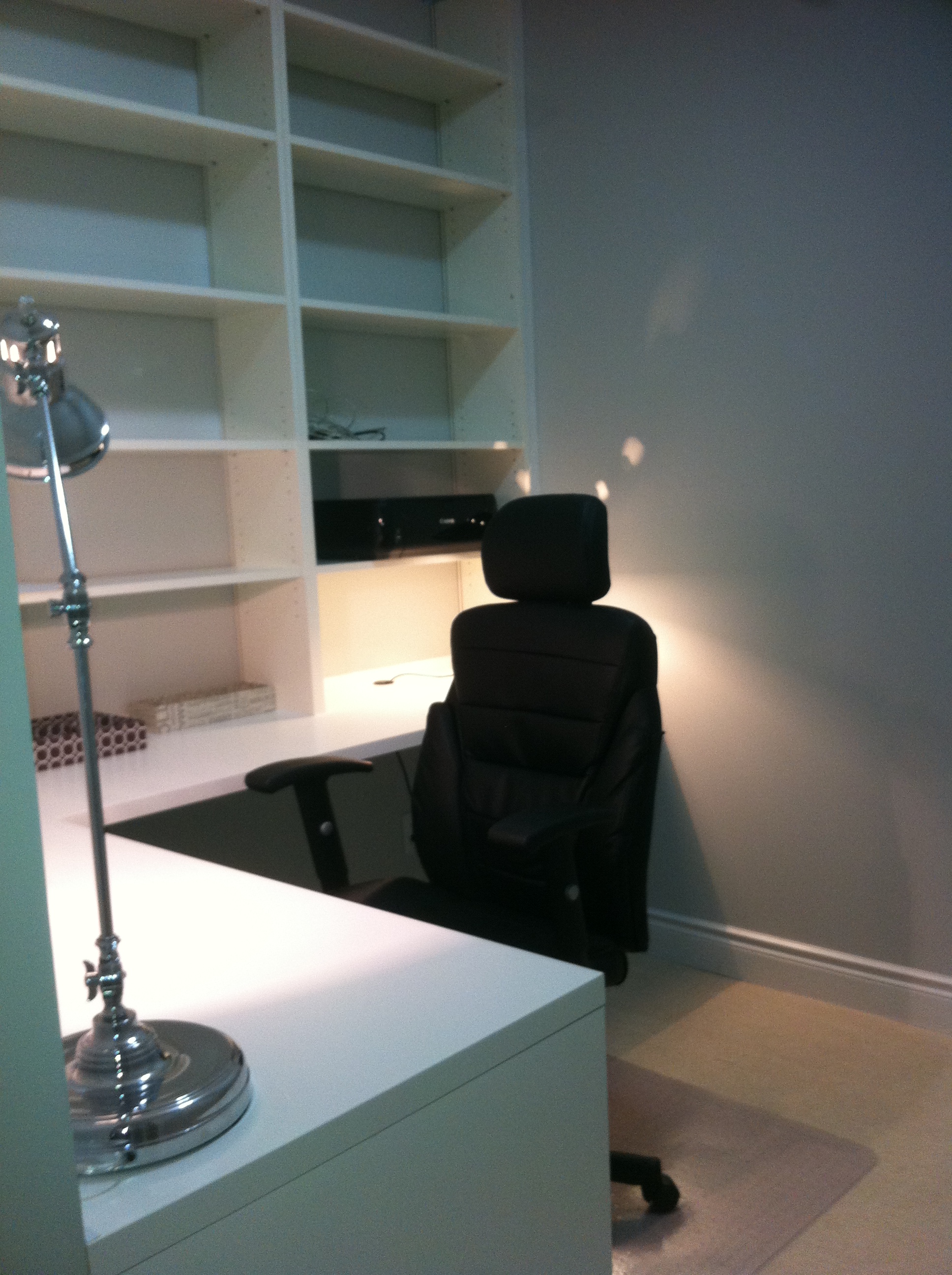
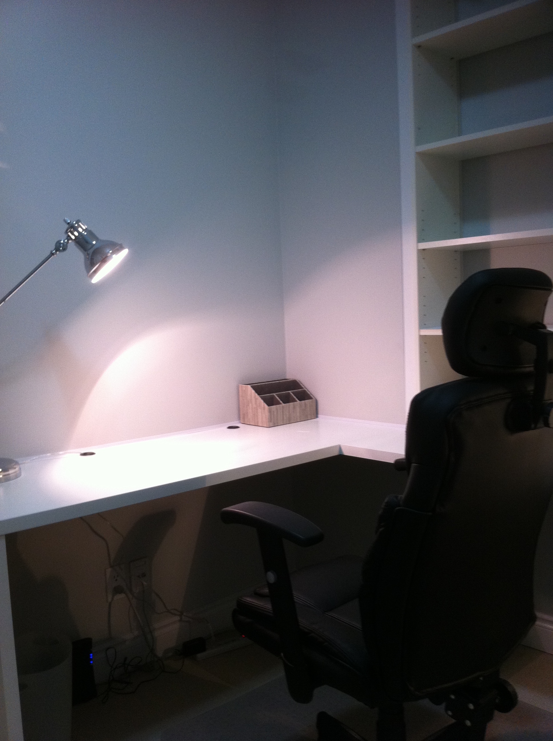
The first was done for a client who works from home and spends 12 hours a day in his home office. He needed a large work surface to spread out his papers and tons of shelving for books and binders.

We took three Ikea work tables and cut them to fit the dimensions of the room, creating an L shaped work surface from two of them and a desk side from the third. The tables were then mounted walls using L brackets and anchors.. We then took two Ikea Billy bookcases and cut the bottoms down so they would fit onto our work surface and reach the ceiling.

Then we added some trim pieces, drilled 4 holes and installed desk grommets and created an easy pleasing and functional home office.

IMG_2662 IMG_2659 IMG_2655


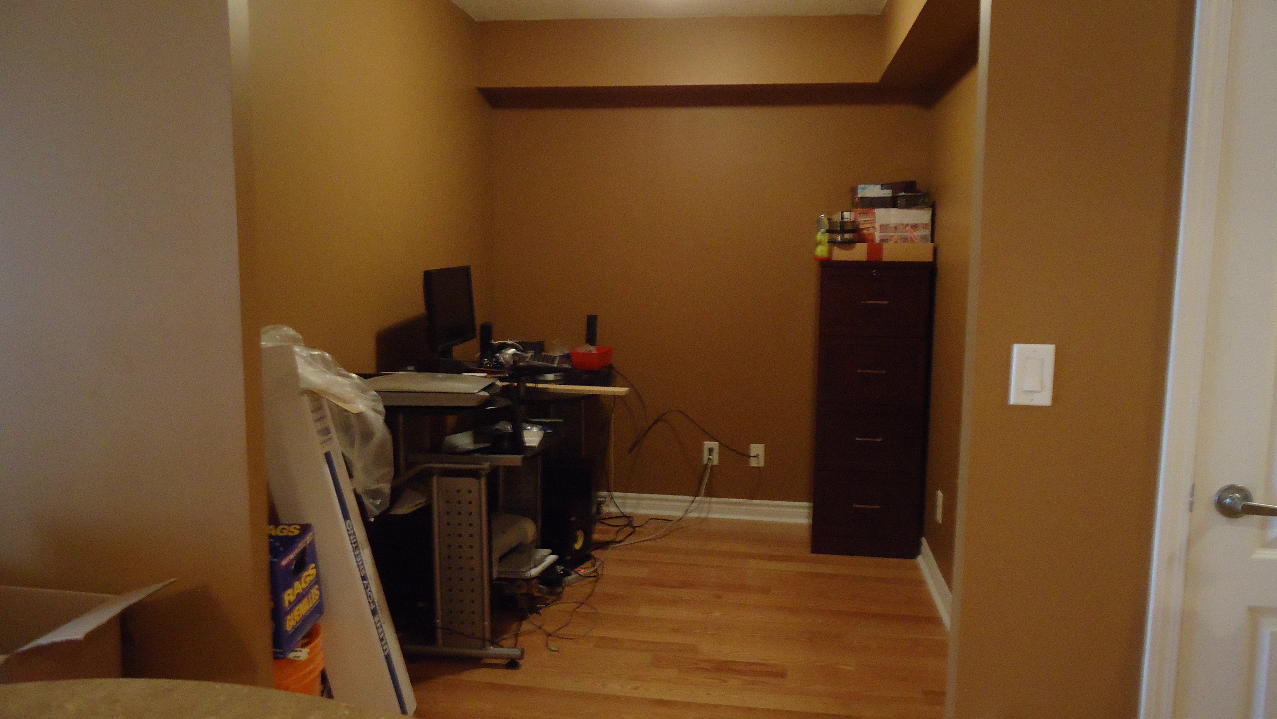
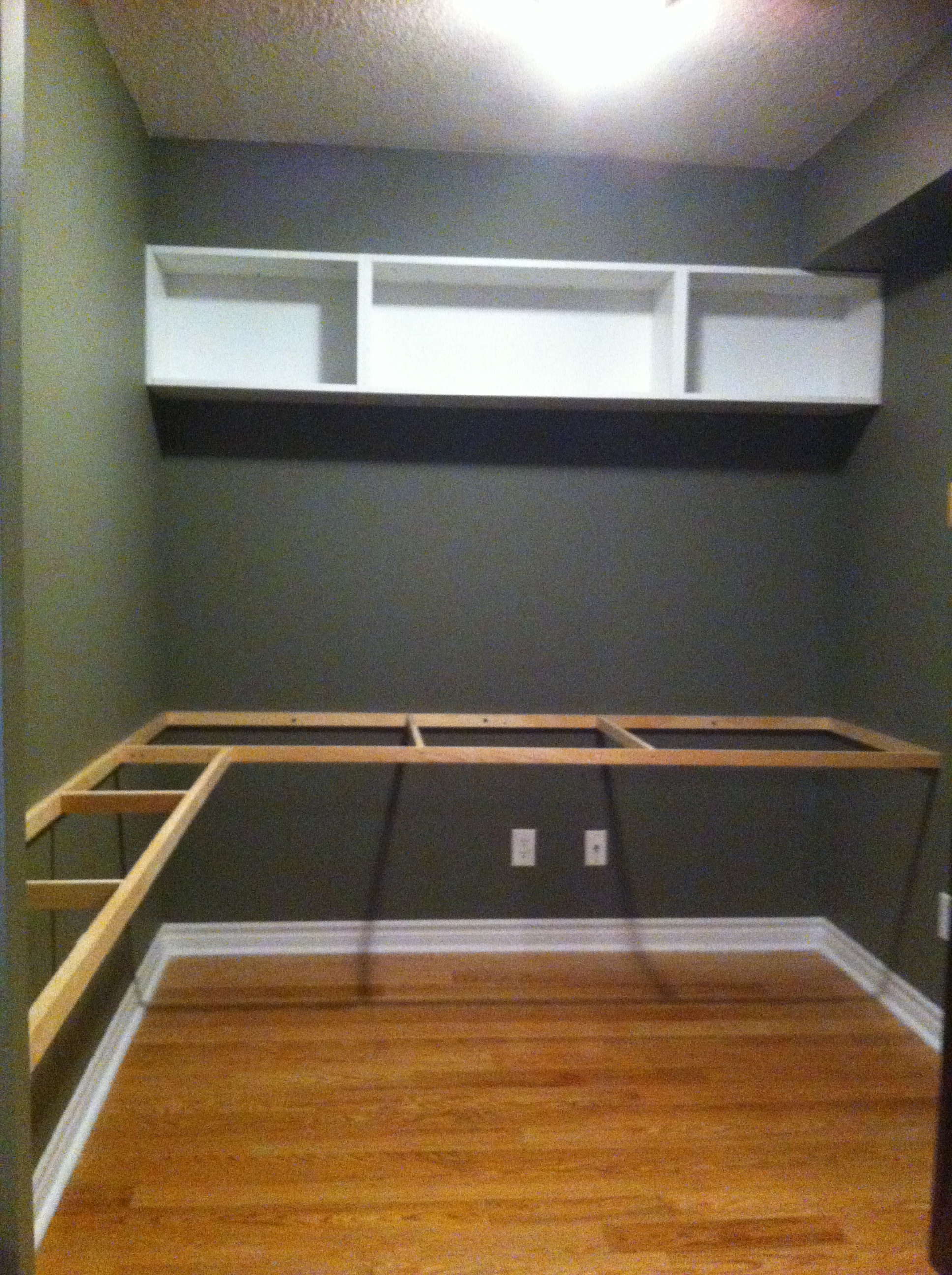
At the second condo, the client need a large workspace and a long shelf for monitors and keyboards as he does film and music editing. Book storage wasn’t an issue but some overhead closed storage was needed.

In this case, the back wall was too long for stock work table top so we had to build a frame from scratch and cut table tops from large sheets of melamine. We added a couple of legs and two angle brackets for additional support. For the overhead cabinets we used kitchen wall cabinets designed to go above a stove as they were the perfect size.

DSC07132

IMG_2483

IMG_2486IMG_2796


So there you have it; two custom designed home offices created to address the specific needs of each client. A little creativity and improvising can go a long way to turning a basically useless space into something that looks great and functions perfectly.

Posted in Before and Afters, Closets and Storage Solutions, Custom Desks and Wall Units | Leave a comment

Liberty Towers

Well, I’m glad this one is done!

Completing a renovation in a condo is challenging enough dealing with elevators, security personnel, parking and waste removal, but when you add in construction, traffic, two out of three elevators down for maintenance, furniture and unpacked boxes everywhere and clients constantly changing the plan and micro managing the work, this one has been unbelievably difficult and stressful.

The biggest issue for the owners of this unit was storage.

The first rule of condo living is de-clutter. The second rule is de-clutter. And the third, well, you get the point. Thee folks decided that instead of getting rid of some of the dozens and dozens of pairs of shoes, pants, jackets, crystal and china, we should simply find a way to house it all. No easy feat in a 600 square foot 2 bedroom.

To be able to do the impossible, we had to remove walls, move walls and build closets. the condo prior to the work looked like this:

BEFORE


And the proposed layout would look like this:

AFTER


Here’s some before shots:

5 3 1


The plan was to remove the two existing closets, giving a much larger living area, add in a pantry and wall up the den to create a new coat closet and a large walk in closet. A new closet would also be built in the 2nd bedroom. The final result is slightly different from the original proposal. The angled wall was replaced by a squared off one and a pantry “room” with floor to ceiling doors that open at right angles to each other was added as opposed to a store bought pantry unit that would slide in beside the fridge.

For obvious reasons, removing walls means laying all new floors, so the old floors had to be replaced and as long as we were doing that, it made sense to replace the carpet in the two bedrooms.

And if you’re laying new floors, then why not new baseboards and if you’re doing new baseboards then why not add crown moulding. And why not tile the kitchen since the floor is coming up anyway. And why not tile it on a 45 degree angle and add glass tiles in between all the floor tiles. And why not install louvred doors and more lights.

Yes, this project took on a life of its own as things were changed, added and removed and time dragged on. But, in the end, the clients have a home that can house their things and gives them a much larger living area The home does function much better is is more open and bright.

DSC07157 DSC07167 6 4 2a 2

Posted in Before and Afters, Closets and Storage Solutions, Colour and Paint, Kitchen Makeovers, Woodworking | Leave a comment

Simcoe Manor

Character and charm abound in this historic three story building, originally constructed in 1903 to house the doctors from the local hospital.

From it’s original plaster ceilings and crown moulding to it’s fully functioning radiators and vintage chrome door knobs, this space was the perfect place to bring the past and the present together seamlessly.

Combining contemporary colours and furnishings with some vintage inspired pieces, I was able to bring this century old home into the present while still retaining it’s charm.

Since a picture is worth a thousand words, here are the before and after photos of this beautiful, charming home:

DSC07000DSC07091


DSC07005DSC07056DSC07015DSC07073DSC07010DSC07067DSC07007DSC07104DSC07008DSC07082DSC07006DSC07097DSC07016DSC07084DSC07078

Posted in Before and Afters | Leave a comment

Heritage Hills – small space makeover

This was the second smallest space I’ve ever done.

Overall, it wasn’t bad but there were a few things that simply weren’t working. The paint colour, while bright and light, made the space feel stark and cold. The area rug was way too busy and the futon was, well, broken. It was a bit cluttered, not as bad as I’ve seen, but the space just didn’t have that warm, cozy, welcoming feel that my client wanted.

DSC06921


DSC06932


We began by decluttering a bit, as always. The large chunky bookcase had to go as did the rug and futon. The shelf under the TV served no purpose so we decided to keep it and simply relocate it.

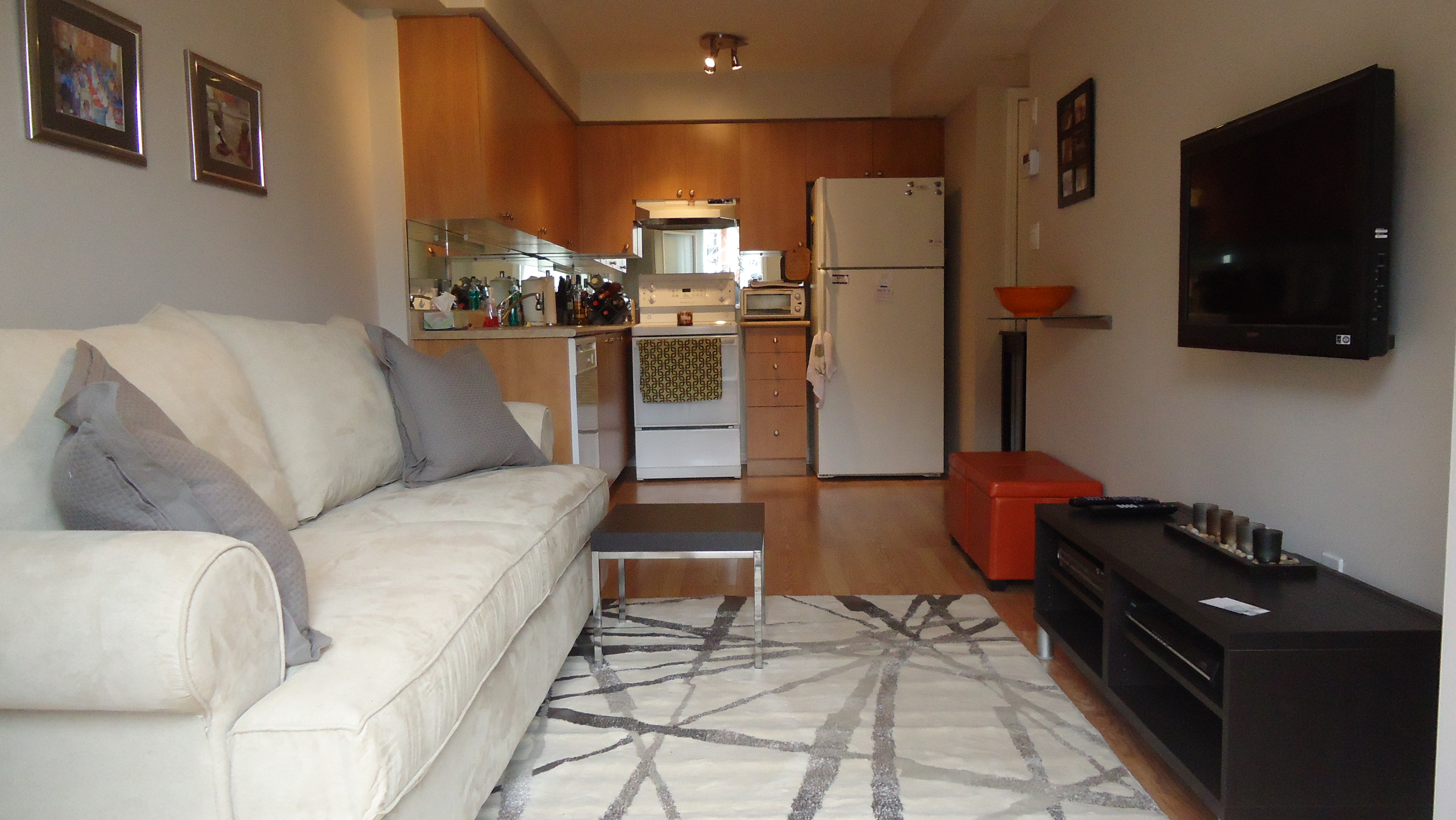
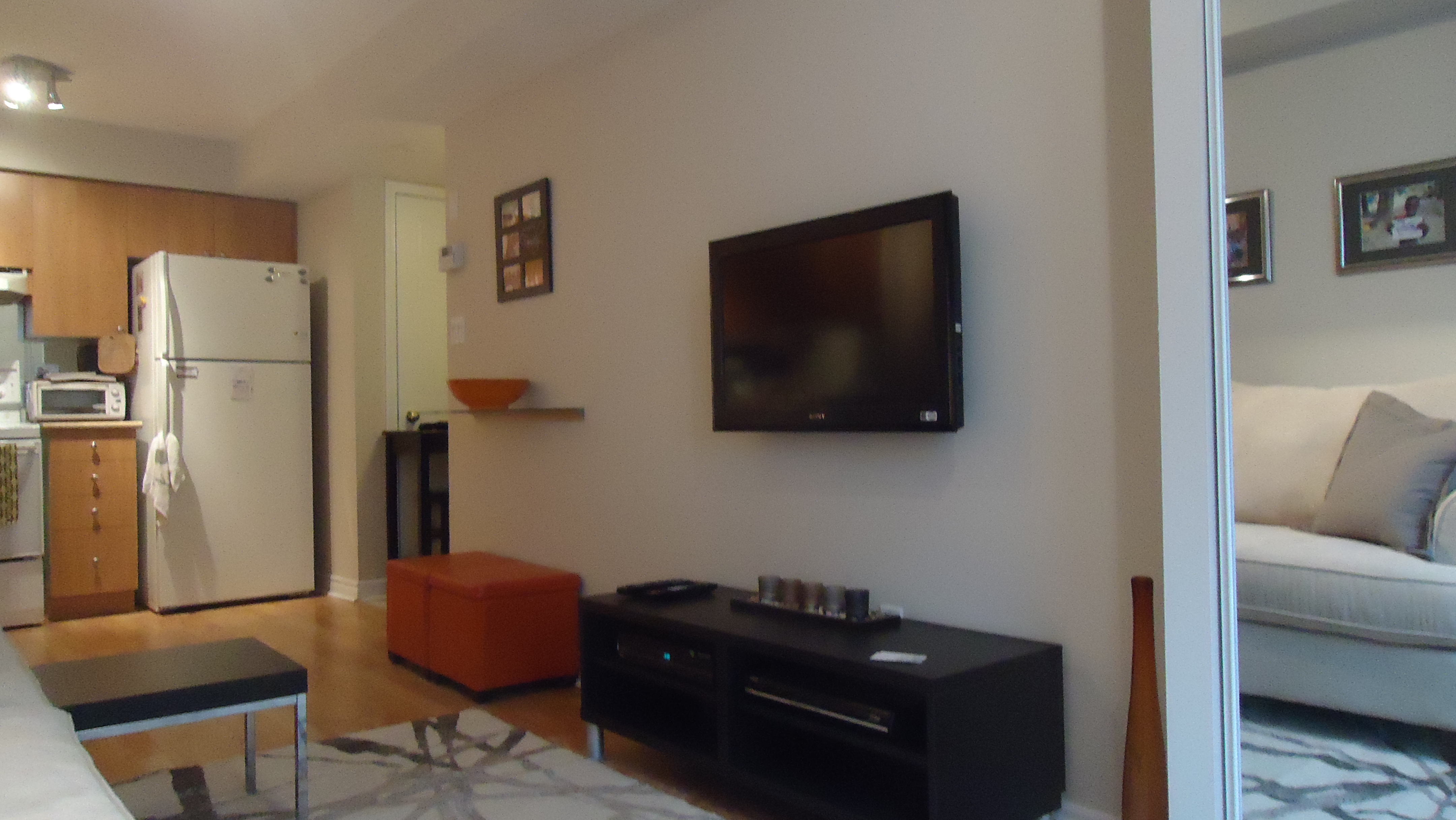
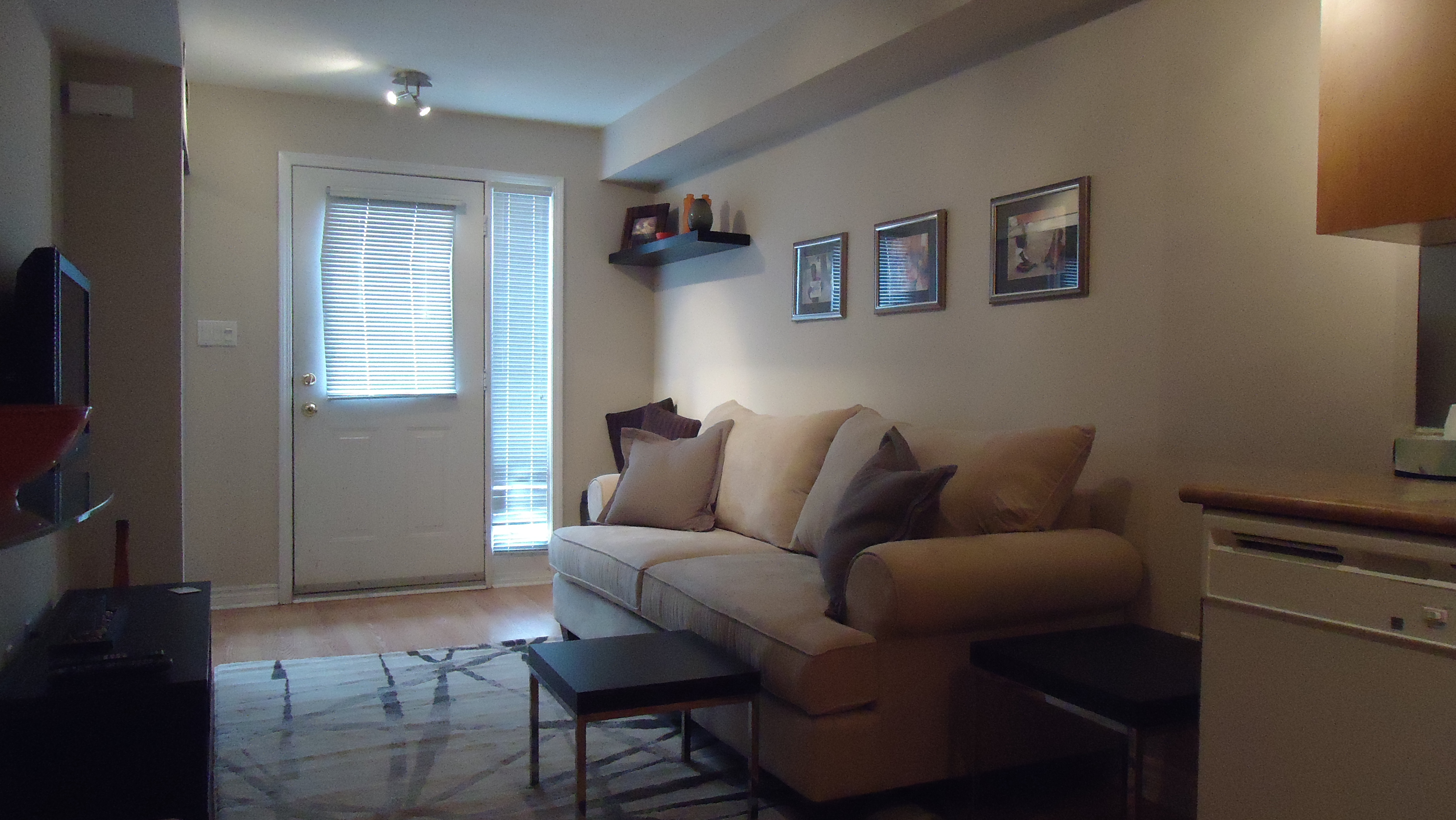
We chose a colour scheme of light cream (Benjamin Moore Baby Fawn OC-15) as our base colour and then chose orange and gray as accent colours.

To minimize contrast, which is critical in a small space, our walls, sofa and new area rug were all the same base colour. Contrast, as I’ve mentioned before, is one of the single greatest factors contributing to a space feeling small, so it’s important that all the large pieces be the same colour.

We brought in our accent colours in the cubes, vases, cushions and artwork. Everything ties in and relates to one another. There is gray in the rug, cushions and artwork mattes and orange in the photos themselves (which the client took on one of her trips – always try to personalize your artwork whenever possible), cubes, bowl and vases.

The result is absolutely beautiful. The space is warm, cozy and inviting. Everything ties in and relates. There’s lots of extra seating for guests and the home is clean, organized and simple.

Have a look:

DSC06925


DSC06927


DSC06928


DSC06931


DSC06937


DSC06934


Posted in Before and Afters | 1 Comment